
I've been spinning A$AP Rocky's mixtape for a few months now. Not too many rappers have snagged my attention as quickly and easily as this young (read: born in 1988) up-and-coming superstar, who is known for his easy-going attitude, unique sense of fashion, progressive mindset (he's pro-gay and anti-meat), requisite tastes for weed and the color purple, and laid-back, but accurate flow. I wanted to encapsulate all (or at least most) of that in a single image, which would exude an air of swirling, stylish fun. Have a listen to some of his music as you read on about my process.
Paying more attention to typography during the illustration's early stages. The final ended up looking pretty different anyway. Learning to trust my instincts more after stretching my muscles with some strong thumbnails.

My lovely girlfriend (at the time) took over 100 random reference shots to help build inspiration for figurative poses. We just turned up music and had me act out movements from some of A$AP's videos. I look so silly in some of these but that's part of the fun of the process.

Cobbled together a rough comp in Photoshop using altered bits from the reference shoot and images of Rocky culled from Google. Also blocked in some type to account for the positive and white space ratio in my mind's eye.
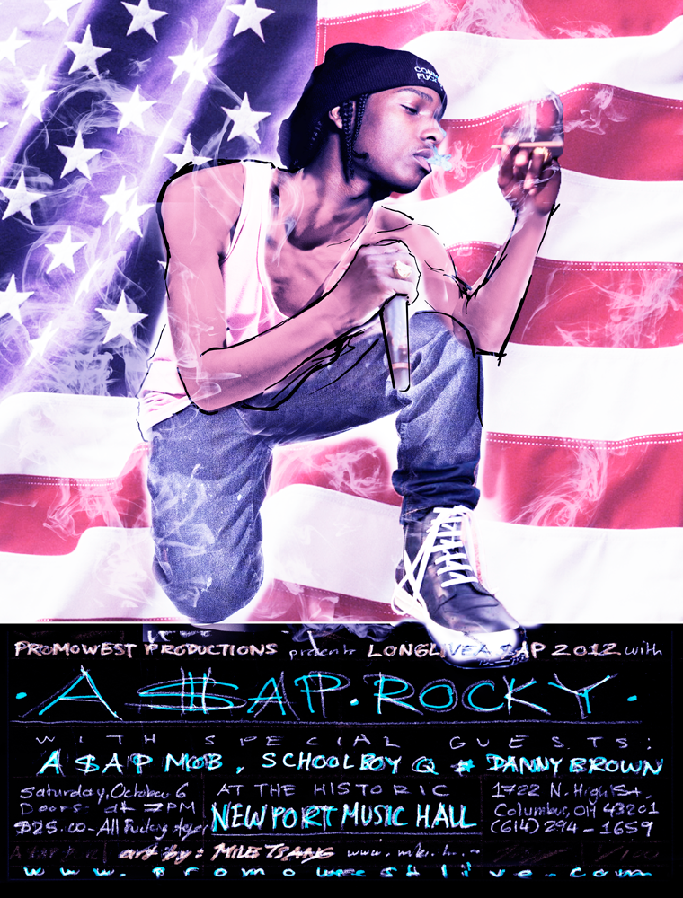
One of Rocky's catchphrases is "Pretty Motherfucker," which comes from his affinity for fashion due to growing up in Harlem. So I made an effort to give him a jacket reminiscent of Raf Simmons' or Rick Owens' designs. I ended up specifically going with the Black Leather Stag Bomber. I also thought for a quick minute that I might put the lyrics to "Trilla," behind him, but that eventually got the axe.
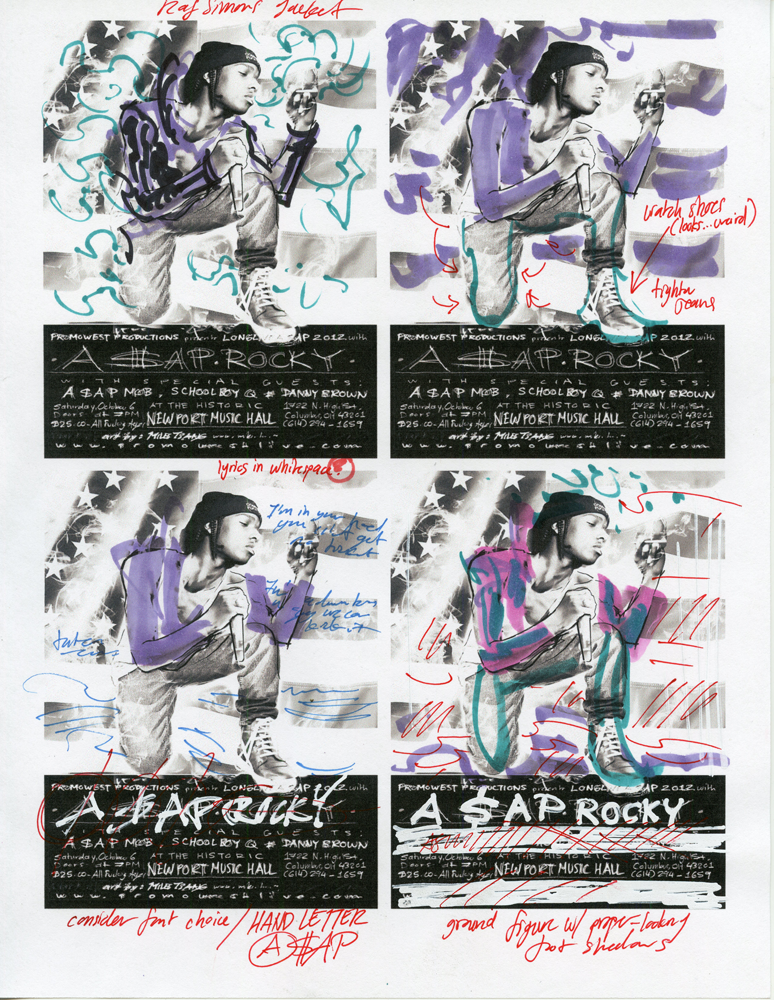
Rough comp with the jacket included, as well as color-steps and print notes. Around this time, I began consulting Brian Ewing for design tips. He suggested getting a tighter idea of what was going on with the type (including dropping the individualized fonts for every performer, as that would have made it look like a cheap press flyer), enclosing the composition in a border to make printing easier, and printing on white paper using transparent inks to maximize the effectiveness of colors. I'd already bought the purple paper, but I did shrink the design a little and framed it. He was right. This would have been hell had I gone edge-to-edge. I hadn't found a decent paper cutter for the 19" x 25" sheets at that point, either.

A few of the better type layouts I thumbed atop inkjet printouts. Trying out different variations really does wonders, especially for something as important as type. I didn't used to think of typography and design as much, but I've come to realize that how information is read is just as thought-worthy as what is being read.
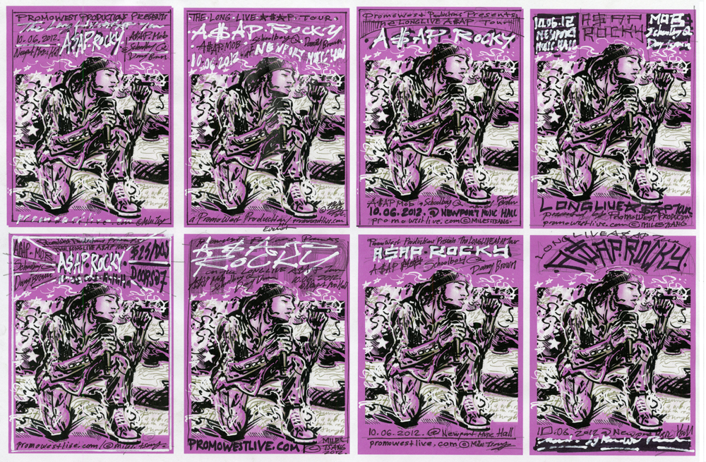
Approximate semi-comp. Ended up just hand-lettering half the type to give it a personal touch. Thanks again to Brian for his advice on that.

Research and roughs spread out across my work station.

Using Saral transfer paper and ballpoint pen to carefully transfer the rough to Bristol. It took a bit of doing, but it's a very clean, accurate way of getting a drawing from a cheap printout to a quality ground for finishing.

Semi-final version of the drawing portion in blue.

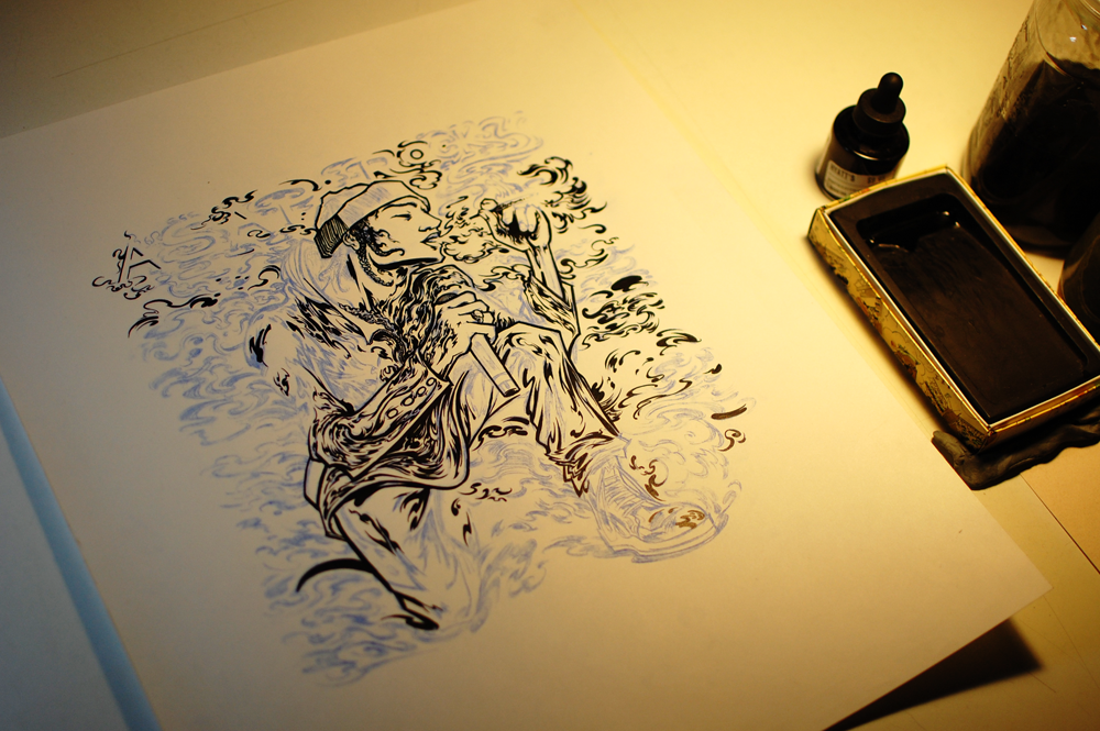
Inking progress shot.
I took my time getting the drawing as clean and tight as possible since I knew there was still processing in Photoshop to go through. I didn't want to have to redraw everything in Illustrator as I used to due to time constraints. This made my whole hand and arm ache instead of just my index finger and thumb from excessive clicking. I will likely try to blend the two for my next project, but I like the effect that the natural, curvacious, restless brushwork lent to the design. The drawing is roughly 10" x 11" on 14" x 17" plate bristol.

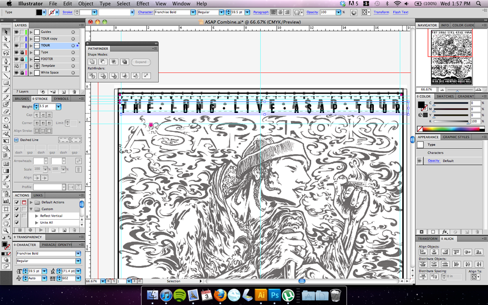
I used guides and grids to plot the type accurately and attractively. I like using fonts from Lost Type, which I was told of by Graham Erwin, because they are designed by fellow Dribbble users who are all major design and typography nerds, which is awesome. Almost all the fonts are pretty stellar, and can be easily manipulated in outline mode to achieve a variety of effects.
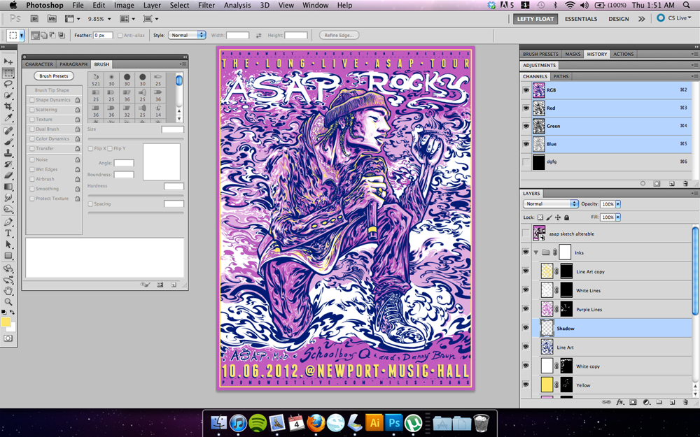
Filling in the line drawing with Photoshop. I ended up using feathered shading for just the skin tone, with the rest solidly blocked in or out using various sizes of calligraphic Photoshop brushes.

Bringing everything together and finalizing with colors and separation for silkscreening.
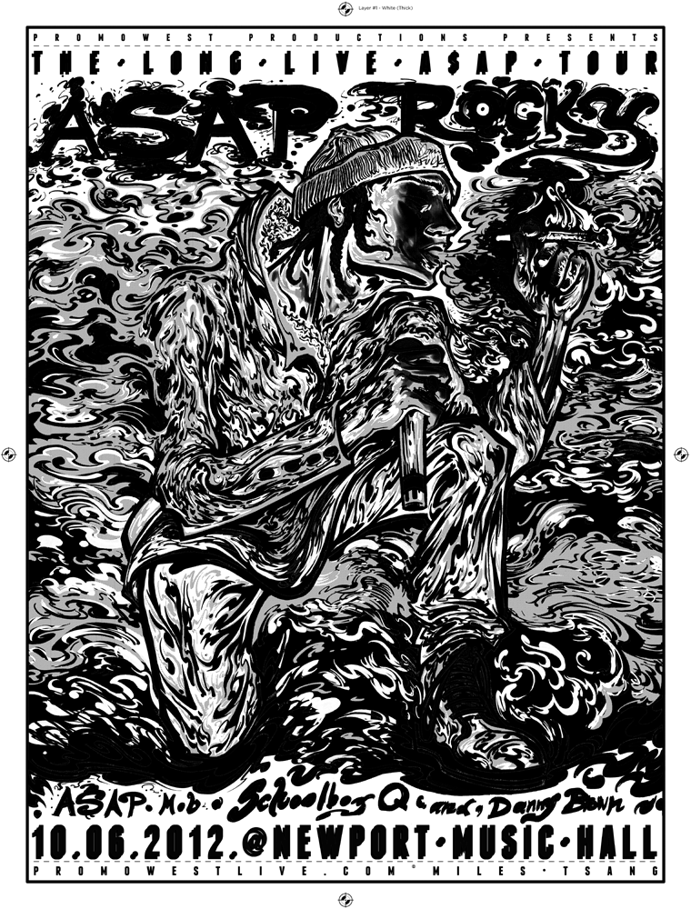
One of the layers of transparency, specifically the white. It encompasses both the white and yellow-gold layer in Photoshop as I wanted it to act as an insulating underlayer to help the metallic yellow-gold layer pop a little harder. Had I not done this, the transparent nature of the yellow would probably have bled into the ultra-chromatic purple and produced less of a vibrant gold and more of a murky brown. The grey areas are actually Photoshop-produced halftones used to achieve an intermediate layer between the white of the ink and the chromatic purple. The transparencies are all 25" x 19" including the registration marks.
Three layers, burned and prepped for printing. The mesh counts (from left to right) are 255 (white with halftones), 230 (yellow-gold accent), and 200 (final dark line layer for sealing the composition). I get my screens from this website.

Printing using the vacuum table recently erected by my wonderful friend and print-manufacturing mentor Garritt. The guy is a veritable print guru, and is constantly restless, looking to find and build new gear to make our lives as printmakers easier and more fun.

Progress shot of the last layer of printing. Couldn't take too many because I was afraid of the screen drying and clogging up. My back was killing me after printing about 125 of these 3-layer prints solo after a full day of work at Traxler Tees in one exhausting 7-hour sitting.

Close-up of the final finished print.

Typography detail. I really like how the gold turned out.

I had these trimmed from 19"x25" to 18"x24" at the last minute by a small local print shop just down the street from my apartment called Shout Out Loud Prints. Thanks for the quick hook-up with Chop Chop (the owner of the actual paper cutter).

Holding up a finished print in natural light. The print looks a little different if you look at it from different angles or shine different temperatures of light on it, since there's metallic gold in the yellow and a bit in the dark line layer.
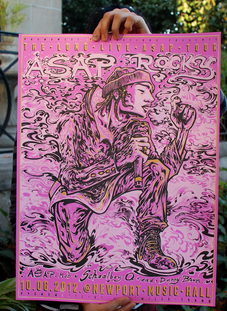
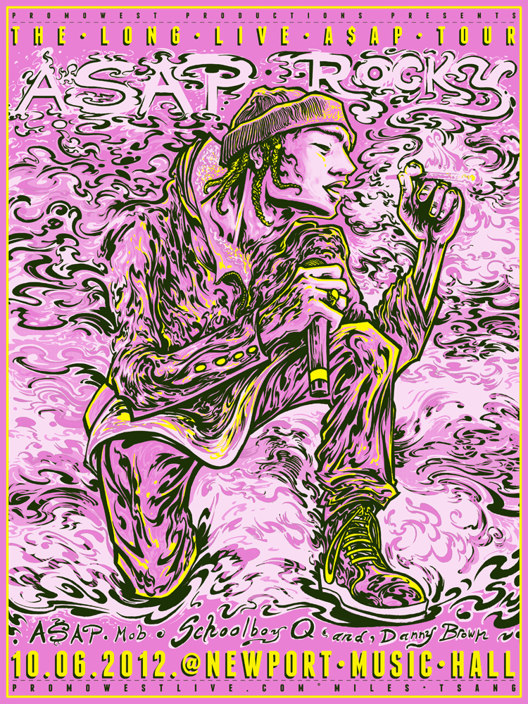
The final digital rendition. The actual paper color appears more pink in real life.
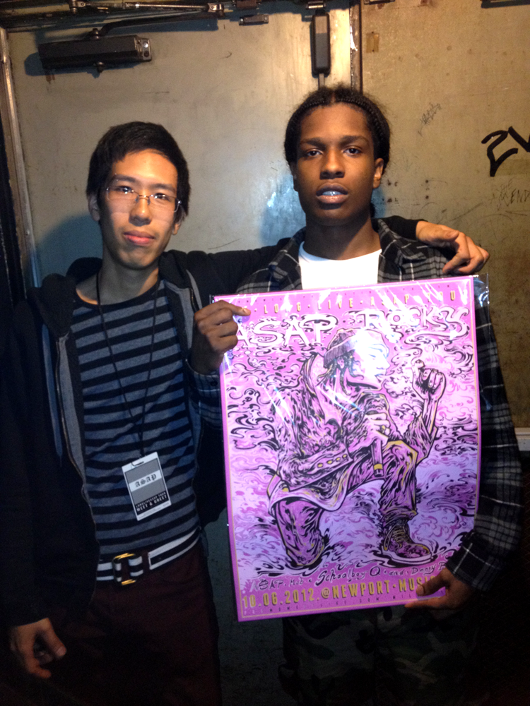
Oh, yeah. I also went to the show and Rocky's management liked the posters so much, he gave my friend and I meet-and-greet passes. He was pretty flabbergasted by it. One of the reasons I chose to focus some more effort on rap posters lately is because not a lot get done and even fewer are done well, with love, care, and respect for the artists' image. I don't know why. I think hip-hop is a fun and gratifying genre, typical accusations of misogyny, materialism, and violence aside. I like to think of it more as young people vicariously recalling past experiences and reaching for the things they want and feel that they deserve. To beats and ever-evolving production trends. When you look at it from a certain angle, it's hard to not appreciate the fact that hip-hop comes from a place of discontent made bearable through expression. Covering up internal dissatisfaction with external style in the name of catharsis, much like many other forms of art. Anyway, I'm glad Rocky loved what came of it. This print is officially A$AP-approved!
For sale through The Shop.