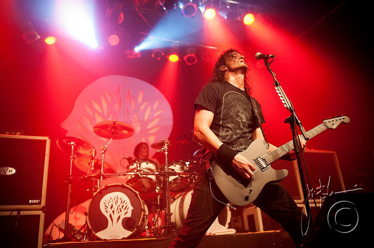
Gojira are the shit. Pardon my language but it's the truth. Their sound is cohesive and diverse in its influences and implementation; you can tell that these boys jam to every known sub-genre of metal out there and they absolutely kill it live. Interviews with them tend to give an impression of courteousness and humility and their lyrics have a definite bent of environmental awareness and inner positivity. Plus they've had no line-up changes since their formation in 1996. In an industry marked by fads and superficiality, Gojira are a shining example of the greatness that can be had with an honest and untiring commitment to heavy, aggressive music.
Concept & Sketches
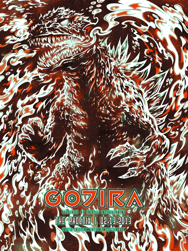
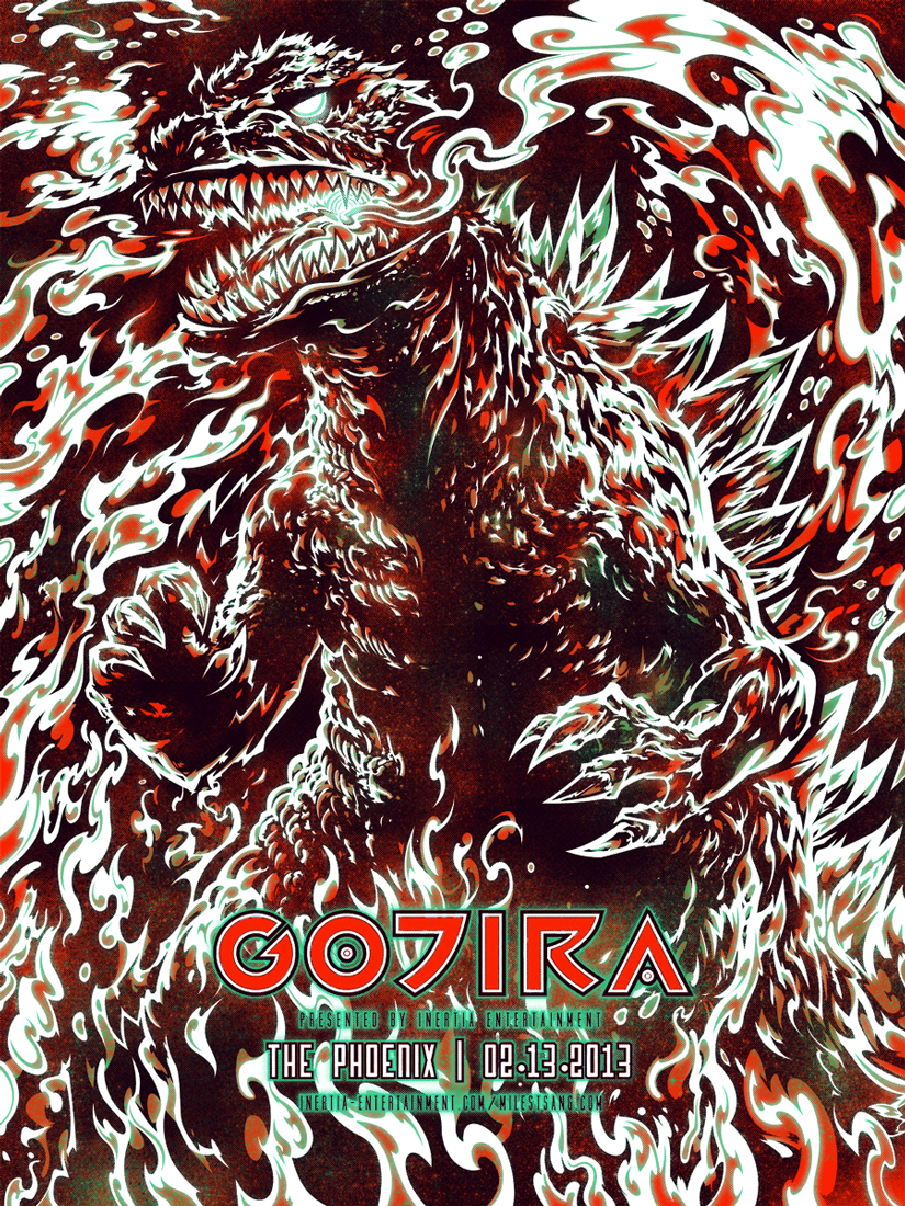
The first round of thumbnails were basically me experimenting with different ways to frame Gojira. A bunch of the early ones included a guitar that I quickly threw out for making things too cartoony. In the end, things just went full-frontal with the figure taking up most of the space, creating and ominous, all-encompassing vibe. I also decided around this time to try and make this look almost like a movie poster. After all, the band's name is derived directly from one of the longest standing film franchises of all time, I couldn't pass that up. I definitely didn't knock myself out brainstorming for this poster. It may seem conceptually lazy compared to previous efforts but because I expended so little effort on ideation, that left me with plenty of energy to dump into execution.


[heading size="h3" stunning="yes" align="center"]Semi-Composite[/heading]
To quickly get at a figurative framework, I used Photoshop to collage several disparate pictures of Gojira into a semi-cohesive whole. The pose was altered and tweaked to mimic the general spirit of some of the thumbnails while maintaining the intensity of the original film stills. The collage was then used as an underpainting by being inkjetted onto card stock, sealed with matte spray, then drawn and painted on until it became an entirely new work. Once a purely black-and-white relationship was established, I drew the entire thing out again in Illustrator, eliminating various imperfections while smoothing lines and sharpening edges.
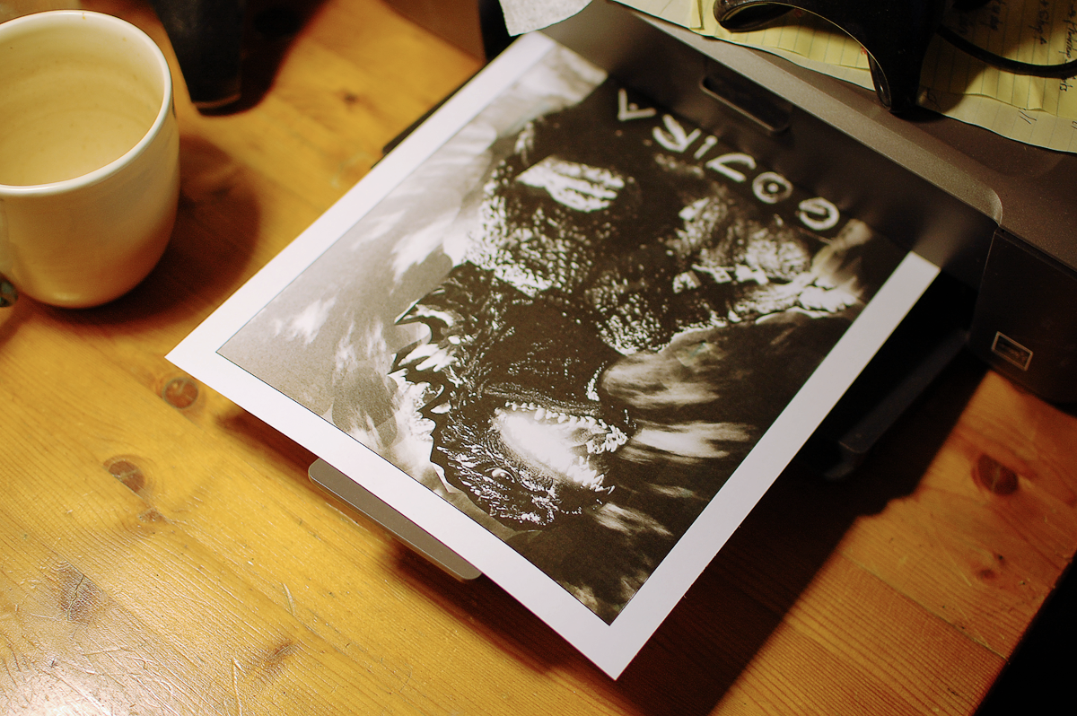

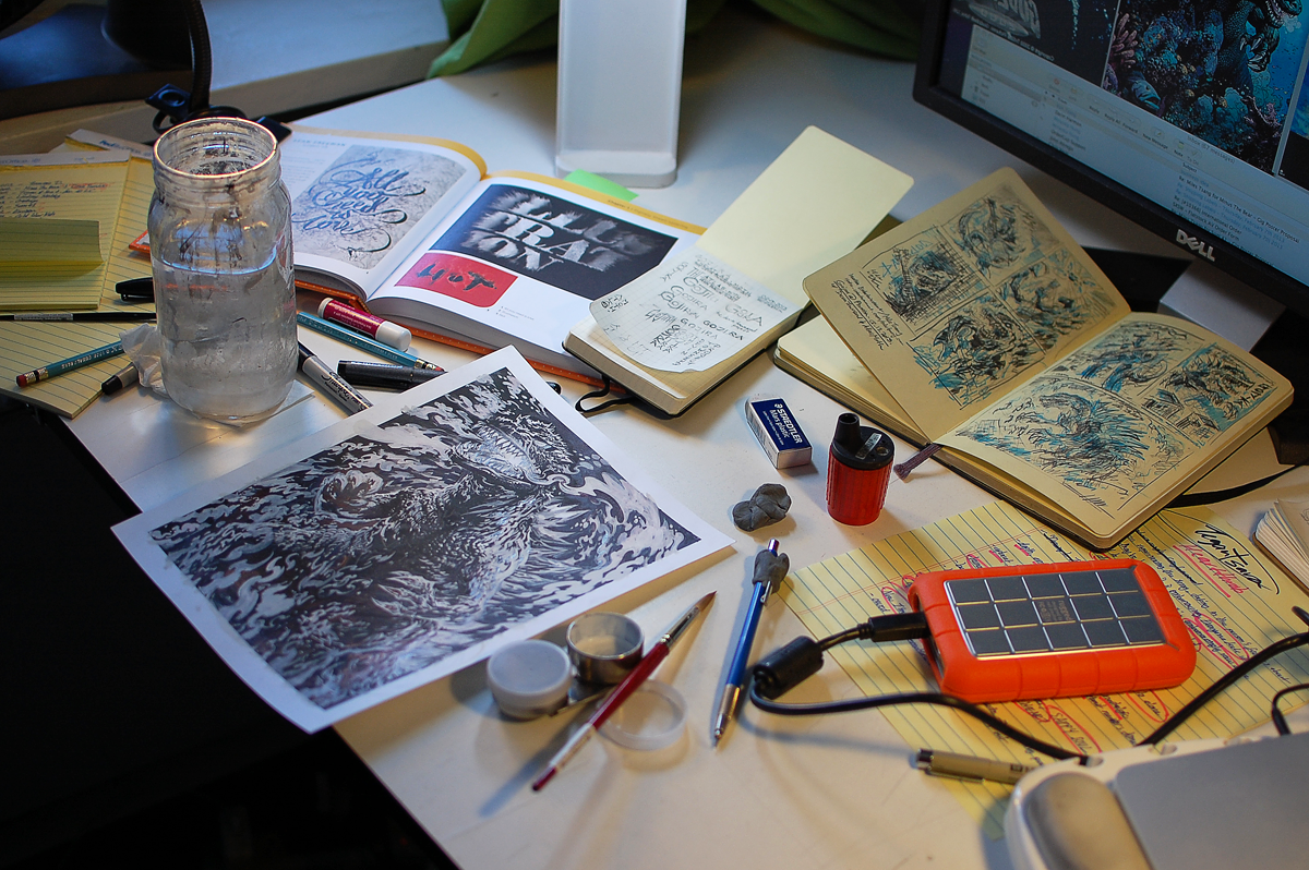
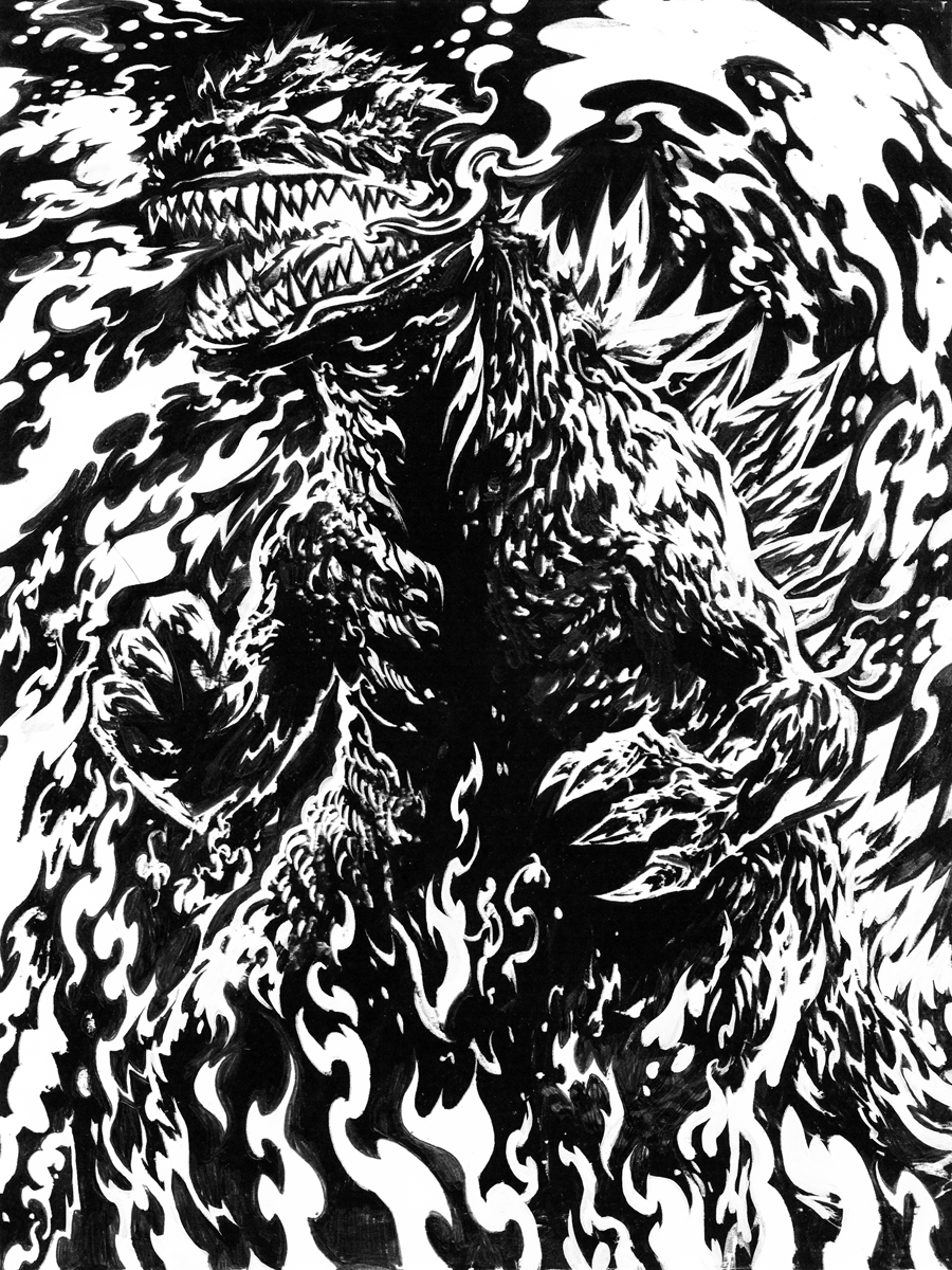

Once that was finalized, another preview was printed out and a secondary shade layer was drawn in pen. This allowed me to render more gesturally, giving an organic feel to the lines and shapes. Maybe down the road, I'll have a tablet screen to fidget with which will necessitate a move to entirely digital processing but for now there's something I find hard to replicate about the marks made by pen or pencil on physical substrate. I take time to do things analog style so even if the drawings end up going through a digitalized process they retain their hand-crafted integrity.

Finalization
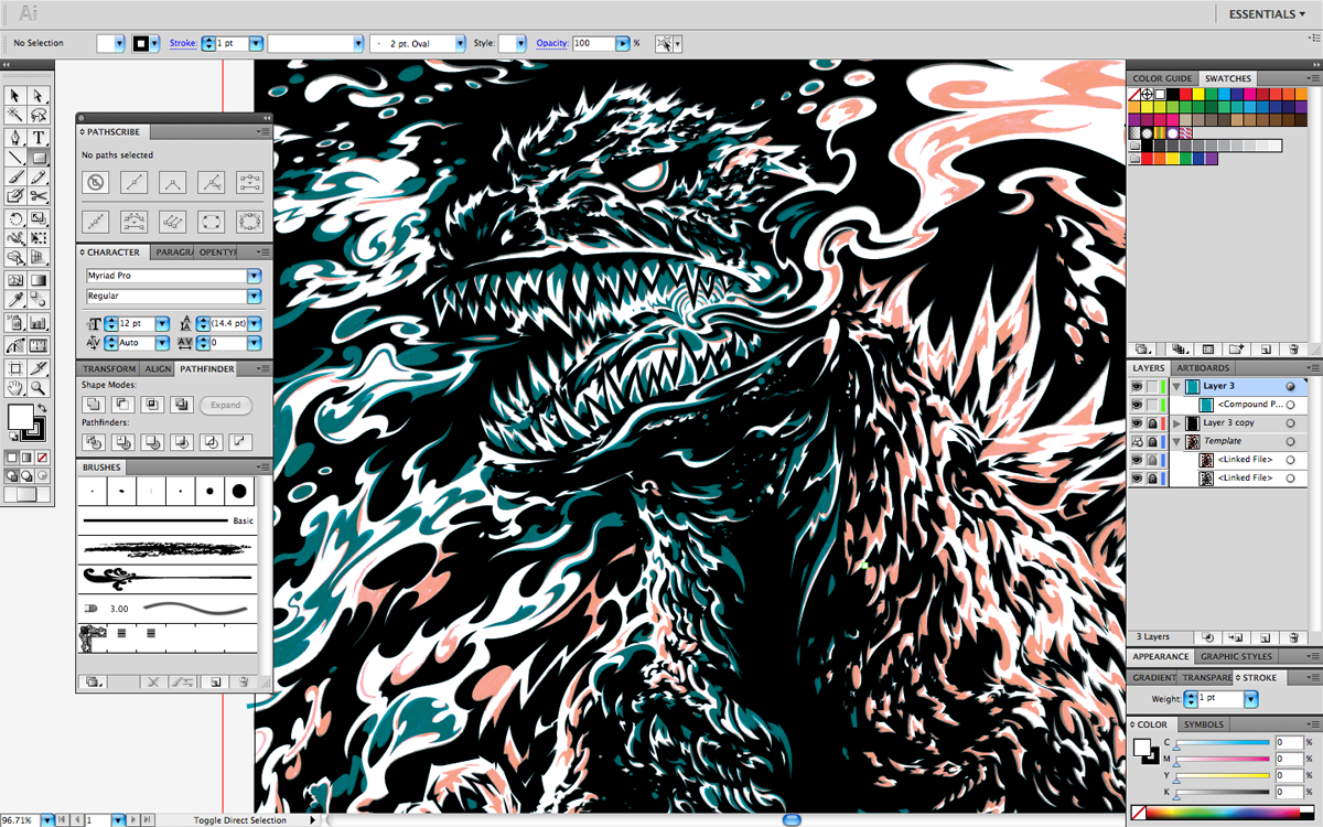
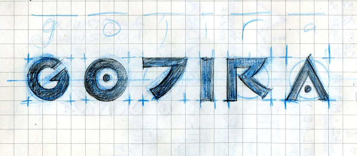
After the secondary layer was redrawn in Illustrator, it was time to seal the deal with type and textures. I've resolved to improve my design skills more actively beginning with keeping a little sketchbook on me at all times for doodling typographic ideas. I eventually settled upon something reminiscent of an Oriental-inspired style in a line weight echoing the size of its subject.


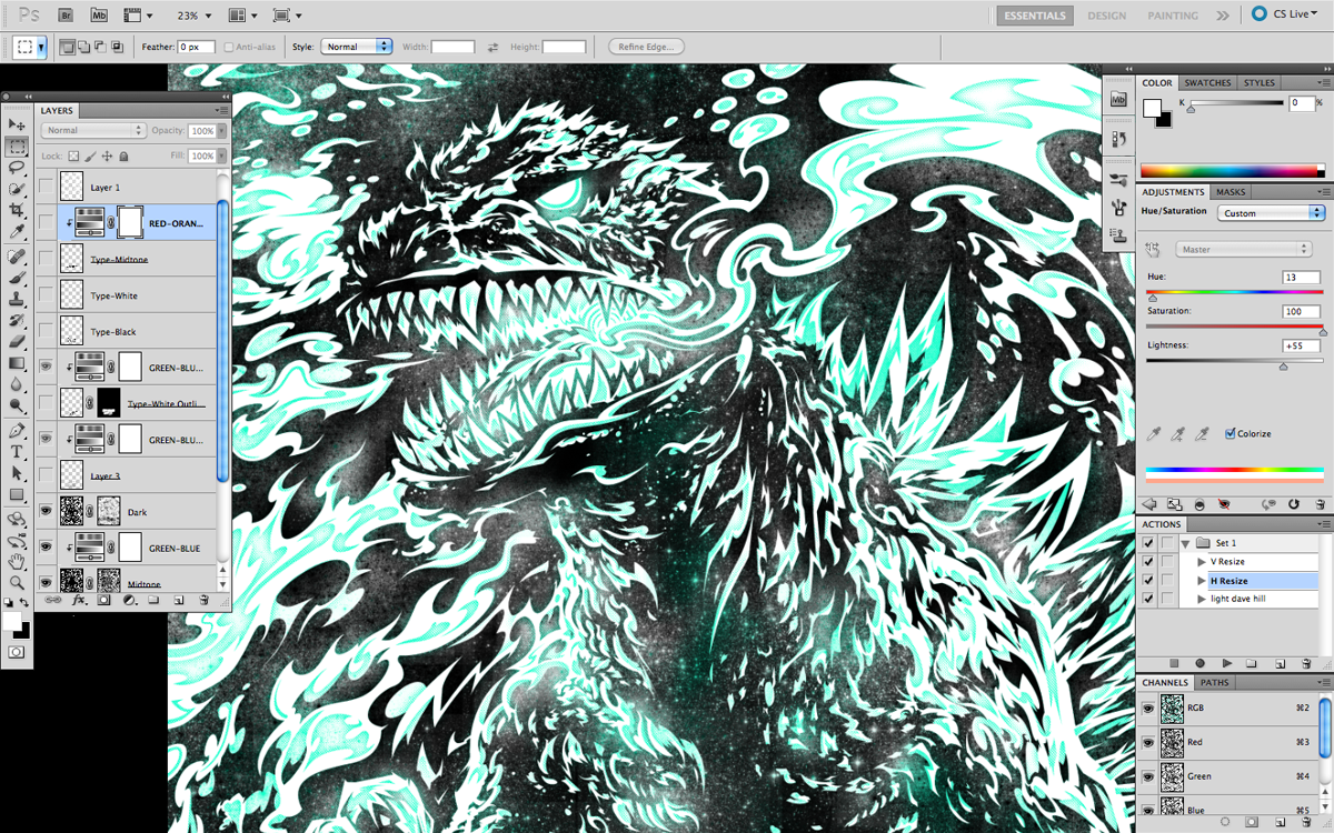
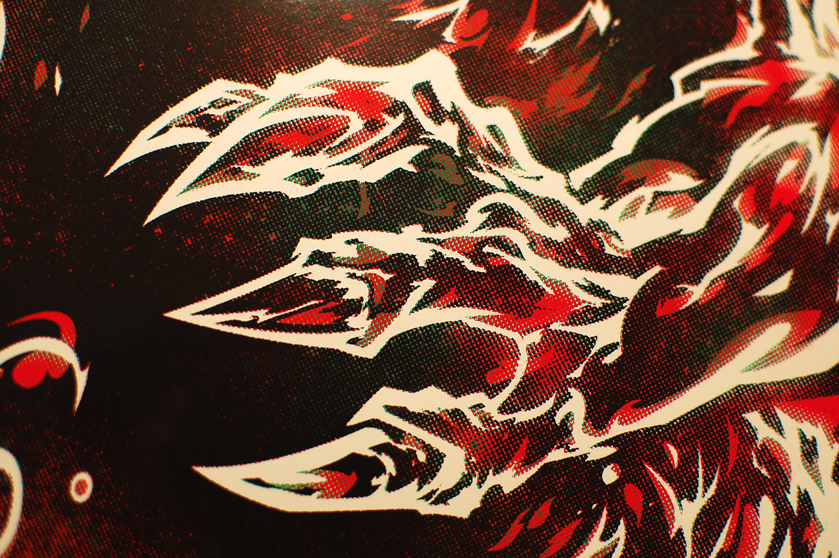
Supplementary textures were created entirely in Photoshop after 95% of the drawing legwork was done in Illustrator using custom halftone brushes (they're not hard to make), carefully-edited masks, and careful halftone-screening (using Bitmap mode to make purely black-and-white tapestries of dots to describe medium tones). The textures are meant to generate visual interest as well as subtleties in tone and colour in order to give Gojira an intimidating radioactive glow.

Screen-Printing


This job was printed on French Paper's 110 lb. Smart White stock because it is exceptionally heavy and bright. Two very necessary trait when one considers the amount of ink to be laid down as well as the desired effect of luminosity. I splurged on fresh speedball because during previous jobs I experimented with mixing different brands of inks and I have a sinking suspicion that that was a very stupid thing to do. In the past I've noted sporadic behaviour in other inks such as unpredictable clogging times, uneven distribution of ink, and slightly differing dry appearances. No one of these alone are dealbreakers, but collectively they can make printing pretty annoying by constantly breaking up your flow. Just goes to illustrate the power of proper preparation and supply selection. All the colours used in this print were custom (read: eyeball) mixed. The black is a juicy mix of brown, blue, and violet (no actual black was used), the red is 2 parts scarlet and 1 part magneta with some extender base for viscosity and the green (though originally intended to be more blue) is white, primrose yellow, emerald green, and blue, with lots of transparent base.


I didn't really do much in terms of trapping (extending the print area of underlying shapes to avoid white spaces and breaks in the printed composition) but luckily my technique and registration kept things in check. Even the mis-registered ones (at a wonderful all-time low quantity-wise) look pretty cool because the final black layer just seals everything neatly. This Gojira print also marks the first occasion upon which I've aimed at a 100% coverage design. Everything before this was either thin or bordered. Glad I made the switch; the image seems to have an easier time enveloping the viewer.
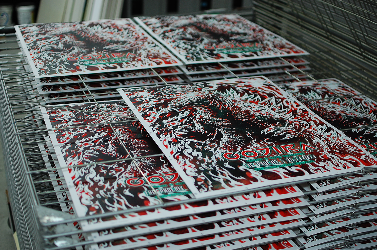


Overall, I was very happy with how this gig poster turned out. I didn't stress over concept and that resulted in a much stronger image in terms of construction and printing. I know that I did something right with this because despite printing 85 o them, I only have about 15 of them left less than a week after the show, which is a new little benchmark for me. So thanks for supporting me, reading this, or just happening across this blog! The remaining prints are up for grabs in The Shop.
*EDIT* This print is now sold out. Thanks to everyone who bought one!