
Clutch are an American band whose sound blends hard rock with related sub-genres such as stoner rock and funk metal. Though I've known of them for years, I'll be honest and say I hadn't listened to them before I took on this job at the request of the wonderful Inertia Entertainment. This was really fucking stupid of me because this band rocks. Really hard. Their show at the Sound Academy last night was a real rock-and-roller-coaster with great energy, an amazing crowd, and one of the best live performances I've ever seen in terms of fidelity to their recordings. Though I didn't know all of that when I started, I trusted my promoter that I'd be a good match for this band and dove right into things.
Rough Drawing / Sketch
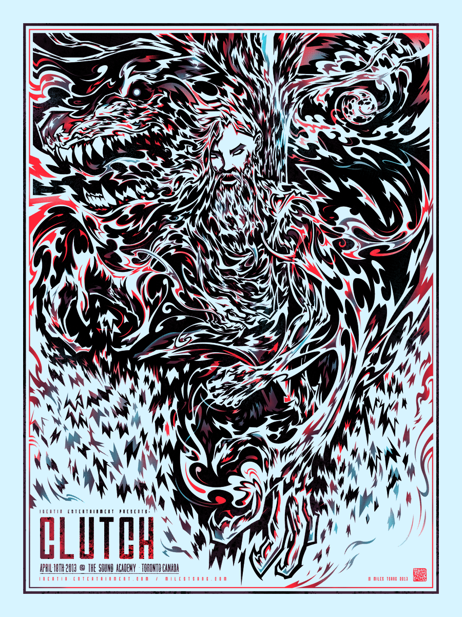
Since I didn't much of a personal history entwined with the band's music, I decided to just go with the first thing I could think of that would be visually enticing which complemented the band's vibe. Their most recent album Earth Rocker has a very taught hard rock sound so I decided right off the bat to keep everything tight and sharp. My favourite song off of the record is The Werewolf Kindly Requests, which is self-explanatory in meaning but very evocative and attractive. After listening to that song a lot, I started to envision this man (bearded, like Clutch's lead singer and a ton of their audience) in a darkened area, perhaps in a bush or hiding in the shadows cast by a tree, futilely clutching to humanity while the moon awakens his inner beast. I didn't really do much preparatory sketching; since I was able to conjure a specific scene and I knew concisely how to execute it, I just jumped right in and began work on the image's skeleton.

I used a coloured pencil for the under-drawing because I knew I'd be tightening it up in graphite later. What was important to me at this stage was establishing a strong structure and some atmosphere.

Beginning to go over the rough line work in pencil. Taking care to accentuate details and make things clearer rather than too much more complicated.

The finalized, tightened sketch.

Refined Drawing / Semi-Composite
Though this might seem a little redundant, I decided to go ahead and ink the semi-composite traditionally before going over it again in Illustrator. My reasoning for this was to work within the limits of analog. There are many lines and forms in the picture that look like they were done by hand rather than a computer and I'm always trying to find ways to confuse the two.

The finalized ink drawing. In doing this, I was able to also have a finished piece in my moleskin which was identical to the final print. It was pretty fun being able to walk around the Clutch show with this in my pocket, letting those who were curious know that this is how it was done. That doesn't usually happen since my process tends to leave behind a lot of detritus in its wake versus a select few refined processional pieces. Let this be the beginning of more of that.

Digital Processing / Finalization
The entire drawing was re-traced manually in Illustrator using the pen, pathfinder, and brush tools and vectorscribe plug-ins. It took relatively less time than usual, however, because of the tight inks from the previous stage. I often struggle a little with re-tracing messy graphite, as there are a lot more blurry lines and grey tones to interpret.

Added a secondary layer and words to complete the body of the poster. The shade layer rests below and cuts into the key layer, which is supposed to create unique colour scintillations and a sense of style and dimensionality.

Next, I duplicated the shade layer in Photoshop and played with masking out and half-toning. The goal was to get a good play of chroma contrasts to make it seem like there were far more than just three colours.

The finalized digital comp with text, textures, colours, and all effects applied.
Screenprinting
The transparencies for this looked very similar because the bottom two layers consist of two colours which cumulatively "Knock out," much of the key layer.

From left to right: transparent cyan on 305 mesh, transparent red on 280, and mostly opaque mixed black on 305.

I was advised by Dan McAdam (one of the most active gigposter community contributors) of Crosshair (a wonderful screenprinting studio which specializes in insanely technical photographic posters) to invest in bigger screens as it would make printing easier with more breathing room between the inkwell and live area. This is more of a (solvable, but still annoying) problem when doing full-bleeds but for now I think I might just keep a thicker border. It's not hard to implement, and there's a nice sense of cleanliness and psychological closure to it. Still, bigger screens would be great...

The first cyan layer is laid down. The parchtone texture of the paper is really showing through because of the high amount of clear base as well as the chroma echo in the blue ink. Pictured: wolf detail.

Head detail.

Claw detail..

Type detail.

Truthfully, the mixed maroon was intended to come out a little bluer. Still, I enjoy the variations in colour and texture that this is creating. That was fully intended..

Registering the layers using overlaid registration marks. It's taken a while, but I can safely say now that my registration accuracy is safely between 85-95% every single time.

The finalized prints drying. Always a lovely sight.

[heading size="h3" stunning="yes" align="center"]Done / Details[/heading]


Thanks for checking this out! There are a few up for sale on my Shop.
*EDIT*This poster is now sold out.