
Overview
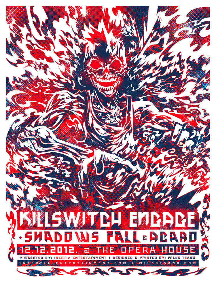
Killswitch Engage are renowned for being one of the most consistently solid metalcore bands around, successfully fusing the clean catchy choruses and screamed vocals of Gothenburg melodic death metal with spiritual weight. The illustration was supposed to suggest beauty versus brutality while referencing bits of the band's second album, although another super-tight deadline necessitated some time-saving edits. I like to think the image that resulted as an undead headbanger brimming with fallout and good vibes. You can read the quick facts for this poster in its separate Portfolio entry.

Where things get done. You can see the semi-comp and gouache paints used.
Concept & Sketches
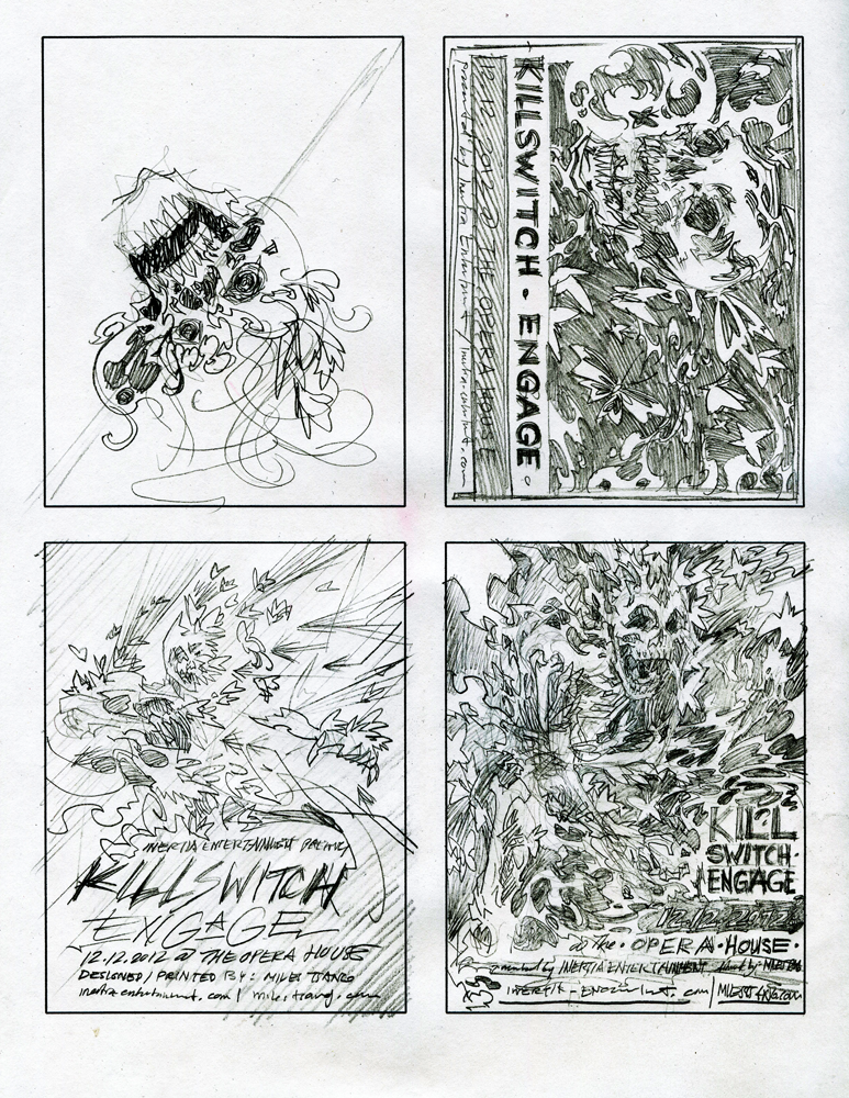
Various thumbnails. Fun to do, though they mostly went unused.
Wasn't sure of the kind of image I wanted to end up with for Killswitch. I knew I wanted to mine inspiration from sources other than the music itself and other poster artists for a change.

One of Marcos Mazzoni's numerous butterfly coloured-pencil drawings.
I got bits of ideas from Marcos Mazzoni and Ashkan Honarvar, two aesthetically-pleasing and excitingly expressive artists which pieces that seem to describe loss and inner turmoil.

Ashkan Honarvar's Krokodil series.
Knowing that the band would be playing Alive Or Just Breathing in its entirety, the idea was to draw a figure whose skin follicles transform into tiny butterflies that proceed to drift away.
Dead and drifting.
This was inspired by my recent discovery of the effects of Krokodil, which is a terrifying drug that literally eats away the minds and bodies of addicts after a relatively short span of abuse, effectively rendering them technically alive, though just breathing. That was the main factoid I wanted to squeeze for creative juices because it just seems tragically surreal for such a thing to exist, though the tight deadline forced me to keep the pose and to take the illustration in a more literal and clean-cut direction. And that was also good.

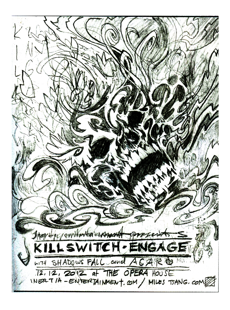
The drawing I ended up using as a basis for the final. I didn't look up any specific references for this; everything about the illustration is straight from the head.
Semi-Composite

Messing with the type a little. Going to try to get back in the swing of altering, cutting up, and re-contextualizing typefaces for novel effect.
I been keeping up with trying out some new methods of obtaining semi-comp images from sketches, which I continue to try to make tighter and tighter so altering it becomes easier earlier. As with my previous Lamb Of God poster, I tackled the typography first. I tried to deploy a font that would stylistically connect with both my linework and Killswitch Engage's general vibe. I eventually settled on one of Hydro74's custom fonts titled "Federation," for the dominant band names and a free font from Dafont called "ONRAMP," for the sub-dominant extra info.

Version 1. Inkjet on card stock with white out, gouache, and Sharpie.
With that out of the way, I moved onto the illustration. I magnified a moleskin drawing and printed it out on heavy letter-sized paper and began blocking in solid shapes using Sharpies and a White-Out pen.
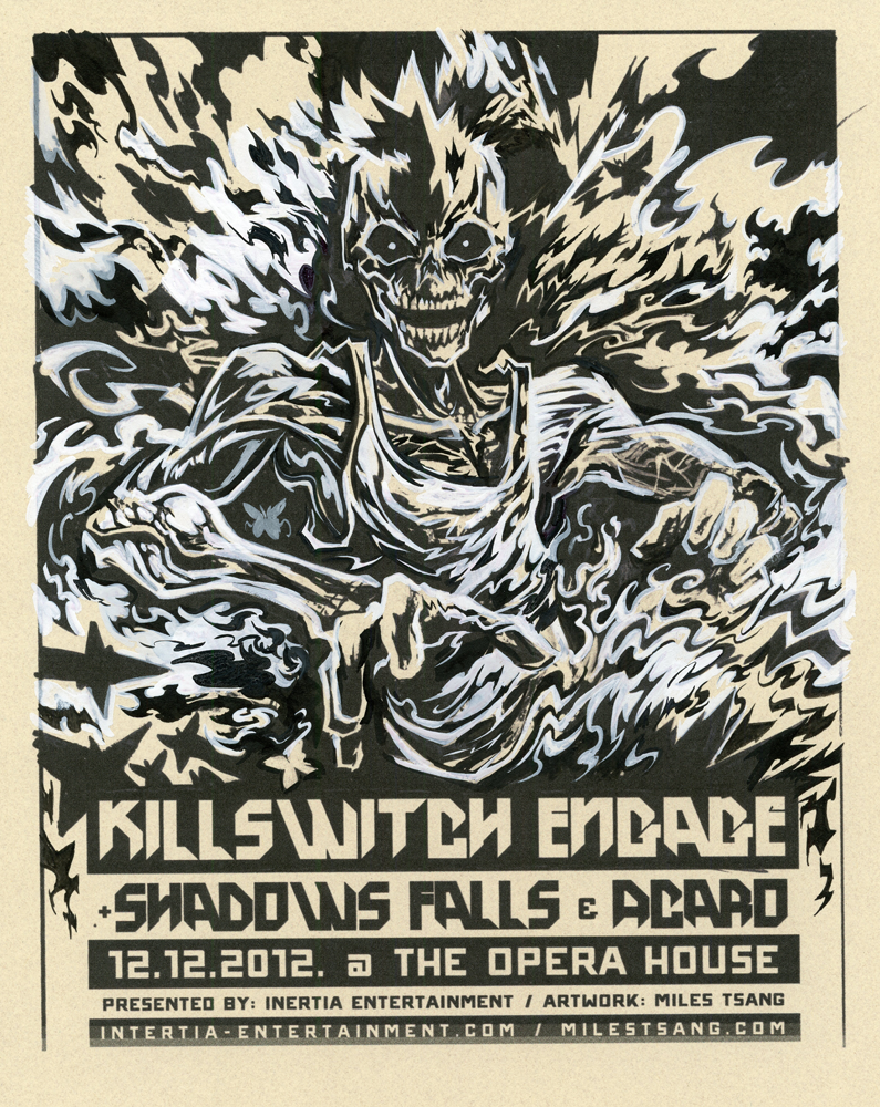
Version 2. More details in gouache and pen and ink. Locking down the general lines.
I scanned that in, eliminated the gray values in Photoshop, and mixed and repeated again, sculpting out the figure carefully and more tightly with each revision.
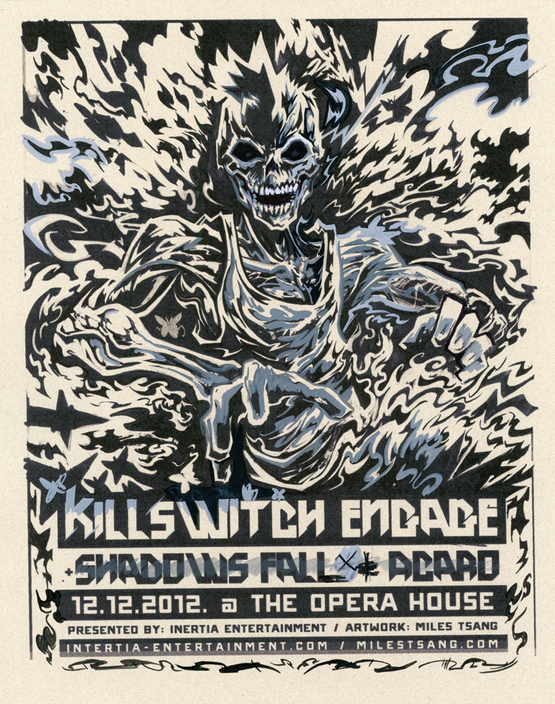
Version 3. The final round of tweaks, this time using gray to approximate a second shade of colour.
I enjoy gouache and will probably try using it more. It forces one to work in a very specific way since you've got to quickly and accurately mix colours because the paint is so sensitive and it dries relatively fast and super-opaque. I eventually came to a result I was pretty happy with, although I was sad to abandon any hope of the butterflies making it through to the vector drawing stage.
Final Composition

Becoming very comfortable with Illustrator's defaults. Beginning to expand into plug-ins and add-ons.
As usual, the Killswitch Engage poster was finalized in Adobe Illustrator. What's new about this design is the streamlined effort that went into it thanks to Astute Graphics' plug-ins. Much of the grunt work of retracing this image was leavened by Vectorscribe, which essentially allows you to edit artwork much more intuitively than with what's available in Adobe's default menus. I won't ramble about the details here, suffice to say that anyone who works with vectors on a frequent basis should definitely consider buying it. I can attest that it has easily doubled my efficiency.

Mostly done. Messing with colours at this point.
I knew for this design that I'd be attempting to squeeze three colours out of two by printing transparent overlapping inks on white paper (as suggested by my buddy Brian Ewing ages ago). I used this foresight once the drawing was done and textures needed to be added to show variation in chroma. I really enjoy how the colours turned out in this; it totally looks like the guy's Killswitch is Engaged.
The final digital drawing with textures added.
Printing

Since I was to print with custom transparent colours that needed to form a third, I had to make a few test swatches to see how the inks would react on paper and to one another. It took me a while to get the colours to something I was happy with, but it happened eventually.
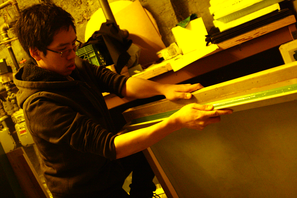
Coating the screen. Silkscreening is one of those things that's hard to put across to people unless they're there in front of you observing the process. A bunch of people who haven't used photo emulsion have asked me how one gets layers printed large and accurately. Big screens, a darkroom in which to coat them, and a light table or exposure unit are what's necessary for the most part.

This exposure unit at Centre3 is large, but the vacuum on it is broken. Therefore, I've learned to always have a small skid of paper unopened for exposing transparencies of this size. This is because the paper package fits snugly in the frame, exactly on top of the transparency , applying equal pressure to the whole print area and ensuring a sharp exposure. Currently, the yellow safe-light is on; the unit uses purple ultraviolet light to soften the light-sensitive emulsion within about a minute-and-a-half when the lid is clamped down and the unit actually exposes the screen.
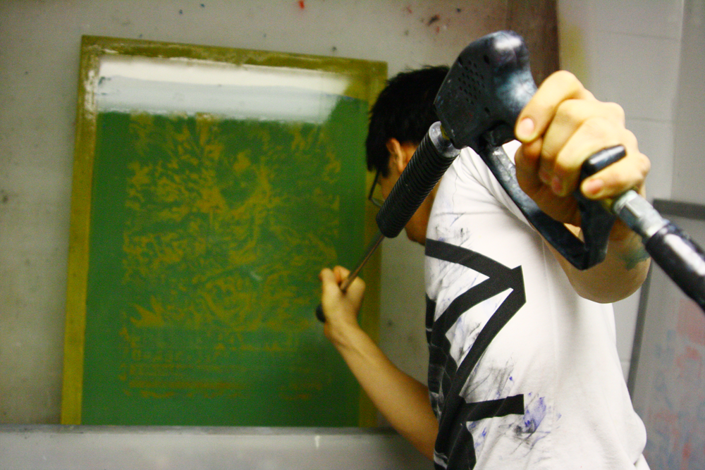
My sister Livia took this overtly dramatic shot. Just me using the power washer to hose out the unwanted emulsion. One should always be careful to coat evenly, since differences in emulsion thickness can lead to the screen clotting and designs coming out "ghostly." This has happened to me too many times to count, so I always take the extra few minutes to make sure as much of the emulsion has been cleared as possible without sacrificing the integrity of the image.

Registering and printing the second transparent blue after the more opaque, but highly chromatic red was laid down. This occasion marks the first time in a while where I've tried to mix colours instead of just going with what comes straight out of the jar. The result is a very strong , mostly opaque red with hints of orange-scarlet and a dark, navy-ish blue that refracts nicely on top of the red.

I need to start doing test prints. Sometimes posterists who do their own printing will make spares of posters and print single layers from multiple designs onto one piece of substrate over time. This works best when transparent inks are used, but the effects I've seen on some are stunning. Mental note.

Really happy with how these turned out. They were printed on extra-sturdy 110 lb French Paper so they feel much more substantial and a little heftier in your hands.
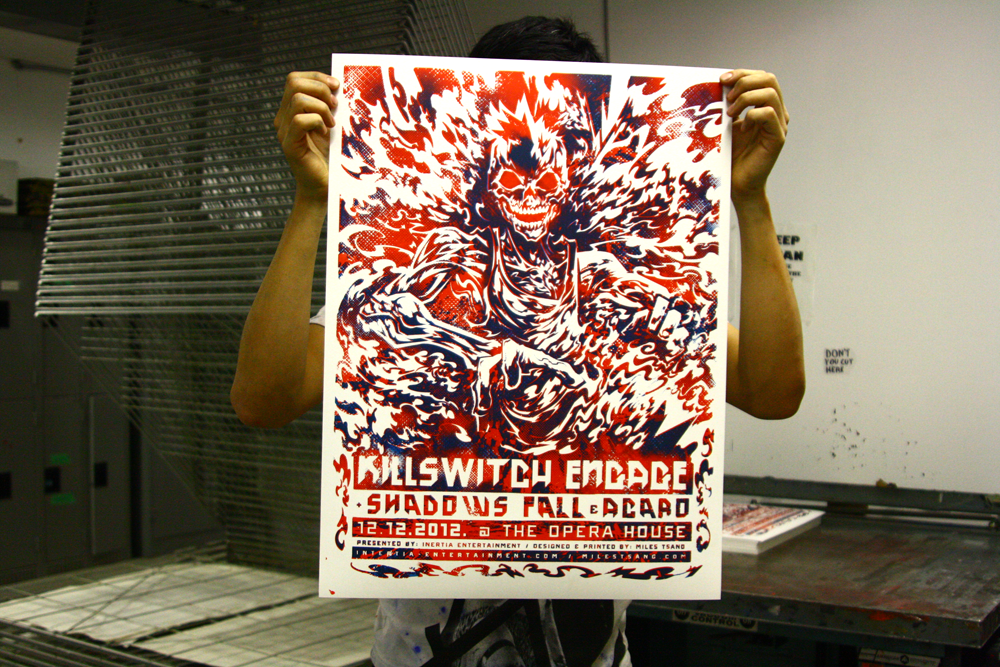
Holding the final print. Though I wish I had more time for a cooler and more apparent concept, I'm really happy with how the printing turned out. When I went to the show, Inertia and the Opera House staff were pretty wowed by it, and they sold fairly well at the merch table, allowing me to break even on supplies and get a few Christmas gifts.
This print is available for purchase through The Shop. Thanks for reading!