Lamb Of God have consistently pushed out solid albums that fuse unfettered hardcore energy with melodic sensibilities and death metal technicality. The voice of Randy Blythe is also an integral part of the band's sound; it's hard to imagine anyone else covering a Lamb of God song effectively without that particular brand of passionately brutal, nicotine-torn rasp. Understanding this, I knew that I wanted to keep things simple; to come up with an image of Randy in a sharp, line-heavy style that felt confident, aggressive, masculine, and dark. (If this page looks like a little much, just check out the Portfolio brief)
Some preparatory sketches. Speeding through the thumbnail stage because I had a good idea of what I was after.
I've been drawing in my sketchbook more often. This took maybe ten minutes to doodle.
Semi-Composite
After Death Grips, I didn't want to do anything too complex in terms of imagery. Instead of trying to build something from scratch, I did what I did for A Place To Bury Strangers and ASAP Rocky and used Photoshop to collage pieces of separate pictures mined from Flickr and Google Images.
I used two photographs and my own hand to complete this reference.
I also made an effort to knock out typography before doing any actual drawing since not doing so tends to trip me up at the end. I needed to ensure that the illustration worked alongside or at least fit within the confines set by the resulting composition. Again, in the name of keeping it simple I chose the font Gotham. Sturdy, reliable, no muss, no fuss. Lamb of God-ly enough.
Most of the pre-final pre-amble was spent on the rough drawing. I printed out the reference combine on an inkjet printer, then taped it on top of a piece of Saral transfer paper so it would remain still while I scratched in a kind of figural outline on cream card stock.
I then lifted the transfer paper off and interpreted the rest of Randy's Figure in a sharp, stylized manner.
The inkjet printout gets pretty messed up by the time I'm through with it...
To add another little personal lick, I also guessed in the look of some tangled dreadlocks, as recent Lamb of God photos show him rocking the tendrils pretty hard. I also added flames because, well, they're playing with In Flames. And they were the first band I ever tried to do a gig poster for.
Progression after about an hour's time.
Two or three hours. Tried to keep things moving.
The final graphite drawing on recycled cream card stock.
Final Composite
Though I didn't do a colour study, I knew somewhat how the final Lamb of God image would turn out so I just went with my gut in order to save time. I've been told by other practicing visual and musical artists to learn to trust my natural skills and instincts and to learn to just bang things out when the situation calls for it. In a way, that's a tough pill for a passionate young artist to swallow, but I've come to recognize the ability to reflexively balance time and effort as the mark of a professional.
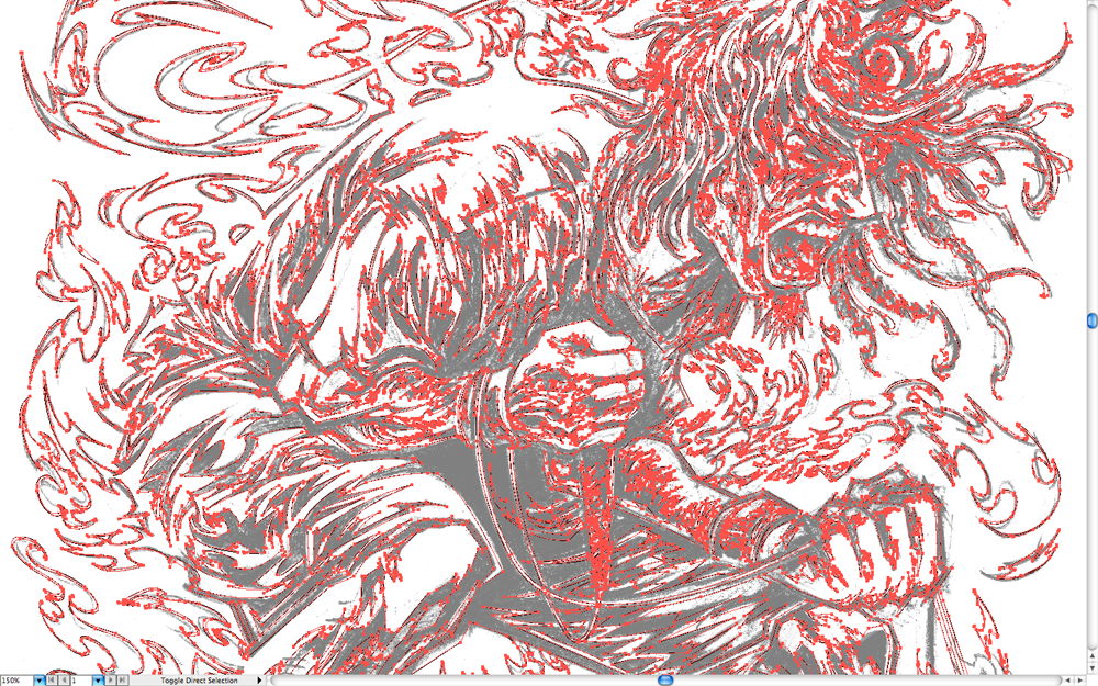
Redrawing the semi-composite in Illustrator is always a love-hate thing. Mostly love. But sometimes the natural slowdown that occurs and having to see the same thing from so many different angles and magnifications gets tiring. However, it's very necessary since I've yet to come across another method of achieving razor-sharp linework that renders this easily or flexibly. I love traditional pen and ink, but to me, the permanence factor is a bitch to contend with, so I find that a tight graphite sketch redrawn in vector pen just works.
Lamb Of God with special guests In Flames, Cannibal Corpse, & Sylosis @ The LC - 12.02.2012.
I achieved the final image by solidifying the whitespace in the lines established in illustrator with a single positive shape. The type was tweaked slightly, then added in as another white shape. I knew I'd be using the rest of my red paper, so I bumped the white shapes forward a bit by painting with a halftone Photoshop brush and applying a few other cracked and splattery textures. By staying on my toes and keeping efficiency at the forefront, I was able to create and fully separate a design I'm actually happy with in a mere 3 days. New record!
Printing
Printing this job went relatively smoothly and quickly. Aligning the layers came easier this time around since by this point, I'm really starting to get a good feel for Centre3's studio equipment. Because of this, I made an effort to document some of this process using a video camera.
Surveillance-style.
Vellum layer #1: black.
Test prints on clear mylar laying on top of each other. I'd almost forgotten what truly transparent layers looked like. I've been working with mostly opaque vellum for a while now...
The first layer, properly positioned.
An altered photo of the flooded first layer screen.
French Glo Tone Red Light paper with the first textural layer of black ink applied.
Stack of prints in the paper cutter bay.
"Lamb of God 2012." A total of 95 of these exist.
A recording of me. Printing over the course of two 1.5-hour-long sessions. To the tune of Star Slinger's Say Please. I don't know if you can tell...but I fucking love silkscreening.
*Edit: Aaaand this is why I love social media. Randy Instagram'd the poster! Pretty fucking killer!
Thanks for reading! This print is available for purchase through The Shop.


