The Dillinger Escape Plan are one of my favourite bands. They enclose blended elements of hardcore, math rock, and metal within jazz-like song structures that are recorded with obsessive precision and played live with an energy so aggressive, they've been labeled "the world's most dangerous band". I first saw them in 2008 which inspired me to do a gig poster for them in 2010. It was enough to wow the band into staying in touch so when I found out that they were headlining Summer Slaughter 2013, I hit up Ben Weinman for permission to do a poster for their Toronto stop to celebrate his birthday. He immediately approved and stressfully beautiful things occurred.
Brainstorming & Concept
Since this was my second time doing something for The Dillinger Escape Plan, I felt I should reference the first poster while showing some growth in concept and technique. Didn't want to regurgitate another Sunshine The Werewolf but I also didn't want to 180 and discard the opportunity to strike a familiar chord. So I started with a word association exercise while free-versing visuals to warm up the brain and beginning research. Vocalist Greg Puciato has said in interviews that he came up with all of the titles for their 2013 record One Of Us Is The Killer while stoned one night and that his words are written to be sung, not read. So while there may be fragments of images found in his lyrics, they're definitely not designed to be a roadmap to literal visuals. I went through some embarrassingly bad first ideas. I'll spare you an overlong explanation of their bullshit.
The first idea I really ran with was mashing up Farewell, Mona Lisa with Prancer, the opening tracks from their most recent two albums. Swiped the composition from The Mona Lisa, and glued a sinister looking reindeer head on it flanked by exploding atom bombs in the background for good measure. I collaged a key image to be traced, editing and placing each object carefully to make them easier to reinterpret as drawn pieces.
But as it progressed, my inner critic started shitting all over my soul. Wasn't making me happy, so I started drawing over the collage to see how my treatment would come out if taken further. While not not okay with it, the rendering didn't excite me, and the more I forced it, the less emphatic I felt. It didn't say enough, it only spoke to me mutedly from too few angles. I also noticed that the atom bombs were destroying Leonardo's classic composition, and while that in and of itself is pretty cool, it kind of defeated involving the Mona Lisa at all, which unraveled my reasons for adopting Prancer, which killed the whole thing. So I scrapped it and went back to the drawing board.
I went to One Of Us Is The Killer and spun it several dozen times. Again and again, Prancer spoke to me the loudest, so I started trying to verbalize how I internalized the song, emphasizing abstract feelings over literal lyrics. I came to the conclusion that the song made me feel somehow like I was falling, as if in a panic-stricken adrenaline rush coming in flowing bursts, anchored by this downward, dissonant feeling of anger. I started to get these unsettling sensations and images of being inside of a plane going down (which is a recurring fear of mine), but I couldn't quite relate the thoughts in my head to the sound from the band in a way which would translate into what I thought could be a saleable image while maintaining my style. Dejected from my indecisiveness and lack of imagination, I took the rest of the day to rewatch Breaking Bad.
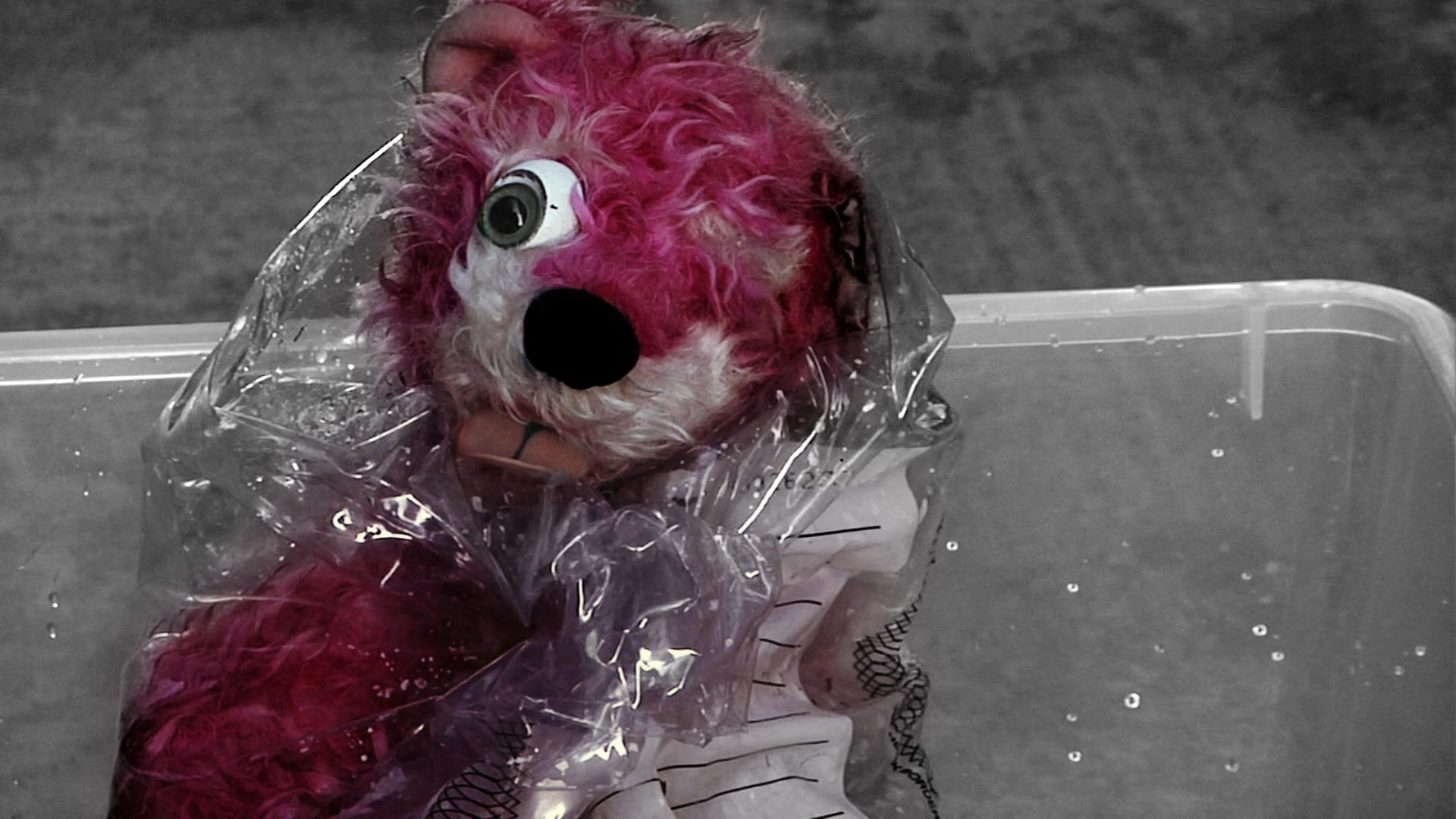
Which is when it hit me. That fucking pink teddy bear with its 43% burnt face.
If you're into Breaking Bad (I salute you), you'll know that there's this recurring pink teddy bear in season 2 and that it comes from…an airplane. I figured this was an alright direction because gig posters are supposed to solidify a moment in time and the final episodes of my favourite show air three days after this concert. It felt right, a kind of topical gig-pop-culture poster. The bear motif was fleshed it out into a fully-realized character, embodying my feelings about that hard-hitting song Prancer. Greg said he picked the most brutal song to be given the most joking title because he's against the presence of homophobia in metal and "Prancer," is one of the gayest words in the language, so it would be ironic and funny that surly, tough-guy-type metal heads would have to go around saying "Have you heard that new Dillinger Escape Plan song?! No?! It's called…Prancer!" Suddenly putting a flaming pink bear in there kind of made all of the sense.
Rough Sketch & Semi-Composite
Having locked down a concept I actually enjoyed, I started up a new method of rough sketching using dry erase boards and markers. I enjoy this technique because I'm not really ever that attached to my early thumbnails and doodles. Like many artists I know, I have this anxiety about permanently marking up my otherwise saccharine moleskin with crap I'd just as soon keep hidden. Not saying I'm giving up on sketch-booking (what kind of artist does that?) but dry erase markers are a fun diversion because mistakes never happen permanently, and you can actually build up some interesting textures by erasing spots intermittedly, leaving little holidays in the marks, making little valleys of texture, and mush-mashing the inks together. I don't know. It's fun!
To echo my last poster I gave the beast a gun, except I used the M60 Walt was seen buying from a black market arms dealer at the outset of this final season. I knew this was solid when in a total Yoda-moment, I realized that there's a totally fitting symbolic parallel between the lineage of the Dillinger spirit and the energy of Breaking Bad.
Dry erase markers are really flexible. Don't like something you just did? Wait two seconds and kill it with your thumb, finger, hand, or whatever is in reach. After a while, I was able to build up this fun-looking and fun-to-make temporary drawing. No muss, little fuss, less attachment. Take a picture and move on.
The picture was taken into Photoshop and manipulated and collaged-upon beyond recognition. The first step was to establish an impression of a framework, the next was to bring in real pieces of things and to tighten up the whole composition a little. I knew I'd be re-drawing everything again so I didn't bother to polish much. It was also really important to me to keep the layer palette organized, since it made each piece easy to alter, resize, or mess with. Flexibility is always important, but especially so at the beginning.
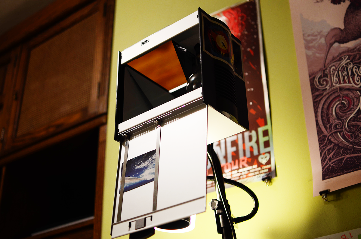
Once I figured out and cleaned up the collage, I printed it out. The image seen here has been cut out to about 5" long, so it would fit in my vertical projector, which I bought after watching Drew Struzan's Making The Hellboy Poster Art DVD. I learned a lot from that thing and would highly recommend anyone who's into making art to check it out.
Lots of reference photos surrounding the work area. Always good to have lots of reference from various sources and perspectives. That, combined with an applied understanding of composition and anatomy goes a long way towards stitching disparate pieces of a puzzle into a cohesive, stylish whole.
The old poster owes a lot to German Expressionism, which emphasized the expression of inward, emotional reality by way of controlled stylistic elements such as extreme distortion, unrealistic colours, thick outlines, and a focus on eccentricities of face and figure. I wanted to keep parts of that treatment, but also include some ideas of flow and gesture that come from my Asian influences. Plus more detail.
This is an Artograph Designmaster Projector.
Using it, I'm able to magnify or shrink pretty much anything I can get flat in a 5"x5" dimension.
So fucking useful. Whatever it takes to get the job done. Frankenstein it!
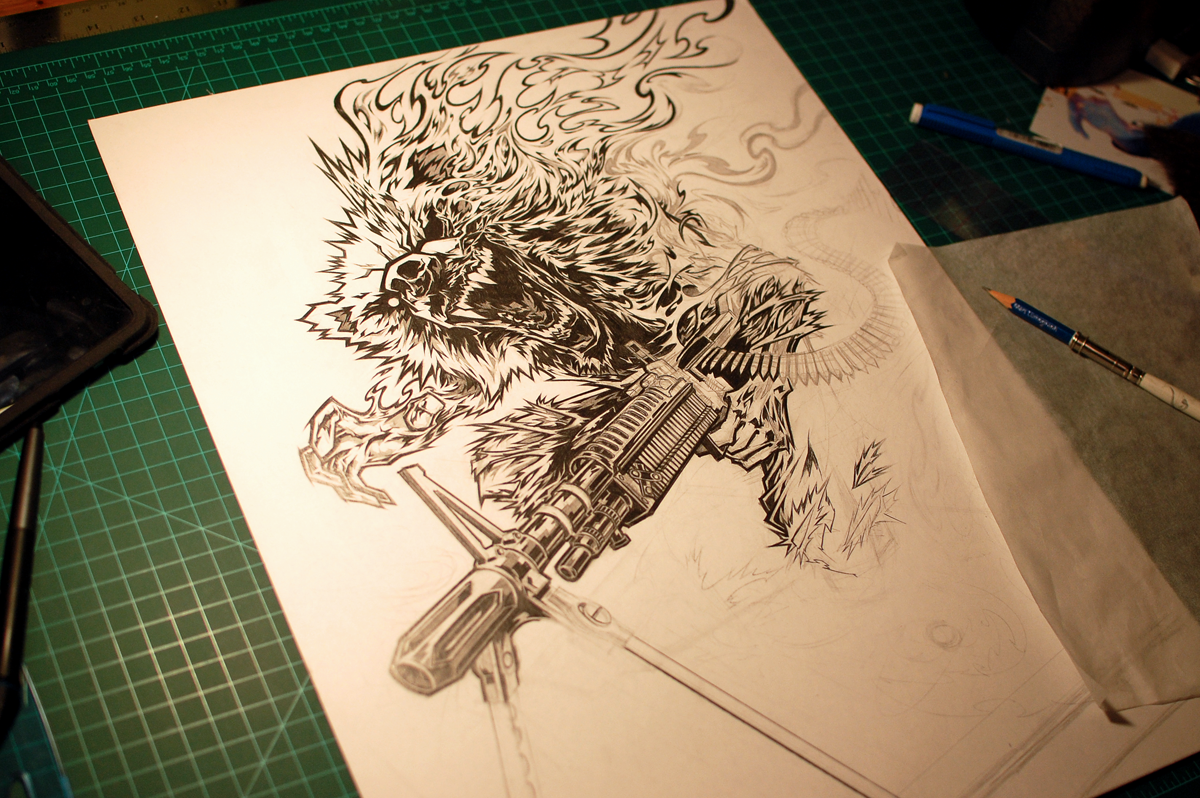
It took a few days to render the drawing, as I was interpreting a lot from the collage, rendering everything really, really tightly and cleanly in order to make digitizing it less painful. Pretty sure I only used 2B and 3H pencils.
The final graphite drawing. Took a lot of special care to make sure the gun made a kind of sense, even though I think it's kind of obvious that it was drawn freehand if you look at my vector stuff. Still, I enjoy the fluidity of the drawing, and since I knew I wasn't going to be re-tracing it in Illustrator, I took time to ensure that all the curves and sharp ends were just right. This drawing is also a little more compositionally-conscious than a lot of my other stuff. There are a bunch of shape contrasts and echoes, carefully-placed pockets of active and inactive space, as well as implementations of the Golden Ratio going around.
Finalization
After the key drawing was done, I scanned it into Photoshop and started messing with colours. I used a plug-in which automatically creates separate colour fills for line art, for use in comic book colouring where people have to deal with translating several pages' worth of pencils. As a result, I was able to colour and separate the image for screen-printing in only 1 day.
Setting up fill-masks with coupled adjustment layers and just started going at it.
I was way more concerned with putting interesting combinations of colours beside, atop, and around themselves than with actually describing linear form. If it felt fun and it made a kind of sense, I coloured it so. Didn't think through a lot of it, just tried to make a ruckus and then sort out the resulting chaos.
Around now, I started to consolidate my approach little bit, removing unneeded layers and consolidating patches of colour more consistently.
Starting to get a clearer idea of where I want to take the colours. My only stipulation was that magneta-pink be omnipresent, keeping the idea of the Pink Prancer in mind throughout. I also started adding textures and directional lines to give more visual variety to the piece. Again, it was simple because I had everything efficiently grouped and organized.
The final digital preview. The colours had to change a little later on, since ink behaves less predictably than computerized colours. Though I'm getting better at mixing specific hues, I'm hardly machine-perfect. Then again, that's kind of my whole point.
The only thing I did in Illustrator this time around was the lettering. Not hand-lettered, I settled for Gotham out of time constraints and again for the sake of familiarity. My last poster for The Dillinger Escape Plan had the same layout, so I thought this would be a very blunt way of connecting them.
The final image, complete with corrected colours, and a glow-in-the-dark layer for added [breaking] bad-assery.
Screen-Printing
Printing for this was a lot of fun, even though my studio space kind of got rearranged on me. Here's registering the screen and mixing and testing ink. It's always really tricky getting the proper opacity going, especially when significant parts of the illustration rely on proper overlap.
The pile after the first pink layer. The paper is French Speckletone Cream, a subtly textured eggshell paper with a really classic almost vintage poster feel to it.
A detail of the print after the second blue layer was laid down. Note the accuracy of registration and mixed blue-red.
Body shot of the test print.
Registering the third (yellow layer using acetate. The way it works is you anchor your explosed taped screen to its hinges, (in my vacuum table's case) brace the screen, then tape down piece of acetate and print a dark colour on top of it. Then you can do a colour change and register your poster properly. Works great with registration marks, and if you leave the acetate and are using acrylic ink, you can always use hot water to erase the dark key and re-use the plastic for another layer. Here, the poster is exactly registered.
Detail shot of the underlying colours before the black comes on.
Registering the intermediate glow-in-the-dark layer, sealed between the colours and the final key layer. Here, the poster isn't registered. See the methodology there?
Details
The final edition number ended up being 200. Ouch.
Fire detail. I enjoy the contrast between the sharp little bursts riding the undulating waves of Dillinger hellfire.
43% of this dude's face is burnt. It's labeled.
More contrast between textures and areas of active space.
Suggestive directional lines and shape contrasts. Some fun tricky blends of chroma vibration and simultaneous contrast, too.
Detail shot of the text area.
Signing and numbering the edition in metallic ink.
Final shot of the finished poster, in human hands for relatability.
Also, proof of approval/adrenaline-inducing validation!
The poster is available through The Shop. Thanks so much for looking and reading!


