The Black Keys are a two-man band with roots in raw, guitar-driven blues and classic rock n' roll from Akron, Ohio. They've been kicking around for close to 12 years with solid full length releases every year or two, although they broke into the mainstream in 2011 with the album Brothers. Even before I was into them I heard them all the time, having spent five formative years in Columbus attending (and then working near) CCAD, where drummer Patrick Carney's brother Michael was also educated. I really only know this because some students and I got to eat lunch with him following his Grammy win for Brothers' packaging (the CD changes colour using a heat-sensitive ink when played), during which we badgered him with really annoying questions. I remember the meeting being comprised predominantly of advertising and graphic design students, with me being the only singular illustrator. I never thought that a couple of years (and a few more Grammy wins) later, they'd be the ones coming to me for my ability to both draw and print a production-sized, professional-level run. In 2011 I still wasn't yet taking posters that seriously as a career and the best I'd printed was an edition of 75 of what I'd now call more shallowly-thought-out, terribly off-register 3-opaque-color screenprints. So for me, it's not only something of an honour to join the ranks of creators who worked with a band which is known to whole-heartedly promote the poster scene and fairly compensate its artists. This particular job also represents a little full circle moment to me, a tough-to-crack personal goal with a chewy sentimental center reached. But enough with all that crap, let's talk about how the poster was made.
Concept & Rough Ideation
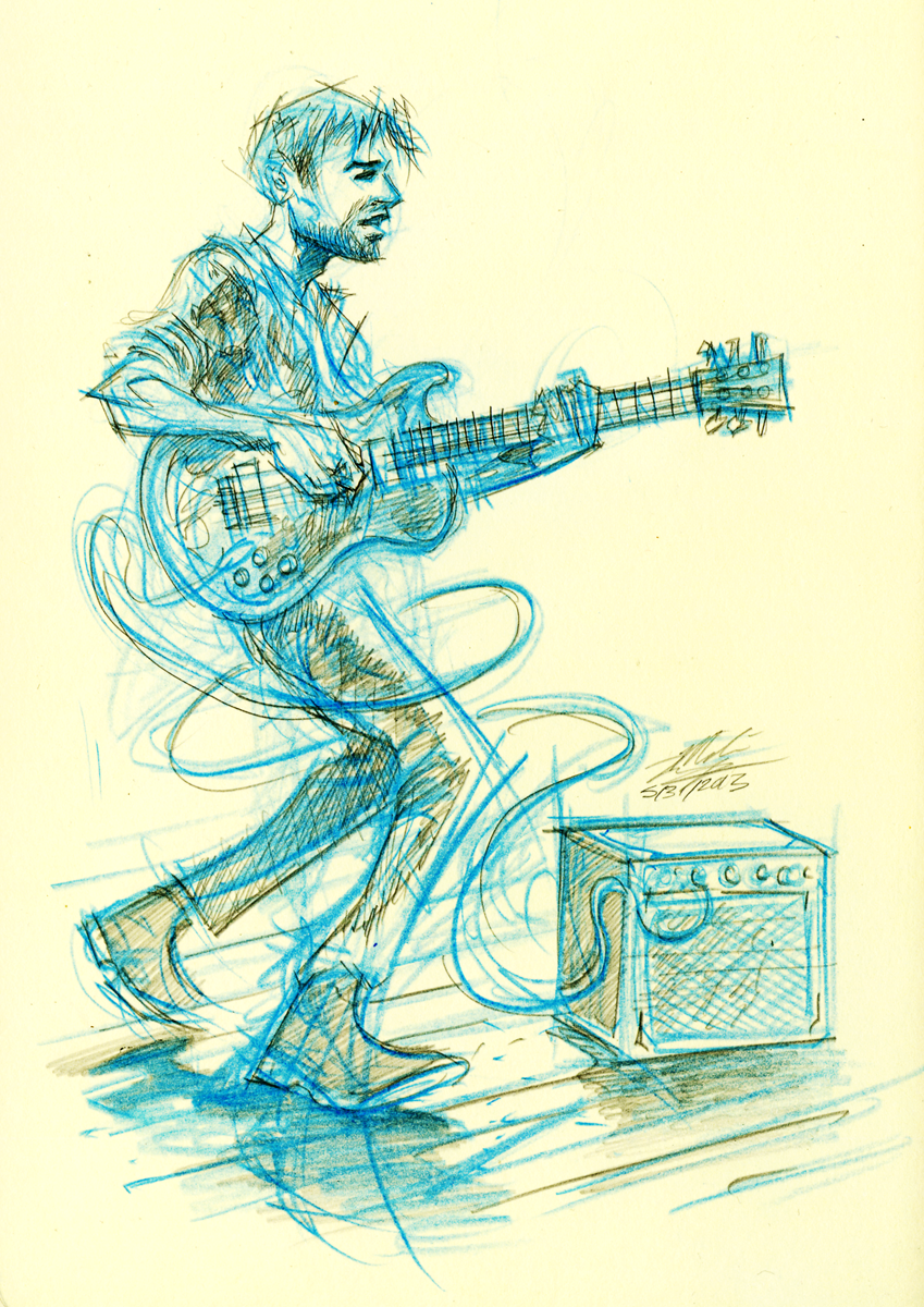
Warmed up my brain by just free-versing an image. This turned into a sketch of Dan Auerbach, which I liked. However, the band have been working with poster artists for a while now, so they send a creative brief with general rules and guidelines for concept and imagery and one of the big nays is just portraits of the band. Boring, overdone, for the most part. It's not simple coming up with an original concept for a band that has so many posters already.

So a few crappier doodles later, I came upon a better idea. My immediate favourite off of El Camino has always been "Little Black Submarines," so I felt like doing something related to that. I was kind of dismayed when in my research, I found that famed rock posterist Emek had already done a super-LBS-centric poster for The Black Keys.
But upon closer inspection, I found that Emek's version left enough out for me to interpret genuinely on my own. I pictured an underwater scene in the ocean deep with little creatures swimming around a figure. The rest kind of just grew out of that first very vague feel, eventually blossoming into a deep sea diver rocking out. Upon further research, i also noted that Dan Auerbach uses a specific guitar for the intro to only this song when playing live, a song the studio version of which the band has said comes "[the closest to our live sound]", so the guitar is basically s unique thing for this specific song. The idea felt really fitting, so to reflect that, I chose to include the Dobro guitar which is an American classic with a rich history and a unique aesthetic. The instrument prompted me provide what I felt was a matching piece of headgear for the figure, which kind of cemented the feel of the piece.
After getting the idea approved, I set about collaging elements harvested from Compfight and Google Images. This semi-composite looks kind of funny, but I knew I'd be rendering it in a consistent fashion, so I wasn't worried. Apparently the band enjoys surrealism and humour as well, which is why I included a little submarine juxtaposed against the huge diver (Dan is actually the one who's way shorter than Patrick in real life). I threw in the submarine and had Pat appear in it, along with his live set of Ludwig drums, and Justin Beiber's skull being taken apart by deep sea creatures. Not sure if that reads, but that pompadour is lifted from a Beiber photo. Because their "feud," makes me laugh and this posters is for Canadian festival dates.
Another thing I felt was missing from Emek's rendition was a glow-in-the-dark effect. He's known for pumping out various iterations of designs with multiple finishes and effects, so I kind of couldn't believe it when I found his already green and vibrating poster didn't glow despite the lyric: "Should've seen it glow / but everybody knows / that a broken heart is blind." So I snagged the opportunity to include the band's portraits as kind of hidden gems in the composition. This way, I could discretely include them in a way that helped deepen the concept of the poster. I originally meant to draw a pointillist-inspired night-version of all the bioluminescent cells in the animals' bodies as they occur in deep, deep water, but I think going with linear fills and silhouettes also did the job handsomely.
Semi-Composite
I decided then to do the piece traditionally to reference their aesthetic: "embracing the beauty found in imperfections." I was originally going to try combining digital rendering with traditional elements, but just decided to go 100% traditional to keep it more raw and streamlined. To get this done, I had to translate the image onto a physical piece of illustration board, so I cut the image up into letter-sized portions, and printed them onto precisely-hand-trimmed pieces of sheet protectors. Since I use an inkjet printer, the ink simply sits on the plastic, allowing one to slap it onto anything flat. The first layer went down kind of messily, but the following ones were fine, and eventually a cohesive transfer was completed.
After the digital semi-composite was made physical and to-size, I sealed the ink with matte fixative spray and painted several washes of thinned-down gesso over the whole thing.
This way, I could control the opacity of the under-image to be traced and the surface would be primed for drawing and inking.
I used waterproof sandpaper to smooth everything down mostly so my pen nibs wouldn't snag and break. I hadn't used nibs as extensively in a while but I was raised on them in elementary and high school, so I know how they feel, and the sort of surface I like to work on.
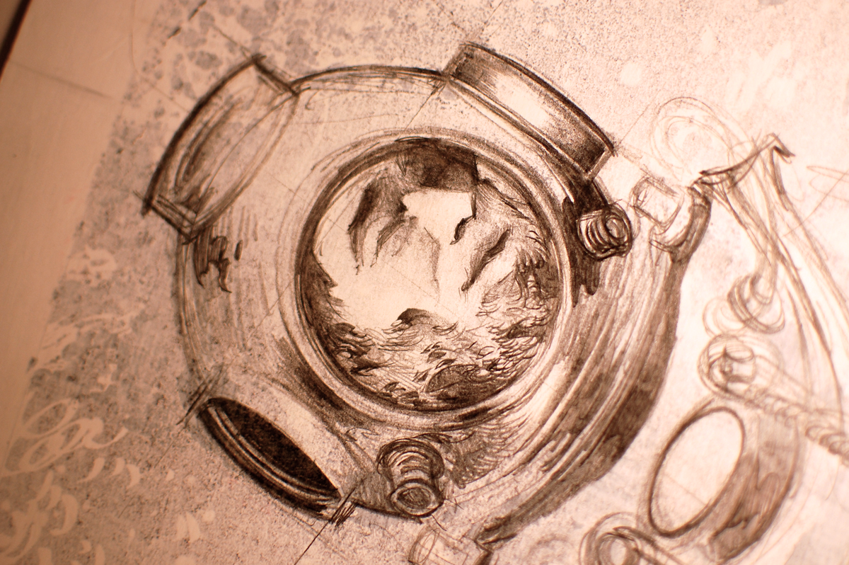
Started re-drawing the image in graphite. I thought if I could draw smoothy enough, I could get some interesting effects in Photoshop from the pencil grain and the subtletyty of the marks, things I've always admired about traditional dry media drawing that I don't see a ton of in screen-printing. Translating that particular smoothness becomes very difficult when dealing with flat fills and approximate half-tones.
Eventually I got over doing the whole thing in graphite and mixed it up, sometimes drawing the section in pencil before inking, sometimes jumping right into inking. It all depended on what I felt the spot needed at the time. I purposely tried to turn off intuitions that screamed "No, that doesn't look quite right," or "You really gonna do that? What if you fuck it up?" It was kind of stressful, but in a good way. Kind of kept me from zoning out as I worked on this for almost three 12-hour days straight.
I mixed up inking tools as well. Sometimes it felt nice to do brushes, others I went back to nibs. Sometimes I used the nib to fill, sometimes a brush felt better to do lifework with. As always, specifics of technique, though fun to rethink or vary at the time, mean little to the end user. So I tried to just switch stuff up a lot and to have fun with constructing the drawing in my own way. I also used white acrylic paint to do white fills and get organic white shapes atop the black areas.
The lettering took a bit of time to get into, as I originally tried to do something inspired by 20,000 Leagues Under The Sea before realizing that my brain (unbeknownst the conscious me) was just regurgitating Ken Taylor. So again, I just sort of winged it and went for a more free-form font that was traditionally-drawn as part of the original piece. I didn't feel like doing any digital compositing for the type, as I knew it would probably look strange to do anything different since the rest of the image is so very organic.
I've been wanting to draw nautiluses since forever. Fucking finally drew me some fucking nautiluses. Hell yeah.
The final key drawing. It is exactly 18"x24", the same size as the finished poster. I've been told to size up when drawing raw images so the final product (with the graphics scaled down) looks sharper and tighter by design. I purposely didn't do that so each and every mark I made would be seen as-is. For my old ASAP Rocky poster, I drew small traditionally and scaled up, which was a mistake because I think the edge quality suffered for it since I didn't take it into Illustrator. This was a workable compromise.
Finalization
After the drawing was scanned into the computer, I separated the line art and started drawing in fills and accents using layer masks. What works for me is a full fill, coupled by a mask which I then draw into. Since the mask is composed of black-and-white, I just use a brush and switch back and forth between positive and negative by pressing "x," (the default hotkey in Photoshop which switches background and foreground colours). This way, the file mimics the structure of a silkscreen transparency, and I can apply colours easily using adjustment layers.
For the first time, I applied that technique to 50% gray values instead of full black. In this way, I could do a lot more detailed stuff and get some far more delicate colour mileage. The colouring process took a full day (usually it only takes a few hours, but I wanted to be extremely thorough for this particular gig).
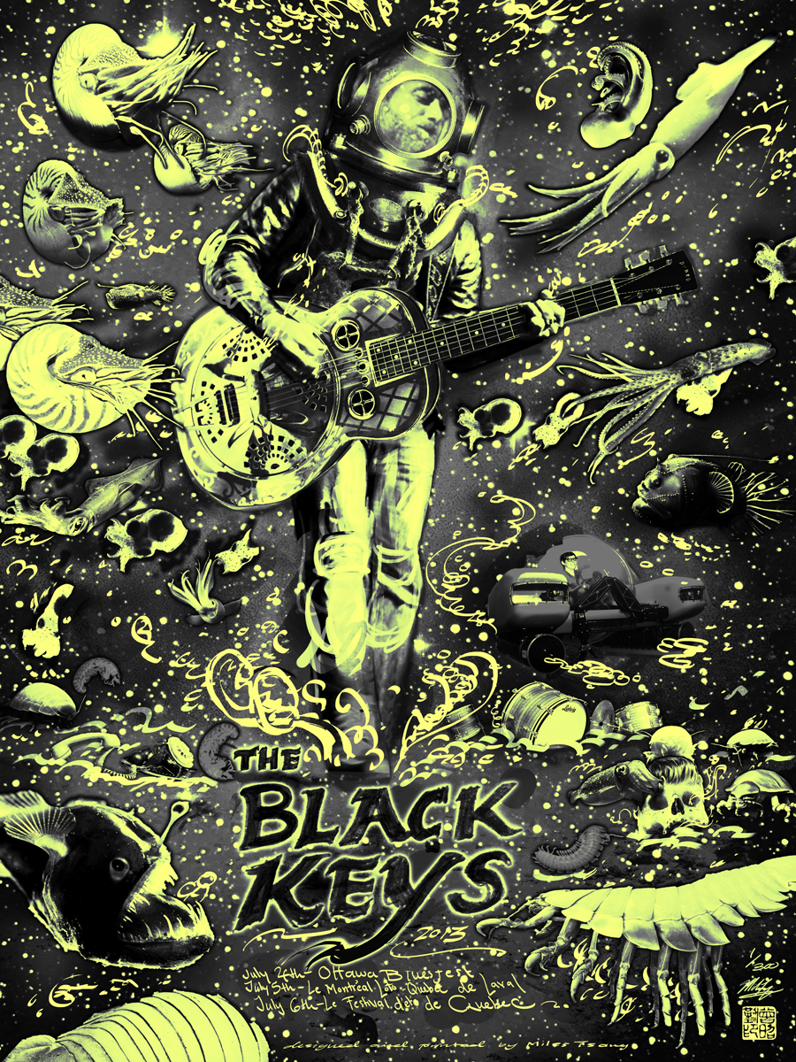
The final digital preview. Snazzy.
Glow in the dark version. I originally griped over the fact that Dan's face isn't as starkly visible in either version as I wanted, but I came to appreciate that in the daylight version, his ghost-presence kind of draws you in, alerting you to the fact that there's something hidden Patrick only shows up in the glow version since he's on white. I find it funny, though. His presence feels so fitting but almost unexpected there. I don't know. Not everything needs a reason.
Screen-Printing
The printing process for this job was much longer and more arduous than usual because the edition was designated to be 300. That's 3X anything I'd attempted up to that point. I ended up spending about four 13-hour days in the studio getting this job done right.
The first layer was easy (as it almost always is) but something was off. Since there were so many prints to do, I made a point of trying extra-hard to keep everything on-register. I re-aligned the bristol braces catching the corners of the paper more than once, but over the course of the run, I still noticed microscopic deviations and shifts. Couldn't figure it out for a while but things started to make sense as I moved onto the next layer.
As I registered the next layer (transparent cyan-blue), I still noticed little shifts every now and again. Since the edition was so big and it was for a band as big as The Black Keys, I was understandably kind of shaken. At this point, the image's integrity was still there since the red and blue looked cool even when off-register (since i separate by knockout, which allows for artistic deviation when done knowingly) but I could tell that I'd either need to figure out why I wasn't in 100% control or the next layer (which relied heavily on precise alignment) would ruin the underlayers, and I would be left with a huge stack of crappily-printed, super fuzzy posters. My worst nightmare. Seriously. Had to call my sister to get her to talk me down, I was so worried about lost investment and face.
So I took a beat and studied the prints and press. I finally figured out that the press arm which clamps the screen actually has some slightly loose bolts in the back which allow the screen to slide ever so slightly forward and to the right if I pull up the screen too hard when the paper sticks, and slightly backwards and to the left if I push the screen down to do a pull too vigorously. So basically for the last several months, I've been printing with microscopically wonky press. The difference isn't huge, but it becomes very apparent when staring at the same image for hours on end. I doubt I'd have figured this out had The Black Keys not ordered so many prints.
To finally fix this, I braced the screen with a right angle rules and a thick piece of square-edged wood. It worked. From thereon out, my pulls doubled in accuracy, almost down to the hair at times. It's like I'd been running with a piece of glass in my heel for months and had just now found and removed it...or like a recording artist that finally graduated from their parents' basement to the a rented studio...pretty fucking great.
However, as noted before, lots of damage had sort of already been done. The red was inconsequential since it was more of an accent than a full fill, but the light-cyan and dark blue-black key layers needed to interlock more precisely to ensure the image came out looking at all like the preview.So (and here's where it gets gruelling), I got some acetate, taped it to the table, and proceeded to print each and every layer after that by manually registering each print underneath before lifting it up, putting the scree down, and doing a precise pull. I began this halfway through the first blue and continued until the job was done, meaning each pull took about 4-6X longer than normal. About 750 times. My body aches just thinking about it.
For the glow layer, I had to secure the screen first, then I printed a transparent cyan pull onto the acetate registration sheet. Since the other three layers had already been printed, it was a simple matter of making sure there was no whitespace showing between the prints and the acetate. So that last layer was actually a little easier. I played it loose since that layer would be very low-visibility in light, and the others would be invisible in dark. Whatever works.
Here you can see a detail of Patrick in his little deep sea submersible. It's not quite a Little Black Submarine but it did in a pinch, and I really enjoy the "hidden gem," aspect.
After they were finally printed, the posters were carefully trimmed to equal sizes. There were a lot of them, so that actually took a few hours itself.
The finished pile, hours before they had to be shipped out to Ottawa for Bluesfest 2013. Signing and numbering these was a bitch. I hate signing and numbering. People who enjoy it are weird. If you are a printmaker and you enjoy it, you are weird. Weirdo.
Packaging and shipping these was another little hassle. I just got the prints done on July 2nd, meaning the prints had to be picked up by UPS before their last run of house calls at 7PM (I finished trimming these at 3!) The band generously allowed me to keep the first 50 to sell on my own, so I divided the rest equally into three mini-packages for easy distribution over the three listed festival dates with everything double-bagged and triple-taped. Security and clarity of contents are always paramount when shipping out posters, and clients dig it when things are simple. I feel that especially in the tour business, the less hassle anything is, the better.
Details
I really enjoy how all the deep sea creatures came out. Very reminiscent of when I was little and I'd spend hours trudging through woods and swamps, poring over nature books and illustrated almanacs of worldly animals, memorizing details and facts I'd always remember but never use because I had Aspergers and no friends. At least none who cared for turtle-hunting, or facts such as how the male anglerfish fuses with the female during copulation.
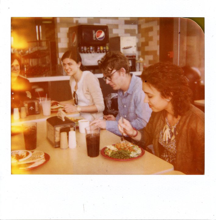
The colours came out a little more cold-violet than originally quoted, but I enjoy them more. It has to do with my lingering love for the vibe of old peel-apart Polaroids (particularly the now basically-extinct ID-UV film), which I was playing with around the same time I was first getting into screen printing. In fact, you can view a pretty interesting archive of my life as dorkily documented through Polaroids here. These milky, glistening cyan midtones and pulsing alizarin shadows kind of remind me of simpler times, so I guess a part of me just enjoys imposing that feel. A tiny injection of personal nostalgia through colour.
The poster is available through The Store. Thanks so much for looking and reading!
EDIT: This poster is now sold out (5 hours after putting it online). Thanks to everyone who bought one, shared it, or paid it any heed whatsoever!


