Goblin are an Italian progressive rock band with a strong cult following that are known for their contributions to Dario Argento's horror movie soundtracks. Since this was to be their first tour of North America (despite having formed in the early 70's), my promoter commissioned me to do a limited run for their Toronto performance. As a lover of the weird and cult-y, I happily
Brainstorming
I honestly had not listened to much of them before getting this assignment but it was immediately obvious that I needed to watch lots of Dario Argento movies. Which I did. They're insane. Tons of crazy stylized violence and (particularly in Suspiria) eyegasmingly vivid colours. I didn't really know where to start but I knew I didn't want to turn this gig poster into a movie poster since LandLand had already done a sweet Suspiria poster a few months prior and I was sure some one else would pick that idea anyway (Shawn Knight killed it, actually).
So I kind of just went simple and honed in on the band's logo. Turns out that it's based on an etching by French draftsman Louis-Leopold Boilly depicting "Tartini's Dream," which tells the story of how fame Italian composer Guiseppe Tartini allegedly created his most famous work "The Devil's Trill Sonata." Legend has it that Satan appeared in a dream and played it for him. That's pretty cool. So I ran with doing my own version of that.
Semi-Composite
I doodled several sketches using dry erase markers. I don't really care if it looks rough, they're really fun for me to use. And as sketches, they're functional enough for me to get an idea of the flow of the piece since so much of my marks is comprised of gesture. I eventually decided on going with the one on the right because it felt the most iconic.
Having decided on a pose, I asked my buddy Christian to pose for references. He plays a mean violin, and has the same body type as me and Satan, so his contribution was invaluable. The final drawing doesn't look 100% like any of these but all were used as inspiration and reference to get a fuller idea of the torso and arm placement.
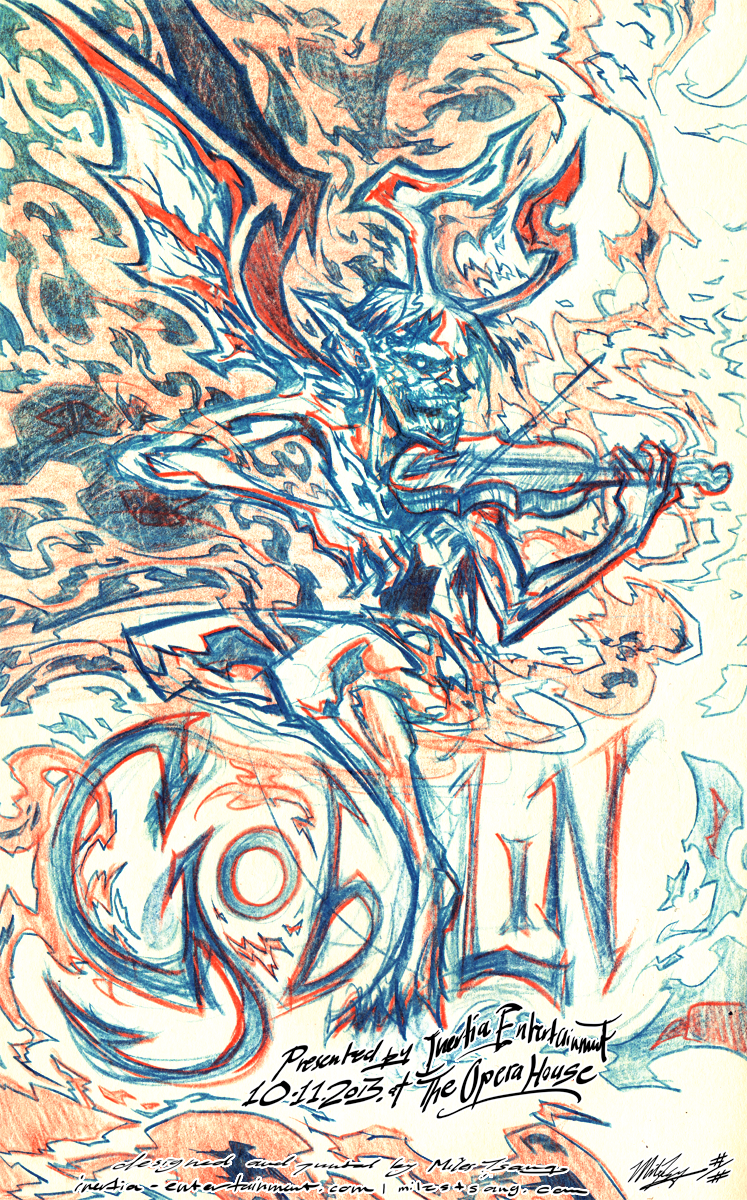
I began drawing a more refined sketch in my moleskin, which eventually came out looking like this. I used red and blue pencils because I knew I'd be using red and blue ink. Worked to tighten up the structure, sharpen all the points, and provide some interesting background shapes and movements.
I blew the sketch up and transferred it to grey-coated illustration board using my vertical projector as described in my Walking Dead post and proceeded to refine and tighten the drawing using graphite and grey acrylic ink.
Once the key was mostly drawn, I began doing fills and highlights in the same manner.
I continued using a combination of nibs and brushes to fill in the blanks, eventually going over the key lines again in black ink for solidity.
Final semi-composite drawing in acrylic ink on 15"x20" two-ply illustration board.
Finalization
Once the semi-composite drawing was finalized, I scanned it into Photoshop (in four pieces on my little flatbed scanner), stitched it together, and then separated the lights, mid tones, and core blacks. Using adjustment layers, I was able isolate portions of the illustration and to colour/detail each piece separately. Took care to include a fair amount of overlap, as I've found that the more one does that, the more unified the piece feels. In moderation, of course.
I spent a few hours adding colour. I tried to imbue the piece with the vibe of a psychedelic, twisted fairy tale; bright and chromatic, but iridescent and sinister. The original inspiration for this image was Satan appearing and playing a beautiful violin tune in a dream and I wanted to keep that feel. When separating into halftones, I referred to instructions from this video, which helped me get a better grip on the idea of separation as well as achieve a very smooth finish for the print.
Screen-Printing
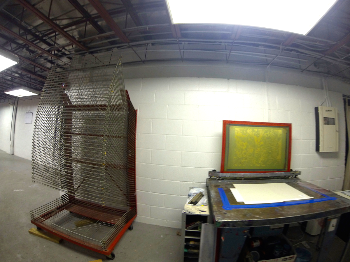
One 100-piece rack and a cast-iron vacuum table with square-ruler and bristol braces. I was recently told by another printer that I should be putting the braces closer to myself as I print, as it's easier to feel out the registration than if the braces were closer to the back. He was very right, closer is better.
To register, I've gotten heavy ingot he habit of printing a colour layer on mylar, then taping that mylar down and figuring out registration that way. I always include outer crop lines, so I generally know where the paper has to fall each time, in addition to registration marks for precision.
The red laid down kind of opaquely, but you can still see the texture of the Parchtone due to the transparency if you look at it in-person and up close.
After the cyan-blue layer.
I was kind of tempted to not even do the third layer and to just leave it as is. Registration on almost all of these for the two layers was really close to perfect, and the transparency was mixed beautifully so the textures were coming through and the overlap produced some extremely vibrant and well-modulated tones.
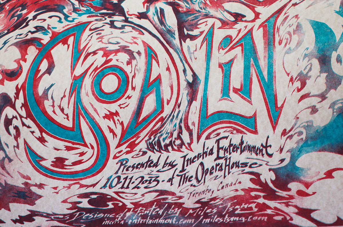
I feel that one of my most glaringly obvious weaknesses as a poster artist is how disproportionately comfortable I am with figures compared to my relative ignorance of typography. I mean I know most of the basics and names for the parts of letterforms, but I know nothing of their history and my font choices can sometimes come out feeling random because of it. For this poster at least, I'm pretty satisfied with the type, as I feel it connects the figure to the background, while being aesthetically pleasing and fitting. Type is really important so since this drawing was smaller than my usual scale, I took time to perfect it. Can you imagine if I'd just used Gotham on this (YIKES)?
After the black key line/shade layer was applied.
Trimming the prints. Note the registration accuracy.
My cutter actually only trims up to 24", meaning I have to cut in small stacks with the braced end curled up for space. However, once that leading edge is properly trimmed, the rest of the cuts are simple.
One of the final stacks of prints.
Afterview of the electric cutter. I love this thing.
[heading size="h3" stunning="yes" align="center"]Details[/heading]
Laying the prints out for signing and numbering. Forgive the weird temperature of the light, my apartment has mostly warm lights which get augmented at night (in spite of Photoshop alterations).
This project proved to me that I can scale down a little for compositions that aren't that structurally complex which behoove a lot of intricate detail. Much of this drawing was just the figure with background shapes so everything came out, even though the original drawing was 15"x20" and the final came out to 17.5"x24". There's not a lot of noticeable artifact-ing or obvious pixelation, which is great. That's always my worst nightmare, when something I take time to make something look traditional and hand-crafted and it ends up looking kind of digital anyway.
Love the shape contrast; little blue-red-veined streaks beside bulbous, amoeba-like clouds with poisonous core shadows encapsulated in a bloody flow.
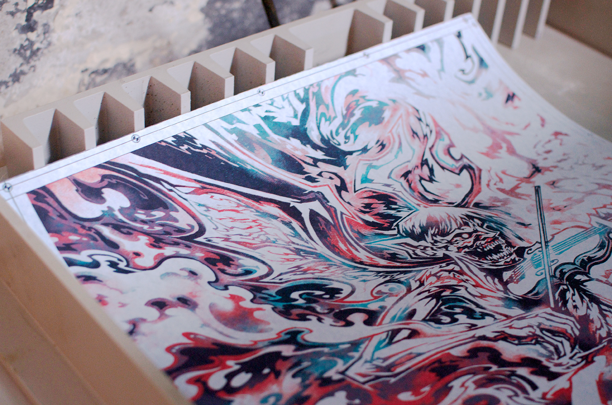
More undulating waves and colours.
Detail of the figure. Satan came out very pretty.
Signed/numbered with love.
Face detail.
Arm and violin detail.
Type close-up. Special thanks to Inertia Entertainment for putting me on this job!
Yours truly holding the print for a "real-life," sense.
Final time-lapse of most of the process. Phew!
Thanks for reading! This poster can be purchased through The Shop.


