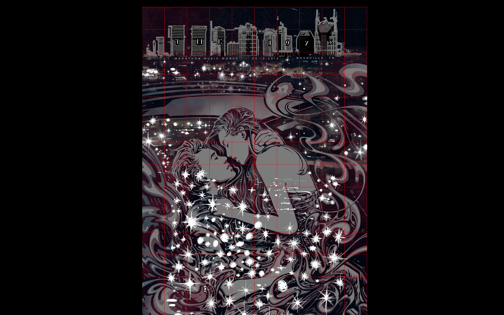
The 1975 are a rock band from Manchester who broke into the mainstream in 2013 with their self-titled debut record. Described by the band as "the sound of the group's collective youth," it is made up of an eclectic mix of alternative rock and pop structures with electronic undertones.
I am not typically asked to do work for bands which sound like this, so conceiving of a proper idea took some time. I began by going to the music and researching the band for inspiration. Some common threads I caught were the band's preference for black-and-white visuals (reminiscent of noir aesthetics), recreational drug use (lyrical), and the inclusion of cars across several songs and releases (a symbol of youthful freedom if there ever was one). And sex. I can get behind all of that.
Getting some bad drawing out on a lyrics sheet. Playing around with ideas for vignettes to draw, trying to keep type in mind. Can see ideas of kissing, smoke, hearts, and weed getting into my head. I feel like I was drunk for some of this.
Jotted down associated words while watching and reading a few interviews. My first inclination was to go simple and do some more graphic stuff involving cars or maybe something in the vein of Frank Miller's Sin City. I moved on from that quickly because both solutions felt lazy. Took the sketches a little further, going a little looser. You can see the idea and thumbnail that ended up getting refined here.
More doodling. Loosened up and focused on the idea of smoke as a graphic element gridding up and guiding the composition. More permutations about ideas with the car. I remember deciding around this time that I wanted to do a couple kissing (or about to) because I've never done that before. And the more you listen to it, the more the music kind of pines for it. I think.
Illustration
A reference collage was constructed on top of one of the sketches out of various photos scoured from the internet. Really rough, but I knew I'd be able to interpret what I needed out of it.
The collage is then projected onto pre-coated/shrunk illustration board.
The collage acts the framework upon which the following illustration is built. There is no criteria for how finished it needs to look and there's no formula for how tightly it needs to be followed.
Some references and sketches up within easy view so little strands of thought aren't forgotten. You can also see the projector above.
Halfway finished graphite drawing. Made some changes here like moving the spliff so the wisps of smoke read more like carnal energy and less like farts. Editing is important.
Starting to ink. Big chisel tips for large shapes and man-made objects first, it looks like.
Diving right in.
The rest is a blur of black, grey, and white ink.
Inks took about three days to finalize.
Drawing extra assets. These spotlights serve as a little bridge between the primary analog drawing and the digital secondary title block, taking on characteristics of and intersecting with both.
I briefly considered giving the couple some tattoos. However, I decided against it because the composition shoves them too far front and centre. It would have been impossible to get away from the unwanted symbolism of whatever ended up being chosen, so instead of cluttering up the arms with more busy business, I let them breathe. Maybe if I end up doing an art print of these two I'll give them tattoos but restraint felt better here.
Values digitally separated and colour masks roughed in. Briefly considered being lazy and leaving the sky open as a starry nighttime texture, but decided against it because laziness is bullshit. It can always be better.
BOOM. Nashville! (Where the concert is taking place)
Carefully laying typography into an altered graphic skyline template.
Building the buildings up, randomly-lit window by randomly-lit window. Peep that almost-heart tat.
PLOP. Dropping in those analog assets.
Blending the two together. The buildings were very thrown together. I tried to think of them as graphic segments made up of artificial rectangles to flatten the skyline and make it fit snugly into the composition. My thought process was more about pattern and rhythm than any realistic depiction of where windows should logically lie or illuminate.
Insert into the original lazy-sky version, separate further and colour!
Ensuring points of interest are mindfully kept visible with the grid. Also hoped to establish a playful rhythm with the colours of the city.
Finalized "Noir," variant using two screens.
"Chocolate," colorway using two screens.
"Codeine," colorway using three screens.
"The 1975 / Regular," colorway using three screens.
Plus a glow layer. Because why not.
Printing
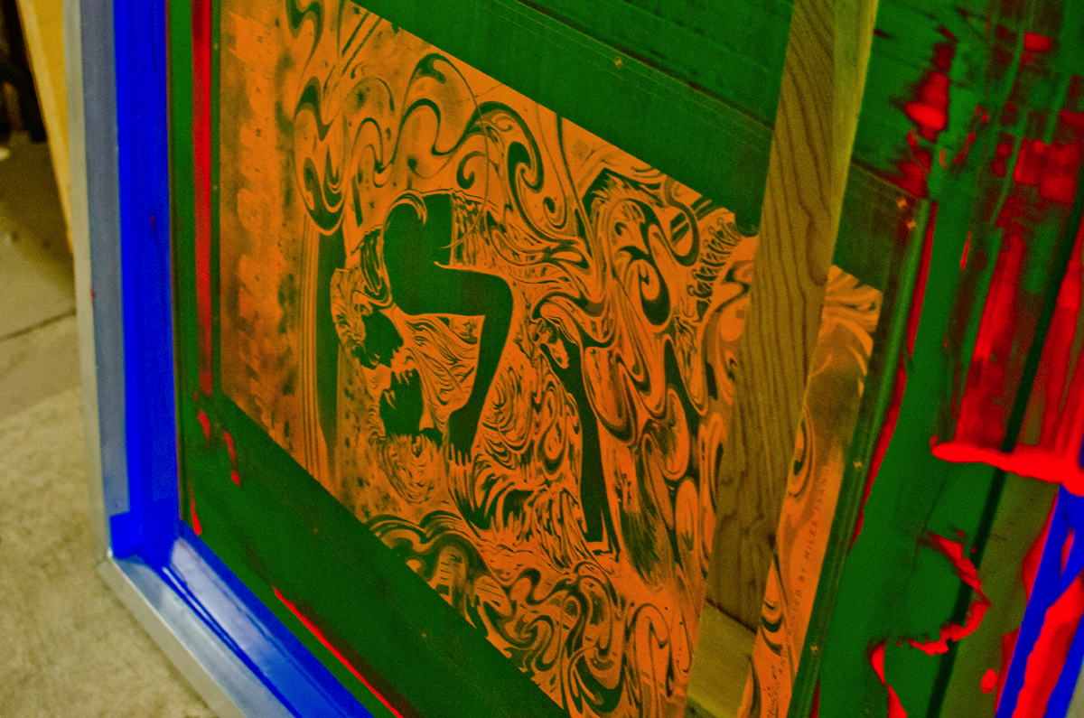
Acetate transparency about to be vacuum-sealed to a coated screen.
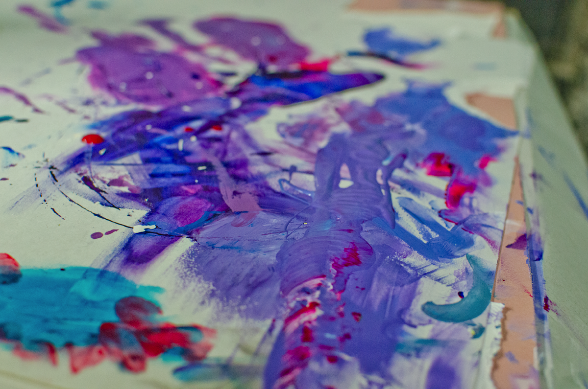
Dave helping me mix inks because I suck at that.
One layer of the Codeine variant down.
"[The purple] needs to be just fucking right!" -Dave
Battle plans.
Casualty.
Fresh recruit.
In-progress shot of the regular colorway. Drop-out in full effect.
Codeine drop-out.
One-colour mid tone Chocolate. The paper texture really shows through on the Noir as well.
Details
The print is available for purchase through The Shop. Thanks for reading!


