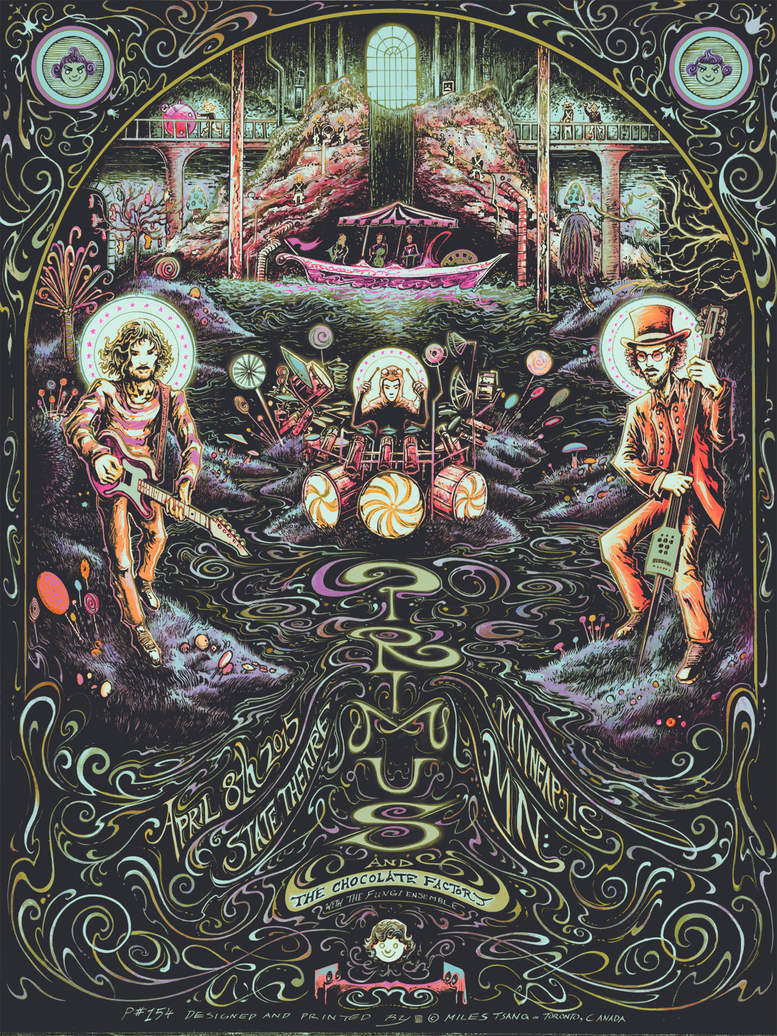
Primus are an alternative rock band fronted by Les Claypool, with Larry LaLonde on guitar and Tim "Herb," Alexander on drums. Having worked with the band last year, I was familiar with both their aesthetic and working process, so when I was asked by Zoltron to open up their Spring 2015 Primus & The Chocolate Factory Poster Series, I immediately said yes and got to work.
Concept
In late 2014, Primus reimagined the 1971 film Willy Wonka & The Chocolate Factory as a fully-fledged record titled Primus And The Chocolate Factory with The Fungi Ensemble. The album follows the general chronology of the film, creating a creepy, surreal, and heavily psychedelic interpretation of an already weird soundtrack/story. Posters for this tour were required to reference both the band and the original film.
The band's recent stage shows also reflect their obsession, with bouquets of candies, enormous mushrooms, and a barrage of costumes all referencing the film. My personal favourite is the bobble-headed Oompa-Loompa backup dancers.
Sketch
Starting with some loose little thumbnails depicting various moments in the movie. Since I was assigned the first date on the leg of the tour, I thought it would make sense to do a scene referencing the beginning of the movie, something that gave off a feeling like you were entering an experience, or the imagination of the band. Some facets from these thumbnails ended up in the final, like the vertical type treatment and the repetition of arches and circular motifs.
Picking apart the thumbnails, and playing with the sketches and references digitally. I ended up piling on bits and pieces of the thumbnails, referencing subordinate objects and figures in the overall narrative.
Extremely loose composite sketch generated from thumbnails to rough out general placement of objects and shapes.
Afterwards, the rough sketch was enlarged, printed out and then traced. Once all the pieces were in place, the image was elaborated upon and rendered in graphite on 9"x12" paper.
Illustration
The detailed sketch was then copied and carefully secured to 11"x14" clayboard, with a piece of Saral transfer paper sandwiched between both.
Ballpoint pen was used to get a good transfer. I used red because it was easy to see what I'd already gone over. Past experience has taught me that black or grey would've been trickier to see and therefore easier to overwork. Nobody got time for that.
The key lines were transferred to the board and then sealed with matte fixative.
Transfer sheet beside semi-composite board. I tried to retain fluidity while refining the poses and improvising new details.
Diving right into sporadic inking.
Tim "Herb," Alexander in "Mike Teevee," costume.
Improvised typography. I could've done this digitally, but I wanted to keep all of the pieces on one board for the sake of efficiency. I also hate (but really need to get over) having only one piece instead of multiple separates combined. World-building would be easier..
Reference material, process work, and sketches.
Finished semi-composite drawing with midtones drawn in.
Once the refined key art was finalized, colours are applied digitally. This is how the image looked after random flats were generated.
Grouping object and piece selections and applying colours strategically using saved Channel selections and overlaid layers.
Separating flattened layers into bitmaps for printing transparencies. Found out my printing setup can't quite take 600lpi (lines per inch), so I went with 300lpi. Maybe I'll try 450lpi next time…
Glow in the dark effect.
"Snozzberry," variant.
Final illustration of the standard show edition.
Screen-Printing
Like the last time I printed for Primus, time was tight and I was very focused on just making the print so I didn't get a ton of in-process printing photographs to show off. I remembered to take photos towards the middle and end of the sessions, though.
Now that I know how Diffusion Dither separations work with my printing setup, I use CMYK style separations a lot now. There are few combinations that get that much mileage and variety out of 4 screens.
Prints drying after the second layer.
Fast-forward to the near-end.
Final fifth glow in the dark screen about to be cleaned and reclaimed.
Final pile of regular edition prints.
Final pile of "Snozzberry," prints.
Details
After printing, the posters were wrapped in clear plastic polybags. The majority of these were shipped to the intended venue in Minneapolis while others were sent to the band's archive.
My sister's cat Callie. Shown here for scale. And indifference.
The posters were double-wrapped in clear garbage bags, further secured with paper tape...
…then sealed in reliable, solid French Paper boxes.
Close-up of Les.
Close-up of Larry.
Close-up of Tim Alexander with his insane drum setup.
Psychedelic typography.
Detail of Charlie with his bed-sharing caregivers.
Variant shot.
Final "Snozzberry," colourway.
"Final printed regular edition.
Thank you so much for reading! This Primus gig poster will be available for purchase through The Shop at a random time on Thursday, April 9th, 2015.
*EDIT* This poster is now sold out


