Robert Plant is the voice of Led Zeppelin. Aside from ushering in the era of classic rock and roll in the 70's and providing the vocal template for countless imitators, Plant is a living legend. His talents have allowed him to carve out an enviable solo career, most recently composing and playing alongside The Sensational Space Shifters with whom he recorded Lullaby...And The Ceaseless Roar. It was released in late 2014 to critical acclaim and several months later, the band would hit the road to promote this release with fellow rock luminaries The Pixies, who are famous for their early work that influenced a generation of musicians who came to maturity in the 90's. It was a surreal opportunity to be gifted with creating artwork celebrating such an insane tour, so I poured my heart and soul into crafting something worthy of commemorating such a unique moment in time.
Brainstorm
"The past is a stepping stone, not a millstone."
- Robert Plant
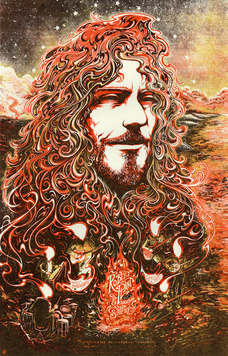
Plant has been exploring cultures and sounds from across the globe since the dissolution of Zeppelin. He and The Sensational Space Shifters are currently touring in support of the recently-recorded Lullaby...And The Ceaseless Roar, playing a blend of Plant's signature folk-rock-blues and Zeppelin songs rounded out with new compositions from Lullaby, accentuated with new worldly accents. His reputation is larger-than-life and as such, figuring out how to portray him stumped me for quite a while. I struggled with visualizing a depiction of him that was balanced; not too old or young, not lost in the past or cemented in the present. I needed to depict his aura with the Shape Shifters fueling and sharing in the experience.
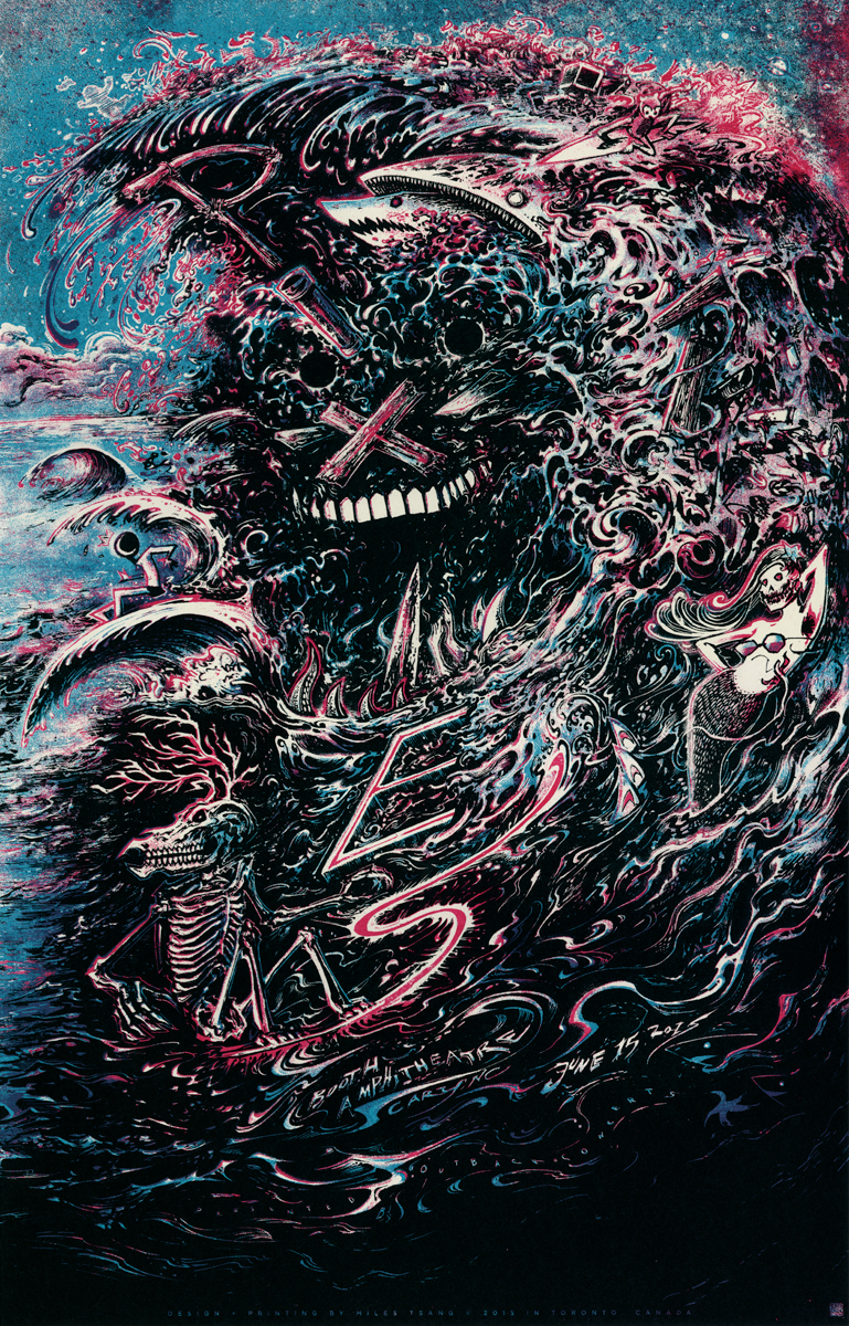
In addition to this, I also needed to simultaneously portray Boston's Pixies, a rock band whose sound consists of a blend of noise, psychedelia, rock, surf pop featuring lyrical themes ranging from the humorously and surreal to the incestuous and grotesque. Their popularity was originally limited in American markets though significantly greater in mainland Europe, the UK, and Israel. Following the Pixies' tense disbandment in 1993, their jarring rock style came to influence younger commercial powerhouse bands of the ensuing decade such as Bush, Nirvana, Radiohead, The Strokes, and Weezer. Pixies reunited in 2004, returning to the alternative rock landscape it helped codify, selling out world tours and recording new material in the form of 2014's full-length Indie Cindy.
Conceptualizing this couplet of posters was tricky because I had to balance my usual concern for the musician's brand/identity with the need to make a diptych since both groups were playing together. A connected series isn't terribly uncommon in gigposters but this case was tricky. Prioritizing the personalities of both was a balancing act and I wanted the overall image to include two very different musical entities occupying a common reality.
I recall listening to a lot of old Zeppelin and Pixies and flipping through a book on the British design collective Hipgnosis I own to get in the mood. I ended up taking several pages of jotted notes and building a file of interview and video links as well as press and tour photos using Dropbox and my favourite nested list app Workflowy. I began collaging to flesh things out in Photoshop and as I was fidgeting with these pieces, I started to make connections..
Sketch + Drawing
"Those are the two basic components of rock music […] the dreamy side and the rockin' side. It's always been either sweaty or laid back and cool. We do try to be dynamic, but it's dumbo dynamics, because we don't know how to do anything else. We can play loud or quiet—that's it".
-Frank Black (Pixies)
Reading that quote steered me into thinking about the tour as if formed by two sides of the same (but aesthetically-inverted) coin with two schizophrenic personas represented. Plant and The Sensational Space Shifters would symbolize the clean, fluid, and melodic side, and The Pixies being would stand in for the chaotic, the erratic, and the jagged. It took a while to come to this idea but once I did, it spilled out [and directly into my sketchbook] very quickly.
I visualized Plant as a spirit emanating from the passionate fires induced by The Shape Shifters playing on American soil (like a spiritual elder statesmen overlooking the scene). Countering that was the Pixies' Broken-Faced Wave of Mutilation, which took the form of an uncontrollable tsunami (a reference to the group's violent sound, surf sensibility, and original overseas popularity).
After the consideration of concept comes the time for execution. Usually, it is the idea that comes before the collage, as I need a strong concept to tie all the visual assets together. Otherwise, I can conceivably waste unlimited amounts of time minutely pulling, shifting, and tugging pieces all over the place. It was the recognition of that fact that convinced me to try to pull this one directly from out of my mind.
Once the sketch completed and tightened to an acceptable level, it was scanned and digitally enlarged it to be transferred to a larger piece of 16"x20" clayboard.
The image was resized to fit onto 4 trimmed sheets of common 8.5"x11" copy paper and aligned/secured. This new enlarged sheet was then taped to the clayboard on top of a piece of Saral Transfer Paper. The lines were then redrawn atop the copy sandwiching the transfer paper, creating an exact impression on the board.
Once the rough lines were drawn and the impression of the sketch laid, I filled in the spaces by hopping back and forth rendering areas in graphite and India ink. I tended to do a graphite under-drawing for areas requiring more detail and consideration, but I sometimes went right in to inking (because I'm impatient).
I sometimes like using clayboard because it allows you to draw light into the shadows. This is because clayboard is essentially a thin sheet of smoothed white clay adhered to the front of a wood panel. It is very a absorbent hard surface, meaning ink flows nicely onto it, and it can be dug into somewhat like an etching stone using scratchboard tools. This allows for two levels of drawing to intermingle, creating sharp edges and the opportunity for unplanned inversions of black and white space.
After a solid 4-5 days of drawing, inking, rendering and detailing, the full piece was scanned (in parts since my scanner can't handle 16"x20" in one go) and edited for spots and smoothness in Photoshop.
Digital Processing
"I used to be better looking than this."
-Robert Plant
After the traditional drawing comes the time to colour and break the piece down digitally into separate layers for the labour of love that is the screen-printing process. I like to take the black and white drawing and add a midtone layer, as this gives the forms some more dimension through the suggestion of directionality and light.
Once the drawing is broken down into midtones, I start to mess with colours and typography, which is continuously refined as the project wears on. I should be plotting this out earlier, I know. Very rough starts.
Once the key is finalized, I implement a Photoshop plug-in called "MultiFill," that uses an algorithm to fill in every pixel of a specific colour value to another, randomizing all the whitespace. I do this because the plug-in fills adjacent areas with highly unrealistic, opposing colours, which makes selecting them for masking and layer trickery much easier later on.
I use a system of Layer Masks and Channels to save Paths and Selections which make them easy to Fill. This means that once the key and midtones are placed, I will take time to cut out each piece of the composition. So on the Channel panel, I will use a mixture of the Lasso, Quick Mask, and Wand Tools to grab and save each form in the illustration as a separate shape.
Essentially, there is a Layer for Plant's hair and face, The Shape Shifters' bodies and flames, instruments, debris, monsters, typography, basically the borders of each and every thing are redrawn so the implementation of colour can be more structured. Since all of the visual real estate is neatly chopped up into divisible areas, this also keeps the deployment of gestural brushwork and textures from getting too crazy.
I decided to revert to the same colour scheme I used for a Kanye West poster from late 2013. The palette is composed of only 3 colours (4 if you include the glow layer), so I went with it for familiarity and efficiency's sake.
Once all the forms have been shaped and saved as separate flats, each layer (White, Key/Black, and Midtone) is organized into its own folder and given a sub-layer for each colour that will be used in the final print (Cyan, Magenta, Key-Black, and Glow in this case). Each of these layers is filled with 100% black (representing the printed transparency layer) and then an adjustment layer representing colour of the ink is applied (the masks from these can be deleted to conserve memory when saving the file). From there, areas can fill in manually and all forms are given tighter definition as this next layer of drawing is applied.
Once all of this sort of technical legwork and setup is done, I can dive very deeply into pure rendering and special effects. I use Photoshop brushes harvested from DeviantArt as well as those of Kyle Webster (who I learned about from my favourite online radio show Adventures In Design Podcast).
I work back and forth between the two sides, oscillating between layers and brushes, attacking it like I would a sporadically-filled painting until all the information is legible, and the proper amount of colour and contrast has been attained. The image is then broken down into singular layers for screen-printing, which is simple due to the aforementioned organization of layers.
Screen-Printing
"To my mind, there is a reason that music is there and it's about being human."
-Kim Deal ( The Breeders / Pixies )
Due to the tight timeline and the repetitive nature of screen-printing, my mind wandered and I didn't take a trillion pictures of the process. Presented instead are some highlights and stopping points where I did remember to take some snaps.
That aside, printing is such a luxury for me. It is the halfway point between painting, drawing, and the computer, and the job I do it for is the perfect balance of personal ideation and commercial output. I enjoy the feel of doing things with my hands, and of holding the resulting object that comes of it. I feel lucky all the time, every day, and I hope that that joy is palpable in the form and content of the work.
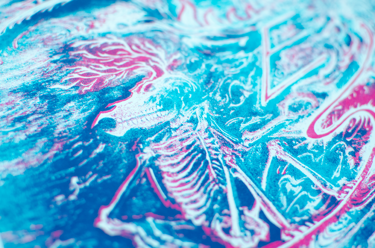
After the second blue layer. Had to make sure there was enough transparency in both colours so I was able to get my third 'free' colour (thanks for the tips @Brian Ewing and @Jason Edminston).
Due to some screen issues, the blue came out much thicker on the Pixies poster and the red came through thicker on Plant. Sort of fitting, considering the water/land contrasts being played up..
In addition to the regular Cyan-Magenta editions, I was also granted permission to print a few alternate colourways, so I ended up doing some colour changes and printed some warm, metallic colourways as well (titled "Pocketful of Golden" / "Digging For Fire" based upon songs from each).
After the prints were finished and left to dry on the racks overnight, they were pressed for maximum flatness. This makes trimming easier, and unfixed curling can make signing trickier than it needs to be.
After the extra flattening, the posters are trimmed and then numbered and signed before being wrapped up and a portion are sent to the venue. Mission accomplished!
Physical Products / Screenprints
Thanks so much for reading about the creative process from concept to object!
[Purchase links / More product photos] available in the Shop soon.
- Process
- 15" by 23"
- 5-Colour Screen print on French Paper (100 lb. Speckletone True White)
- Editions of 150 Regular and 40 Alternate Colorway/"Pocketful of Golden" Variants. All posters glow in the dark.
- Printed, numbered, and signed by the artist.
- Commissioned by Outback Concerts as part of Robert Plant & The Sensational Space Shifters 2015 Summer Tour with The Pixies.
- All transactions are in $USD
- Limit of one copy of each colourway per household
“I'm very, very pleased to contribute in some form or another.”
-Robert Plant
- Process
- 15" by 23"
- 5-Colour Screen print on French Paper (100 lb. Speckletone True White)
- Editions of 150 Regular and 40 Alternate Colorway/"Digging For Fire" Variants. All posters glow in the dark.
- Printed, numbered, and signed by the artist.
- Commissioned by Outback Concerts as part of Robert Plant & The Sensational Space Shifters 2015 Summer Tour with The Pixies.
- All transactions are in $USD
- Limit of one copy of each colourway per household
"There's more to life than listening to rock music."
-Frank Black
{please sign up for the newsletter below to be alerted before these product/sales go live}


