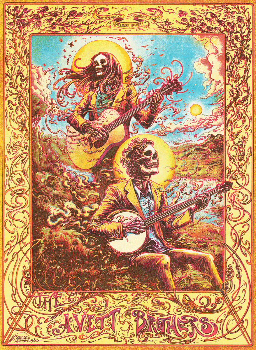
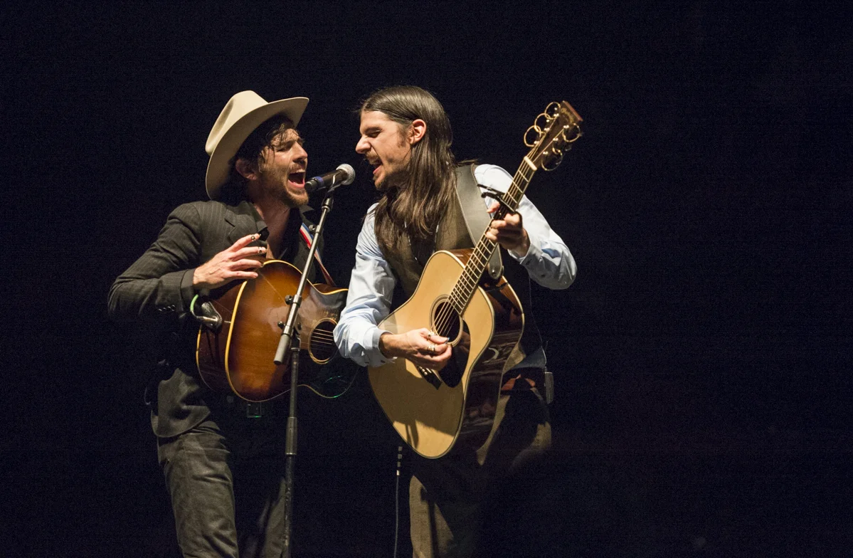
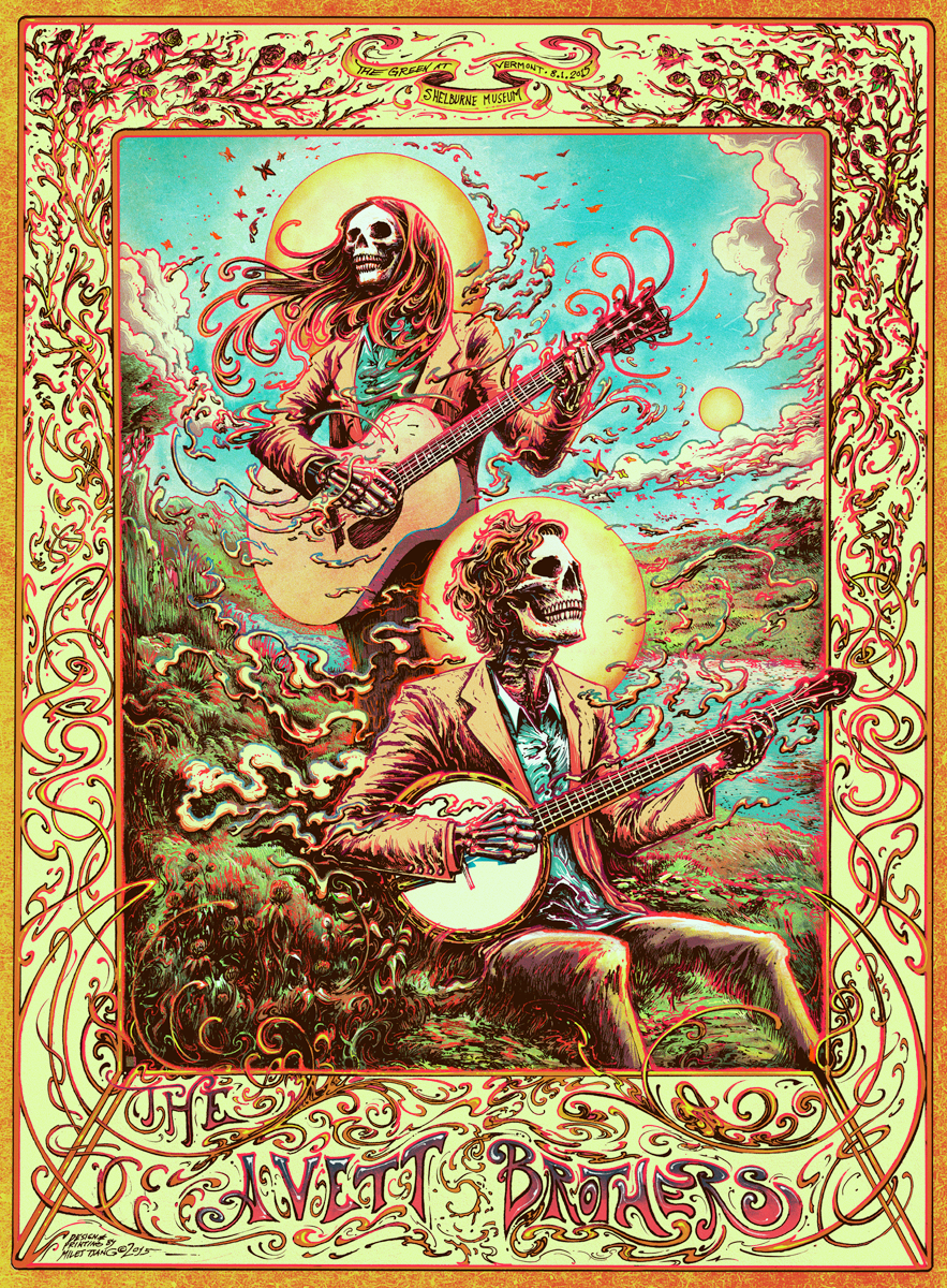
The Avett Brothers are a genre-melding folk rock band from Concord, North Carolina. This occasion marks our third poster together (#1 & #2) as of this writing. I have yet to do as many posters for any other band, which allowed me to think a bit differently about execution on this go around.
Concept
"Forever I will move like the world that turns beneath me
And when I lose my direction I'll look up to the sky
And when the black cloak drags upon the ground
I'll be ready to surrender, and remember
Well we're all in this together
If I live the life I'm given
•
I won't be scared to die"
I'd already done the conceptual legwork in the previous poster, so I took the same concept through my process again, with a different emphasis to produce the feeling of a sequel or a series. I didn't feel like stressing over reinventing the wheel. This idea had legs. Also, I didn't even notice until the poster was released that the concert date was Jerry Garcia's birthdate. Happy 73rd, Jerry!

Write here...
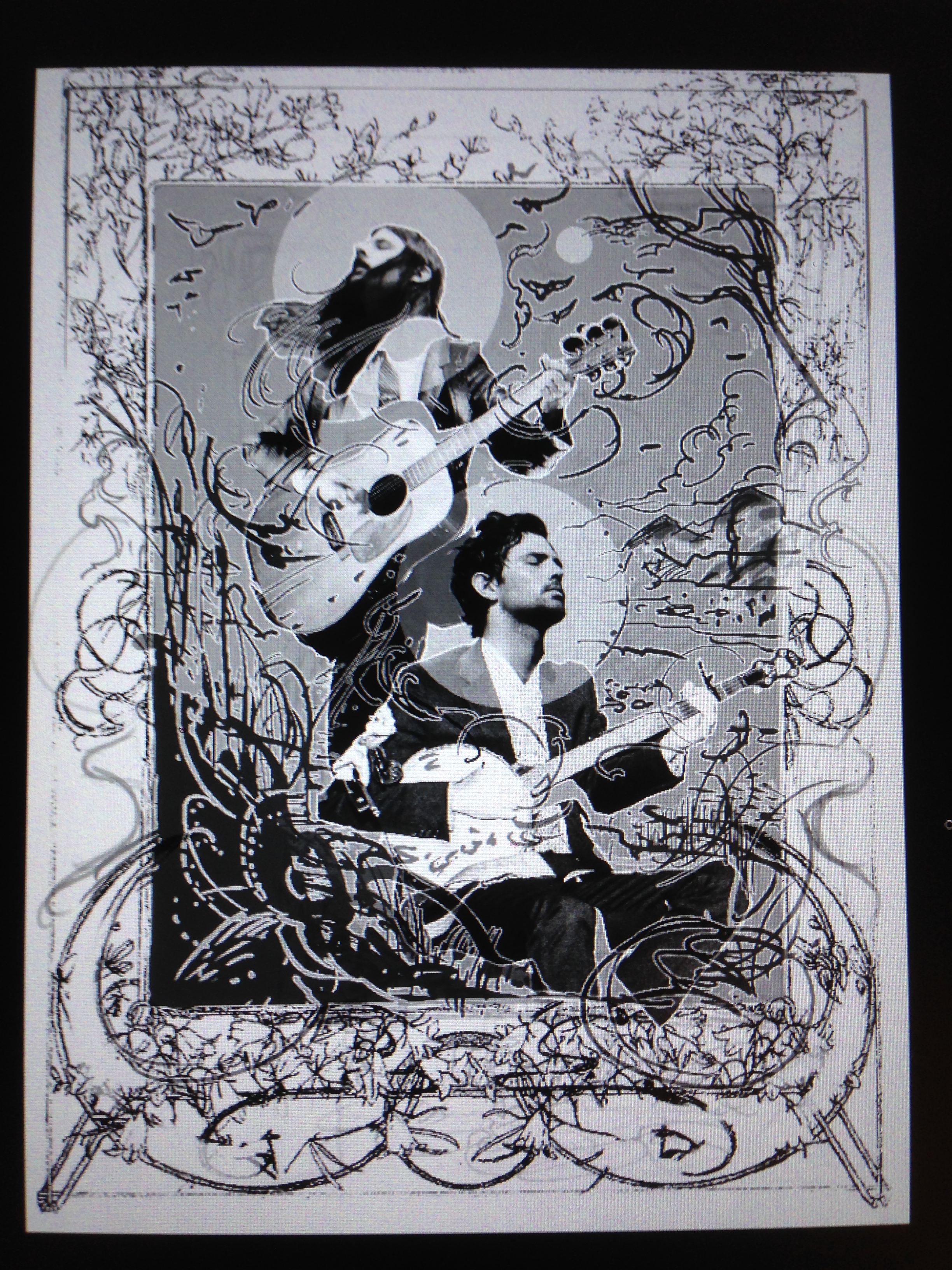
The unifying idea is that both the Grateful Dead and The Avett Brothers are longstanding folk rock groups with a rich visual history documented in poster art known with a known affinity for the ornamentation of Art Nouveau.as well as their use of collage. So with that reasoning, I did some absent-minded doodling, thinking of ways of serializing that previous poster and suggesting an evolution.
Instead of expending energy coming up with new narrative ideas, I just expanded on the previous one (whcih was decorative inspirit). I was able to put more time than usual into rendering and detail without concern over concept slowing things down.

I ended up using this watercolour and gouache illustration by Alphonse Mucha as a jumping off point. It is titled "II. Blessed Are the Pure in Heart For They Shall See God (1906)," and it's a spiritual portrait depicting two girls holding and examining a fallen birds' nest inspired by The Beatitudes (with poetically-postured flowers and vegetation).

Rough Composite + Refined Sketch
"I wanna fit in to the perfect space,
feel natural and safe in a volatile place.
And I wanna grow old without the pain,
give my body back to the earth and not complain.
Will you understand when I am too old of a man?
And will you forget when we have paid our debt
who did we borrow from? Who did we borrow from?"
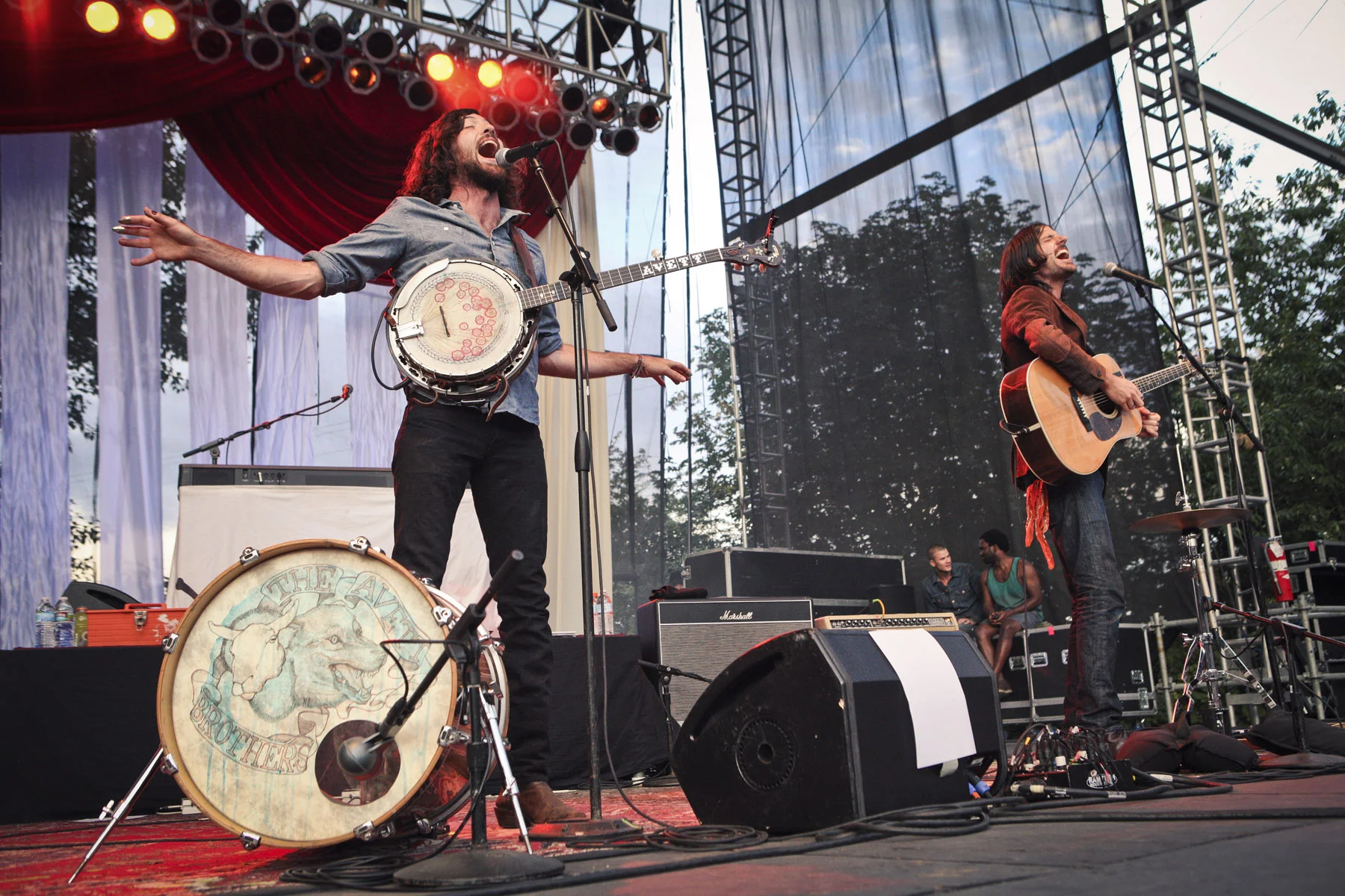
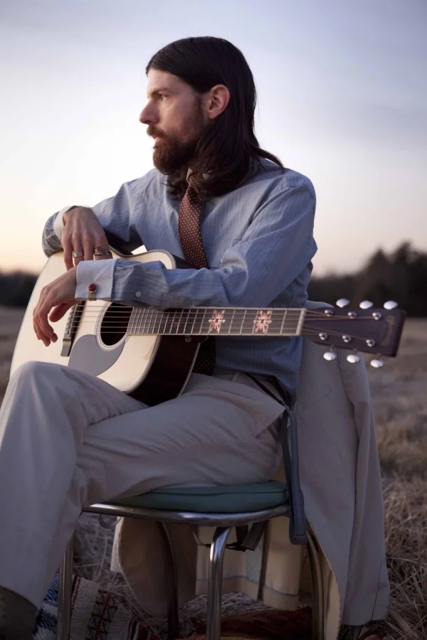
Though I knew the vibe of what I was going for, looking at photographs of the group and other drawings of vegetation helped to spur the image into specifics. I added a few recent or interesting new photos from around the internet to the running file I have on the band. Things like social media are great for this as long as you keep your references partial and you aren't too photo-dependent (though depending on photos is a 100% valid technique that I'm using).


The border of the Mucha piece was cut out and filled with new pieces based on one of the [incredibly] loose thumbnails. I was originally going to illustrate the entire touring band, but didn't have the time to add them later on (tight timeline). This image serves as a safety net for the illustration so I know the gist of where I'll be taking things while keeping it all very loose. I did versions collages both with and without skin but ended up interpreting details over the tracings.
Once the collage was complete, it was printed up on standard copy paper. A light table was then used to trace the collage onto a piece of smooth bristol. Multiple versions of the same image (pictured) as well as references of instruments, the band, and the environment (offscreen/not pictured).
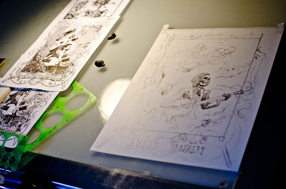
Every area of the illustration was sketched lightly (then darkly) in graphite.
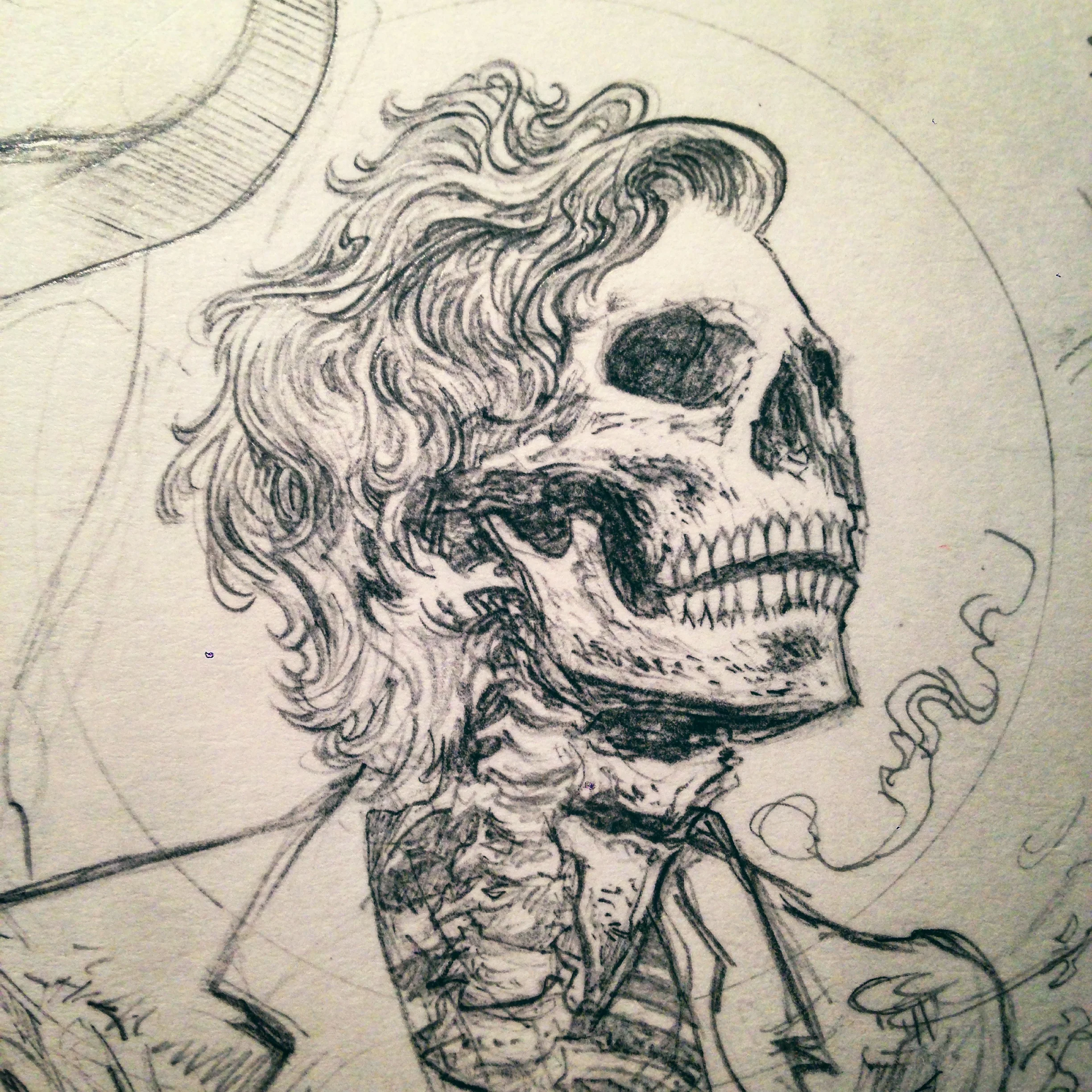
I did not wait for the entire drawing to be pencilled out before inking. Due to impatience, different areas of the drawing were brought up at different times and evened out later. You can also see a small sheet of acetate with some test marks on it. Using this means I don't mess up the paper doing something too risky.
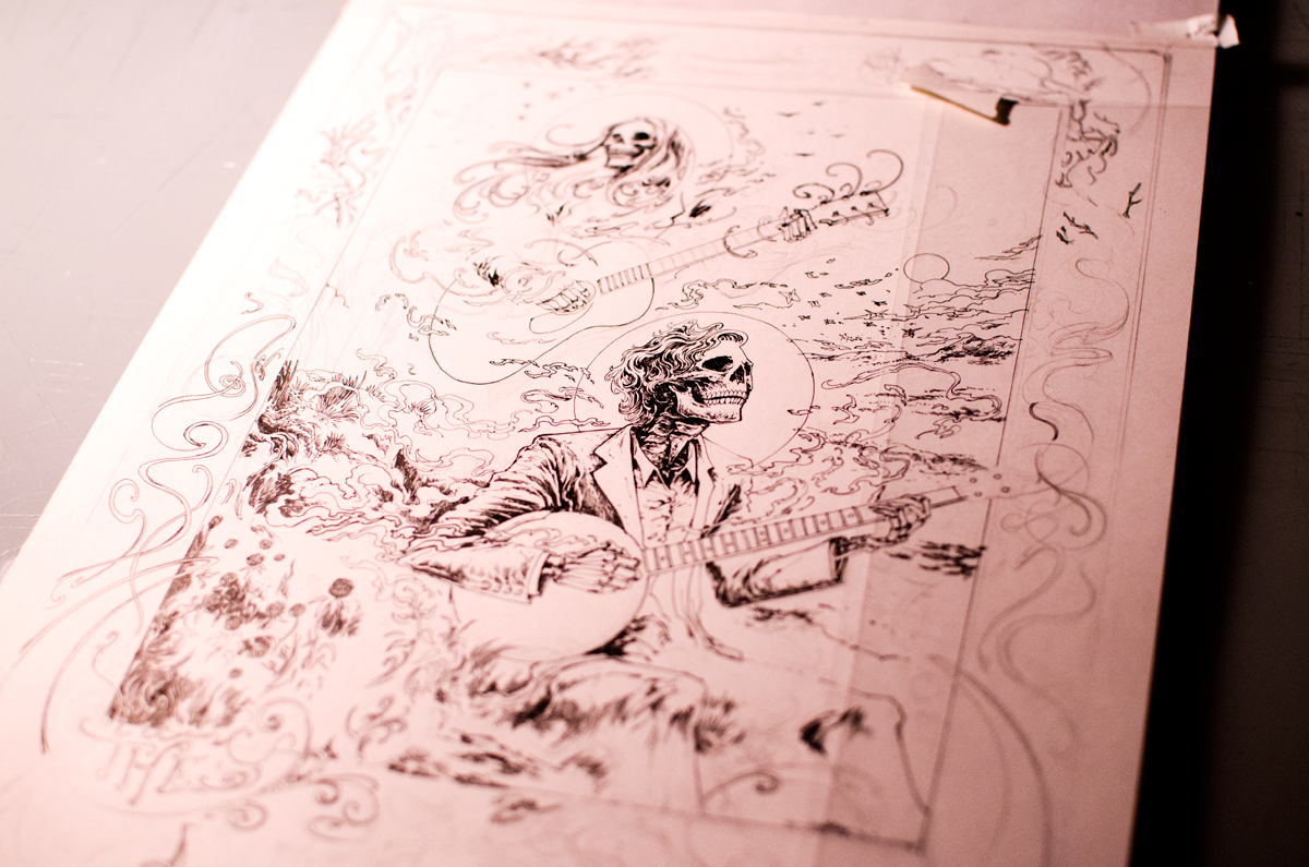
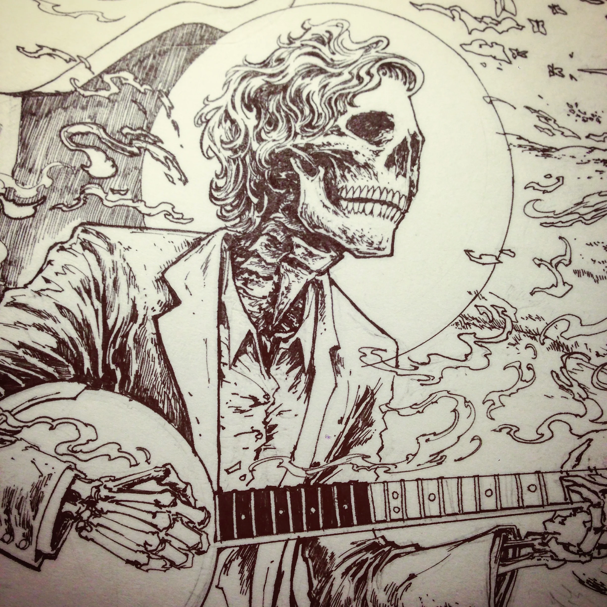
At a certain point, things switch to mostly inking. I like using Rapidograph technical pens because I enjoy the sharpness and exacting feel of the nibs. Maintenance is a bit of a pain sometimes, though.
Ended up doing the illustration on two layers. Wanted to do one, but ran out of space and didn't feel like erasing. I sometimes work on clayboard, but I felt like working on paper to retain the feel of the previous Tallahassee poster (which was also drawn on paper).
Digital Processing
"And most of us out there got fooled
Cause the gold it glittered in the night
We chased it fast like drunk buffoons
The banker lived, the artist died..."
Once the inked key drawing is finalized, it is scanned and brought into Photoshop. From here, the drawing was separated into bitmapped (pure black and white) layers and set up for "flatting." The whites of the image are replaced with pure tones, which can then be grouped according to form.

Colours are grouped and new selections are made and saved within the Channels palette and within Layers as Masks.

While the flats are being sorted, I'm also flipping back and forth between drawing in the midtone. I usually apply an overall tone to image while doing this to keep things exciting. Things really start to come together once this groundwork is laid.

Bouncing back to grouping colours according to form. Using these saved allows one to drop in colour very systematically once all the weird blueprinting and legwork is done.

Once the midtone drawing is done and all the Channels are separated by form, the real fun begins. Layer Groups organized into White, Key, and Midtone contain all of the new layers, which are filled black and Masked (representing the transparency). These are attached to Adjustment Layers (which represent ink colours) and occupied areas are filled in according to rendering preference in a CMYK-style.

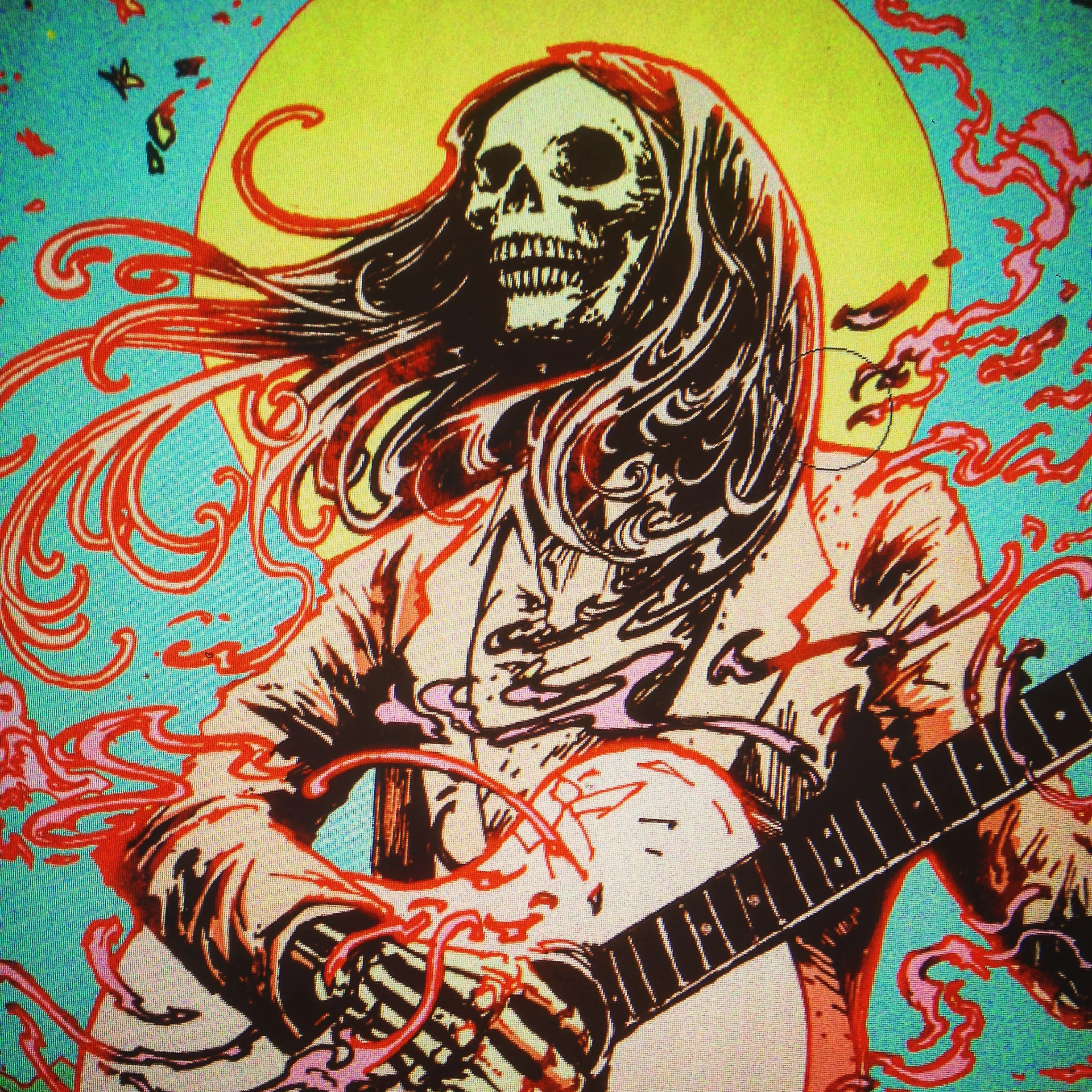
I ended up using a base orange like a sepia dropout under-tone, which gave the piece more warmth and solidity. SHown here is the digital preview straight out of Photoshop.
Screen-Printing
"Down with the shine, the perfect shine
That poisons the well, and ruins my mind
I get took for a ride every time
Down with the glistening shine"
Printing is an imperfect science, so there is always something lost and gained in the translation from preview to print. Colours don't dry or mix exactly as planned. Screens shift and registration wanders. Papers bloat or stick depending on the humidity of the weather or the weight of the ink.
Little flaws or variations are what distinguish each limited print from each other within the edition but that's just a safety net because printing is easy to mess up. Much of the art of screen-printing is keeping fuck-ups from happening so the resulting print comes as close as possible to the desired image.
Go too wrong and everyone will comment on the edition's flaws and blame the printer. Do your job right and most folks won't even realize that there's a person there.


Ended up going by an OCMYKG(Orange/Cyan/Magenta/Yellow/Keyblack/Glow) sequence for the regular edition of 200.
Also got clearance to do an alternate colourway, so I used one that was again similar to the previous Tallahassee poster. Felt fitting. And I really like purple.
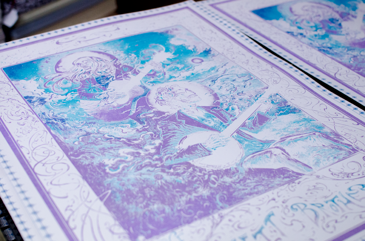
Honestly had so much fun printing (very little went wrong and the prints finished ahead of schedule) that I forgot to take more photos of the actual printing process. But here are the trimmed piles, being sorted for editioning (signing and numbering).

Finished piles of prints, ready for shipment to Vermont (some withheld for online sale).
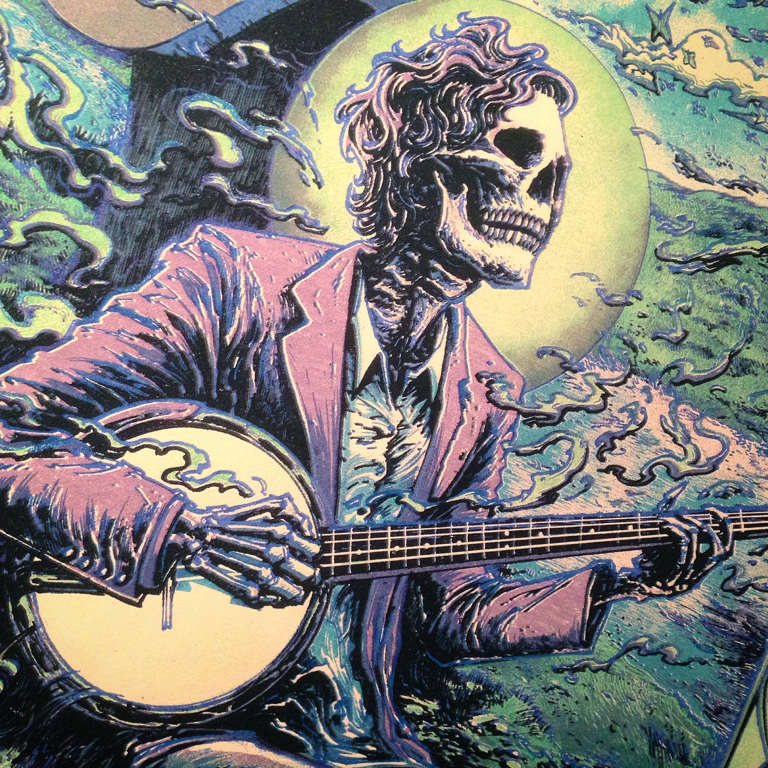
Variant "Moonshine," detail. Mission accomplished!
Physical Products / Screenprints
"It's the skin and bones that keep me on the road
The shoulder blades of a beast that haunts my soul
Wandering lonely and scared
I live the tragedy I shared..."
Thank you for your time and attention!
Purchase links available in the Shop soon.
{ Please sign up for the newsletter below to be alerted before these products/sales go live.
Thank you ♥ }

- Process
- 18" by 24"
- 6-Colour Screen print on French Paper (100 lb. Speckletone True White)
- Editions of 200 Regular (Warm) and 75 "Moonshine" (Cool) alternate colourways. All posters glow in the dark.
- Printed, numbered, and signed by the artist.
- Commissioned by The Avett Brothers as part of their Summer 2015 Tour Series
- All transactions are in $USD
- Limit of one copy of each colourway per household
- Please subscribe to the mailing list/newsletter for info on new releases.
Regular (Warm) / Edtn: 200
Variant "Moonshine" (Cool) / Edtn: 75
GID View (both glow in the dark)