I've been intrigued by Santi White since her days as Santogold upwards of four years ago (a litigious jewelry merchant by the same name forced the vowel switch) and was very glad to hear Master Of My Make Believe when it was released earlier this year. Taking cues from her imaginative aesthetic, welcoming indie rock leanings, and energetic feminine vibe, I implemented some classic Art Nouveau influence, placing her fashionable figure in an Alphonse Mucha and Aubrey Beardsley-esque frame, while making special efforts to balance the textures in her dress, skin, and hair. The final image is meant to seem individualistic, poised, and artistic, just like her music.
I've been putting more effort into my process, meaning more thumbnails, intermediate sketches, and effects studies. I will do whatever is necessary to arrive at a solid final image.
A progress shot documenting my new understanding of Adobe Illustrator's brushes. I can't believe I've been making posters with the software for almost 4 years and am only just now migrating away from pure pen and pathfinder processing.
Framing thumbnails after finishing up the figure utilizing graphite, markers, white-out and my cheap and trusty inkjet.
One of the transparencies (White layer), to illustrate how each layer looks before shot onto a coated screen. 21" x 27".
Close-up of the first layer (red) burned into one of my new 200+ mesh screens.
Registering with marks and transparency on one of the prints. I'm getting better and faster at this as I do more posters.
Detail of off-register layers. I thought it looked interesting. Tricloptic.
Two layers, printed and stacked irregularly.
Face detail. The moire was not intentional, but I designed the image to be able to withstand a little off-registration.
Hand detail. Explosive flash textures and line halftones.
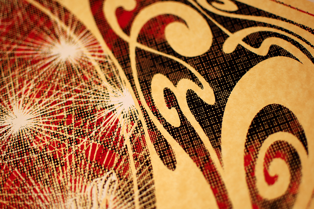
Detail of the arabesque frame colliding with light textures.
Type detail. If you're wondering why PromoWest is on there twice, it's because it was 5AM by the time I finished processing the image and I went right to printing the transparencies with only an hour of sleep and a full shift at the day job afterwards. I began printing the poster that same day, which was a mistake. I didn't see it until the first layer of color was down. Hard lesson learned, as this is really the only thing keeping the poster from perfection. That being said, I don't think it detracts from the overall beauty of the image.
I do so love how the figure turned out, and how much more fluid it looks compared to most of my other posters. The contrast between Santi and the jagged moire-flashes continue to please.
Quality control time. A few prints were unbearably off-register and had to be removed. Shot just before signing and numbering.
Large scan of the final print. It's 19" x 25" on Gold Parchtone paper, just like the previous Odd Future poster.
Full edition of 90. For sale at The Shop.


