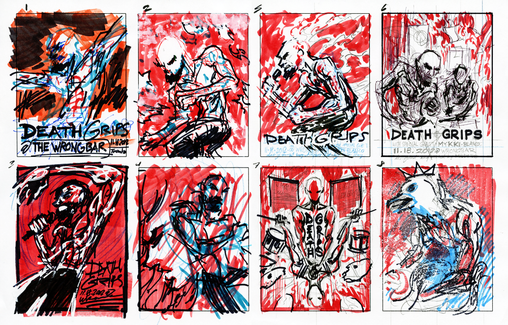
Death Grips are a very scary band. I've known this since early 2012 when "Beware," came out of nowhere and proceeded to destroy everything I thought I knew about punk, metal, rap, and underground music in general. Savage shouted vocals, primal rhythmic beats, and unsettling electronic samples marked by a kind of black metal devil-may-carelessness. Unfiltered awesomeness abound. So when the chance to create a poster for them presented itself, I jumped at it with all of my energy. Interviews with the group reveal a preference for abstract ideas and provocative visuals, which is why I spent quite a bit of time conceptualizing and illustrating in a progressive, but detailed fashion. I knew I had to create something that existed within the same vicious void as their music. From the first few thumbnails to final 100 or so prints, this project took me a little over a week to complete.
Thumbnail Sketches
The first round of sketches were relatively simple; Stefan "MC Ride" Burnett in various poses. This was quickly decided against in favour of something more arresting. Taking inspiration from fan-favourite "Get Got," I decided to focus on the line where Ride mentions "Abraxas," who is a kind of "[Jungian] God higher than the Christian God and Devil, that combines all opposites into one Being." More than interesting enough to build a poster upon.
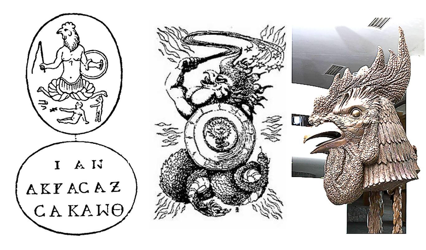
I liked the idea of Death Grips' sound manifesting as an all-powerful, beyond-good-and-evil kind of totemistic force. So I let the idea stick. I did a little more research and learned that this entity is always depicted with the head of a rooster, the body of a man, and possessing serpents for legs. It is sometimes also seen holding a symbolic whip and shield, but I later decided against accessories so I could do more to make the design my own. I came to favour balanced composition over historical flourishes, although a part of me wishes I could have included the surveilling flying-saucer pyramids or the flaming dollar bills raining from the sky.
Research / References
There aren't a lot of amazing artistic depictions of Abraxas on the Internet, so I took it upon myself to construct an Death-gripping interpretation based on what I could find. I was influenced most strongly by Ai Weiwei's Zodiac Rooster. It reminds me of the kinds of faux-bronze dragon sculptures one might see in a palatial-style Dim-Sum restaurant.
Some inspiration was also taken from Japanese concept artist Masahiro Ito, who is one of the main creative contributors of Team Silent. He was a key influence on me during my formative years and his designs continue to freak me out to this day. The use of texture in his work is impressive when one considers that he creates many of his works in this style using only ballpoint pen and Photoshop.
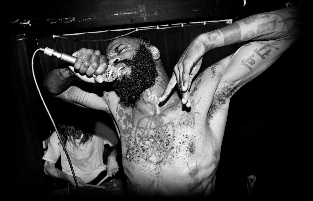
Some consideration was given to including Ride's numerous tattoos, as they are a big part of his intimidating visual presence. Only the central pentagram eventually made it to the poster, since having the rest made the rest of the poster far too busy.
Semi-Composite
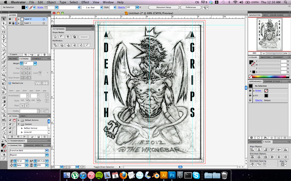
I started loosely, eventually upping one of the thumbnails to letter-size (8.5" x 11") and pasting a piece of onion skin tracing paper atop to keep the composition tight while i worked on it in graphite. The piece was to be redrawn in Illustrator, so I tried to make each stroke as angular and sharp as possible.
The basic type layout remained the same from thumbnail to semi-comp, though the added wings were altered to make Abraxas look less angelic. Instead, inspiration was taken from the name of the song "True Vulture Bare," (which also has an insanely surreal accompanying video). The wings were made to appear tattered with sinew as if the figure had been gnawing its own flesh off, becoming vulture-like and "bare," while doing so.
The drawing took about two days to finalize. Lots of little details. Somewhat painful, but entirely necessary for what was to come next.
Textures
After completing the line layer digitally, traditional textures were added. It didn't need to be big since I knew I'd be bitmapping the image once the paint tried and was scanned.
A close-up of the finalized Illustrator drawing. Printed out on card stock and painted on with reckless abandon.
After the linework came the shade layer to add some more interest and further sculpt out the form. Contrasting against this is a mess of gestural paint strokes which would later be translated via halftone. Next came redrawing the aforementioned shade layer as a mask for the textures and type. The goal was to be organized, yet chaotic, merging fluidity with rigidity.
Final Composite
Using Illustrator's transform and distortion options, I created another mask for background texture in the same way. Shown here are the final outlines and one of the two transparencies.
The final digital version. Meant to give a characteristically dark Death Grips vibe while being conceptual and somewhat reminiscent of their live energy.
Printing
This was my first time pumping out a piece at Hamilton's Centre3 Print Studio. It's a very well-equipped facility and the staff are fantastically kind and helpful. Shown here is the first layer for "Death Grips 2012". The white underlays against the ground of the paper so a little mis-registration looks more stylish than erroneous.
My coated and burned 250-mesh screen. Had to patch a few holes that bled through. Used packing tape for the first time instead of expensive blue printing tape. Equally effective for my purposes.
First layer down on French Paper's Glo-Tone Red Light. I chose this for the majority of the Death Grips run because many of the videos I've seen of their current tour have them bathed in harsh, bloodily chromatic light.
Setting up for the second layer of black ink. Centre3's studio tech (one Chris Saba) was good to me during this round of printing. Not only did he not panic when I thought I broke this old vacuum table (I just snapped the on/off switch), but he also reminded me of how to register classically. Tape large piece of acetate or clear mylar onto the table with the screen set up, print on that, and then place the paper underneath. Thanks to this tip, nearly all of the prints turned out on-register!
Unlike during previous sessions at other print facilities where I would bang out three colours in a single setting, I chose to take my time with this one and wait a night between layers. As a result, the paper dried flatter and made printing easier.
Huge drying racks make me so happy. It's difficult to keep paper from curling if you don't have one and are forced to either hang prints from a clothesline or stack them on top of everything around your little garage, one-bedroom, or what-have-you.
Cutting, Signing, And Numbering
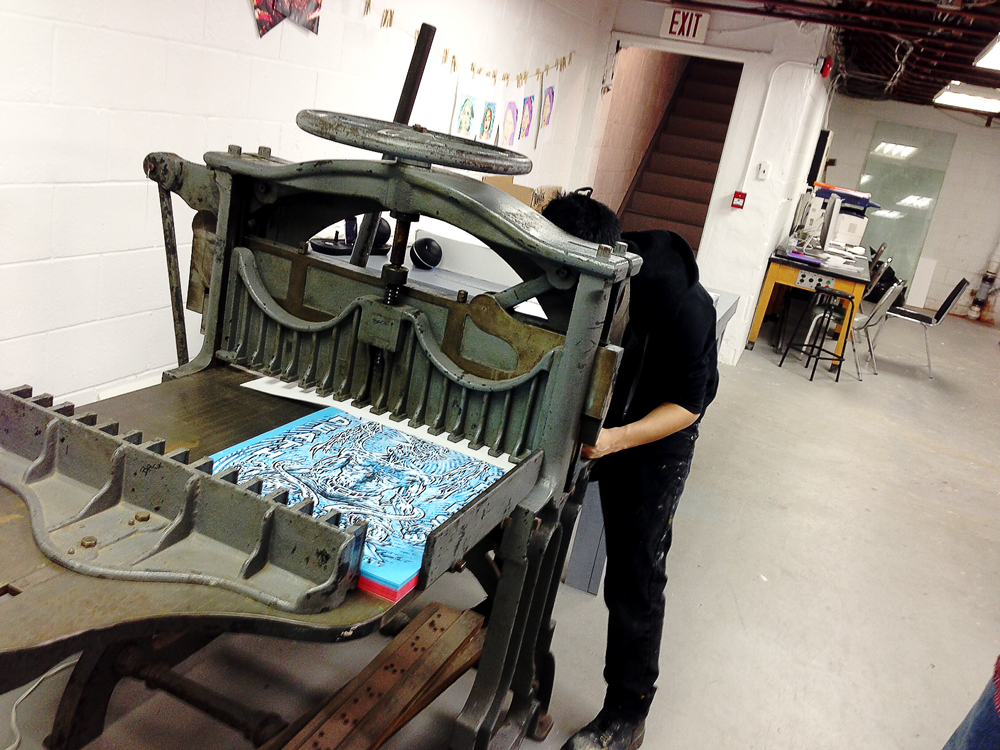
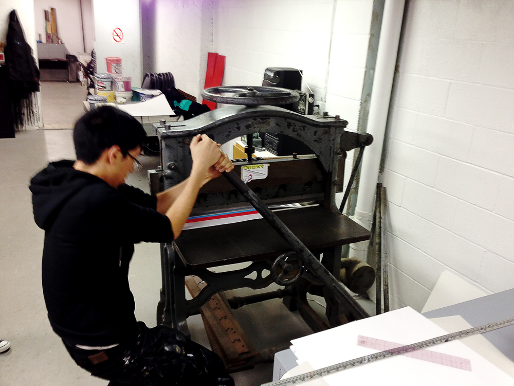
This Death Grips print marks the first time I've used a manual paper cutter to great success. More thanks to Centre3 for providing it and to Chris for helping me get enough leverage to actually pull the operation off.
Aligning the straightest side against the right-angle wall and wheeling it towards the blade slowly. I was terrified while doing this because I've seen some terrible trim-jobs before by sub-par cutters.
I'm amazed at how cleanly this thing cuts. 100 prints in one hard, even slice!
Signing and numbering my life away. This always takes much longer than I think it will, but much of the time, a nice signature and number is the difference between an officiated piece of art and a simple bootleg.
There are 75 red variants and 25 blue Death Grips 2012 prints.
*Edit: Took a bunch of prints to give to the venue and band and got Stefan and Zach to sign one for me. Amazing people. Surprisingly, they are as cheerful and chilled out in-person when offstage as they are wild when on. Sharp, too. Stefan immediately recognized Abraxas and I chatted with him briefly about our mutual love for art and the fact that not everything needs to be said literally; some things are better when expressed in other ways. Anyway, they put on a killer show and I'm so glad I caught them. So loud and raw it rocked me to my inner being; I wanted at once to get as close as possible and to run for dear life. No entertainer before them has binarily triggered my fight-or-flight reflex so acutely. I truly wish nothing for the best for them and hope for their career as an artistic entity to be long and fruitful.
Up for grabs through The Shop.

