Every Time I Die have been in my rotation since high school around when Gutter Phenomenon came out and taught me that metal could be weird but fun while still being hard as hell. Their most recent album Ex Lives was released exactly a year ago to the day [of the band's Toronto performance] on March 6th of 2012.
Overview
Every Time I Die have been together for 14 years as of this writing which is crazily respectable for an off-kilter, hyper-aggressive band that has never really neatly courted the mainstream. To me, a lot of what characterizes their sound has to do with their surreal stories and hilarious lyrics, hardcore punk and southern/groove metal riffs, and a characteristic, confident urgency that's present in every song. Without getting into too much detail, that's how I feel about this band and that vibe is what will be framing this poster.
Guitarist Jordan Buckley right as he fell on top of me in the mosh pit during a concert circa 2008. Good times.
Research
A band with this much history and personal love demands at least a cursory amount of scholastic research. I snagged a few bits from their website as well as Youtube to read up on how they present themselves today as well as see what they've been up to most recently.
Inspiration
Like Andy discusses (at around 3:00), inspiration can and should be allowed to come from unexpected places. He can't skate anymore, so he watches skate videos, and he channels that physical want into his art, which is crafting disgustingly dirty guitar riffs. By that same token, I can't play music, but it's one of the few things in life that's kept me connected to people, to places, and to moments in time. So I channel that understanding and need to express it into works that honour their source. In fact, the first sketches below were drawn under a dim dive bar light while at a Gojira concert. Sometimes getting inspired is as easy as getting weird.
Now that that's out of my system, here are some illustrators' specific pieces that I've admired for a while that possess the level of designed professionalism and illustrative refinement that I aspire towards. Some facets from these were ground up and used as fuel for the Every Time I Die fire. From left to right....
Rich Kelly's Circa Survive poster creates a pleasant rhyme and reason to the placement of all the composition's elements while using a limited colour palette to give the print a very calculated and measured atmosphere.
Gary McGarvey's Bjork poster for Bestival is a cool example of an illustration style that leans more towards the broad, but well-aimed polish of graphic design and less towards detail and the figure, coupling figurative suggestion with glittery textures and bold, but sweet typography appropriate to Bjork's quirky but otherwordly and heavily artistic image.
Then there's the insanity of Vania Zouravliov takes symmetry to an exponential level. The top and bottom figures take up smilar spaces visually, even though rendering details differ. It's interesting beyond just being an insane illustration
Sergio Toppi's ability to play with positive and negative space relationships always astounds, like a more detail-oriented Mike Mignola, handling all his vignettes like paintings by creating variations in shape, texture, line, concentrations of light versus dark within designated zones that could as easily have been gestured as they were designed.
Lastly, I've been really into the work of James Flames lately, as he is an insane contemporary poster artist who goes to crazily creative lengths to get striking, beautiful works characterized by achingly gorgeous analog processing.
Sketches
Starting off by kind of free-versing with figures and gestures and starting to doodle out type samples to see if anything interesting happens. Just getting some bad drawing and baby ideas out of my head. Type doodles which aren't really expected to be implemented in the final design. Still good practice to hand-draw one's type to get a personable aesthetic. Also included is a doodle inspired by The Prestige wherein (SPOILER ALERT) every time Hugh Jackman pulls off the ultimate magic trick, he dies. Another of Keith Buckley just posing and drinking. And a dead man drinking whiskey.
Did a slightly more detailed thumbnail set next with the band in profile, rocking out in a spread-style composition. The next is an almost Horkey-esque decorative snake design since I associate them so heavily with dirty southern stuff of which rattlesnakes aptly symbolize. And then there's the man getting blown away by something out of frame. Unused.
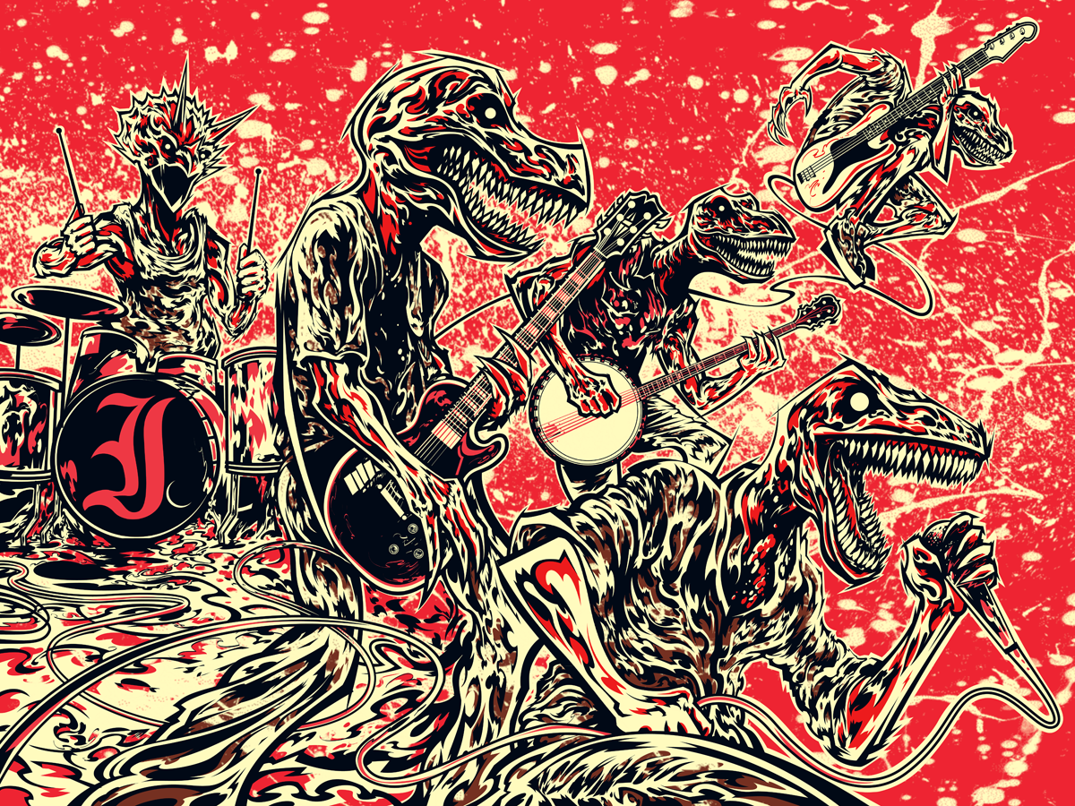
I used to love drawing dinosaurs as a kid and when I was starting out in posters, one of my default go-to's for a quick concept was to switch the head of a member with some sort of animal. Some kind of totemistic force that would be singular and powerful and expressive of how I felt about the band's sound. Simple concept that people can connect with quickly...
[heading size="h3" stunning="yes" align="center"]Reference[/heading]
Having decided upon the dino-head idea, I zeroed in on specific photos harvested from around the Internet to help visualize specific things within the illustration. I also get ideas for lighting and form, which will in turn help me figure out how these figures should populate the space.
[heading size="h3" stunning="yes" align="center"]Refined Sketches[/heading]
Went kind of crazy brainstorming different ways to lay the type out. It's tricky because the band's name has to be super-legible but I still want to do something to it to kind of leave my mark on it. And it has to fit with the illustration so it can't take up too much space in the final. Also did a sketch from the photo in the Research body. The ideas come easier if I make drawing and details fun. Personally, playing fast and loose with lines and anatomy with lots of colours helps me do this. It's a fun warm up and a good barometer for the amount of clarity that has to happen in the coming drafts.
A part of me wanted to do something relating to the first line off their most recent album : "I want to be dead with my friends", which led to me thinking of maybe doing some figures bursting through a house. Deciding that that was for the birds, I went with a glass window, thinking it'd be easier but impressive once textures were mapped in. Tried working the type into the illustration more in a hand-lettered style. I'd have to wrestle with polished versions of those letterforms in Illustrator later if I went with this.
Tried mashing all five members as dinosaurs into one composition which was tricky since I had to scale it down in my already not-too-large moleskin. Also re-did the original raptor sketch, shrunken down and taken a bit farther with type and composition. I enjoyed the type layout on this since it reminded me of a Japanese billboard. Also tried seeing how this might look with two figures and another with more movement. Went back to one to see if it would be more impactful with radial lines that converge on the center. I forget what facet of Russian Constructivism that is, but that's where that comes from I think. The type is inspired by Chinese signature chops. The two oddballs on the right were never used in any capacity, although they were fun to draw.
Semi-Composite
A collage made up of the preceding sketches. Though all of the figures are subject to alteration, this is how I'd like the space to be divided. Gave the frame of reference a little tilt to add dynamism. I feel like the background should be hints of stage equipment with strobe-like flashes illuminating them along the gridlines I have set up in Photoshop. This will be the skeleton for the final.
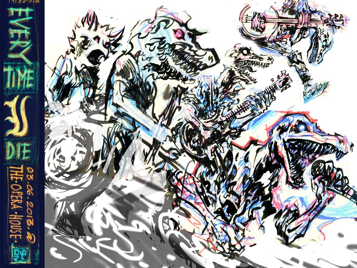
The image was then desaturated and the levels tweaked to eliminate confusing greys. It was then printed out on inkjet paper, sealed with matte spray, and painted and drawn upon before being scanned into the computer again. I'll do this as many times as is necessary, sometimes adding digital tweaks in between scan-and-prints. The endgame here will be to get a purely black and white image that can then be retraced in Illustrator.
Playing with some traditional textures that are just there to help me feel out the movement. Also began tightening up the two figures closest to the viewer and piecing in the two farther figures. Gonna draw the bassist jumping in the top right quadrant soon. Concurrently starting to piece the type together as well as think about background elements. Also, not sure how personalized I want these dinosaurs to look. I'm definitely going to attempt to replicate their tattoos where I can, but should I put handlebars on the Andy-Williams-Rex? These are the important questions...
Continuing to tighten up structure and details on the figure. Tweaked the placement of everything in Photoshop a little to give things more space, balance and a better flow. I also cut the crap and spliced in some Photoshopped elements that I'd have a hard time drawing raw from my brain such a the banjo. I enjoy all the cords on the floor; reminds me of a cramped stage.
Tightened things up. One more rotoscope-inkjet process ought to do it..
The finalized semi-composite.
Also, Jordan approved of this through Instagram, which was awesome.
Finalized Composite
Printed out the finalized key art and filled in a shade layer using traditional microns. Though I recognize the economy and efficiency of digital, I find that my lines come out much more fluidly by pen and paper.
That red was then re-traced. Methodically and painfully in a manner I sometimes compare to old school rubylithe cutting. Just as pain-staking since I take it upon myself to chisel and slice out every shape manually instead of simply scanning a high-resolution file that was imported into the computer. After the traditional skeleton of the semi-comp is laid, I like to deploy the flexibility and speed of digital imaging.
After the colour and the shape happened, I dealt with the type. Giving the composition more room to breathe meant pushing the type block to the left. This kind of disrupts the original grid I had set up, but I like to think it helps to establish a new flow. Mostly everything is well-placed and evenly spaced apart. I inverted it on the inkjet printout just to see how it would look in blue. Nothing else came of that.
Time constraints and my inability to find a fitting font led me to scrapping together letterforms of my own. These are composed of lines and corners that echo other parts of the picture, thrown together with the aid of the shape builder tool.
There were a lot of little steps leading up to this final image. Added texture in the background to give it vibrancy and motion. Consolidated the design into two colours on a hypothetical light whipped cream ground. Masked out both layers, trapped the red under the black, and messed around with lightly painting out sections from both before halftoning everything once.
Screenprinting
A transparency obtained upstairs, where the studio maintains a high quality vellum printer.
The drying rack. Some old test prints lying on it.
Unpacking the paper, clearing the area, and prepping paper braces.
The exposure unit at Centre3 is pretty big and does its job well.
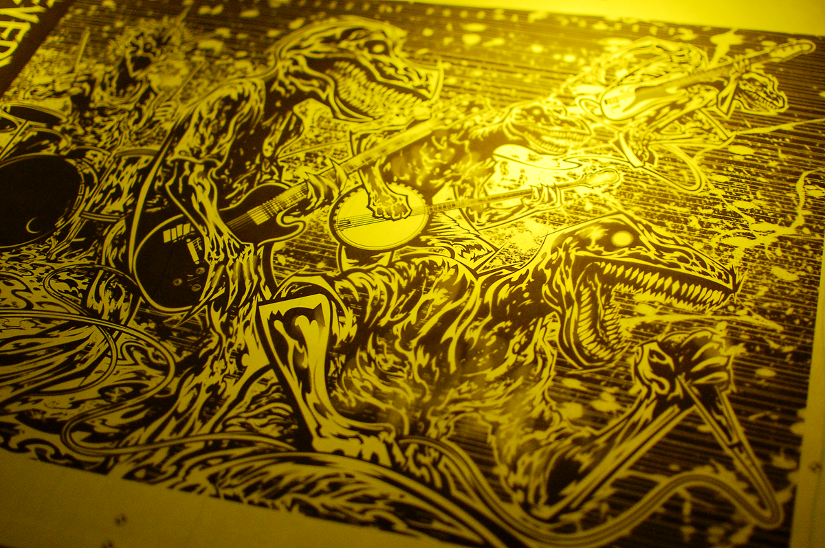
Using the safe light to position the vellum. The yellow light allows for illumination without making the photo-emulsion react.
Using a spare French Paper palette to weigh the mesh down and keep good contact with the transparency. This is necessary because the vacuum mechanic on this thing is busted, which sucks, although this is a fine fix. Too much off-contact will result in a blurry and unacceptable exposure. Fuck that.
Now that the coated screen has the transparency between it and the exposure unit, it's time to flash that sucker with light, hardening the emulsion in the white areas of the transparency while leaving the black untouched, soft, and vulnerable to water.
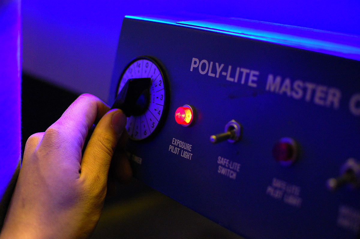
Twist the dial. Magic UV light ensues.
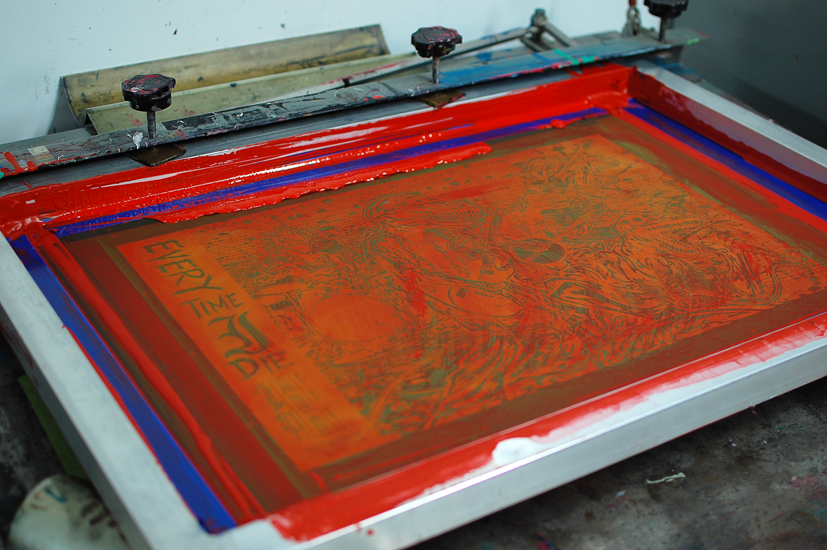
An exposed and unwashed screen. A few minutes and light spray sessions later and this screen will have been completely transformed.
Still wet from washout. Note the detail one can get from a 310 mesh screen.
The exposed dry screen being put into the clamps and set up on the vacuum table. I often enjoy looking at these.
The first layer of ink laid down. Didn't bother trapping anything since this is a mere two colours and tight registration will keep things in check.
I had to leave early without cleaning this screen out in order to catch the last bus to Toronto (this studio is 45 minutes away from home, in Hamilton, ON) so all this ink was rubbery and dry when I got back. Luckily it all washed out fine, although I suspect a dehazing might be necessary in the future if I notice this sucker clogging quicker.
Awaiting the second layer.
Prints drying. Loving how they turned out.
Washing out and reclaiming the last screen.
Lining the stack of prints up as tightly and neatly as possible in order to obtain a clean trim. It's also important to brace the bottom and top of the pile or the cutter's stock braces will leave nasty indents on the prints or leave the bottom uncut.
One stack, one slice. Watch your fingers.
Trimming is kind of nerve-wracking sometimes because whole clusters of prints can get ruined. This step is necessary to make them look slick, however.
I do so love a clean cut.
Freshly cut, lying on top of an unused t-shirt palette.
The spoils laid out on my drawing table.
Signing and numbering time.
Details
Typography detail.
Motion Blur + Halftoning.
Ryan "Legs," Leger
Awesome Andy Williams.
Jordan Buckley on the banjo.
Steve Micciche on bass.
Keith Buckley on vocals.
Basking in the warmth of completion.
I'll be selling my own copies to folks who pop by my booth at Flatstock 2013 first, which, as of this post-signing-and-numbering-until-2AM writing, will be around this time next week. The ones that are left will be released through The Shop. Thanks for looking!


