Widespread Panic are an American jam band hailing from Athens, GA. With a career spanning 28 years, the band are elite performers espousing a blend of Southern rock, blues, progressive, funk and jazz influences. They are renowned for their live performances, which are known to never feature the same songs for several nights apart on tour, or the same setlist, ever. For these reasons, Widespread Panic are considered gig poster royalty to fans and artists alike. I have several good friends that are fans of these types of bands (a few of whom have been seen helping me out in process videos), so it was exciting on both personal and professional levels to try my first jam band poster and satisfy the band and my buddies, as well as Panic's rabid fans.
Brainstorm
Widespread Panic's name is something of an ironic misnomer to me as the band's output is almost entirely tranquil in spirit when not in tempo. They are one of those bands that has been around and commissioning gig posters for so long that it can feel as though literally every idea has been touched on before. Still, I took some time to survey the general vibe of their most popular prints. There are so many and they are all so varied that I didn't get much literal instruction or direct reference points from most of them, although I inferred an overall sense of conceptual openness which allowed the artists to project basically whatever they wanted.
Eventually I got into looking at some of Panic's more recent posters. I'm always very enamoured of Todd Slater's work because I often infer our images as coming from similar places. The density and playfulness of digitally-enhanced (but meticulously hand-drawn and therefore traditionally-grounded) technique combined with clever concepts and surreal motifs always converges to produce a joyful image you can really lose yourself in. I was particularly inspired by this piece, which steered me towards animal themes and ideas of dichotomy and nature. That tree stump though, ya know?
Another artist in the scene whose work I've really started to fall for is that of David Welker. His stuff feels less concerned with pattern or structure as much as density, directionality, and whimsicality. There's a much more informal vibe to the layout of this particular poster, along with lots of details, gouts of textural, hand-drawn linework, and a warm-cool-pastel-palette for unification. The tension between the giant figure and the smaller foreground elements lends an unbalanced, precarious, almost improvisational tone to the overall design, which helped spark the idea to use the giant hybrid phoenix-rooster as a central figure in my own Widespread Panic poster.
Sketch
With some influences in place, it was time to come up with my own image. My favourite parts of the band's songs are the extended instrumentals, which ooze with jazz-influences, primal grooves, and uplifting atmosphere. I eventually decided on doing something bird-related because, let's face it, bird sell, and, I haven't done anything in forever that was specifically bird-centric. For a long time I've also been wanting to incorporate some more Eastern influences and ideas, so I took inspiration from Chinese animal paintings, which are always heavy in a very characteristic sort of poetic symbolism.
For example, a large bird surrounded by a flock of smaller birds might represent the Emperor and the flock the subjects of his court. Their positioning, treatment, or even the species of animals depicted would be symbolic in choice and often carry double or triple-meanings, some of which includes wordplay that is lost in Western translation. I don't pretend to have command of that level of foreign pictorial grammar, but I found the idea very inspiring, and decided to combine the vibe of this band whose music was entirely rooted in Americana and ambiguize it into my vision, bolstering Western surface with a touch of Eastern depth.
Following the brainstorming, note-taking and doodling, I got reference images for the things I don't draw as much. Like flowers. Flowers afford me a premium ration of shit every time I try to draw them. Plant dicks make no sense to me. And are crazy.
Moving on, I did a slightly larger sketch on 8"x10" clayboard. Essentially an incredibly loose, large thumbnail into which I'd tossed shreds of photographic reference to make the collage I would end up stylizing into a linear drawing.
Boom. Collage. With reaaaally shitty, speedily drawn type because I knew I wanted to work that out in the physical drawing. I originally tried to look for birds exclusively found in Missouri, although I gave that up when I figured I could just throw the state flowers (white hawthorns) into the foreground and call it a day. The central bird took up the most time, as I wanted it to look like it was bleeding feathers that were oozing into flowers. Most incarnations of the Chinese phoenix traditionally feature the head of a pheasant. I am not down with this, as I hate pheasant faces. Because of this, i went searching for something ore American, and tried doing a bald eagle. However, that was turned down in favour of the secretarybird seen here, which has a similar raptor-like skull structure as well as ornate feathers sprouting from its head ripe for caricaturing. Fun fact: the secretarybird is the only feathered post-dino included in the image which is not found in parts of North America or Asia, as it is exclusively found on the continent of Africa.
Semi-Composite
The image was printed with an inkjet printer, loaded into a vertical projector, and shone onto a larger piece of ground.
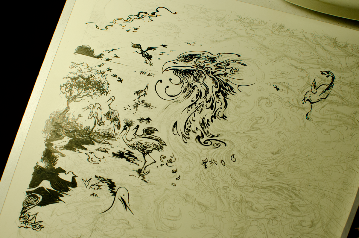
After the rough image and general outlines are transferred, the image is worked up in graphite. Rudimentary outlines and movements are felt out as I refer to thumbnails, notes, and references as the drawing takes shape.
Details are added and improvisation, happy accidents, and mild experimentation in rendering and treatment of objects in the scene lend things a churning, pulsating, directional feel. I wanted to give the bird a very triply edge, like the viewer is turning their head towards the bird just as the mushrooms are really starting to kick in.
I work very loosely, so after rough lay-in of the forms was done, I hopped right into inking.
Mixing it up using various-sized brushes and Faber-Castell's India ink pens, chiseling and sharpening lines using a scratchboard utensil on the clayboard ground.
A view of how messy my workspace usually can become while I'm into it. Reference materials, drawing and cleaning supplies, and sketchbooks and notes all over the place.
Getting the psychedelic side. Leaning into the way the feathers are bleeding into flowers which are spilling off of the phoenix's body.
The key drawing took 3 days to fully render.
The shading and detailed tightening took another day.
Finalization
The key drawing was taken into Photoshop and different areas of the illustration were masked in the Channels menu. Doing this allowed me to save flat areas in which to quickly apply more colour later on. Starting with some rudimentary colour and shading to establish a mood.
I use a plugin that automatically fills in all the spaces which are confined within the key lines. It is used by comic artists and colourists to render entire pages of stories in less time than it takes me to do one poster. Being a poster artist is lazy compared to being a comic book artist. Kudos to you if you're doing that and making a living.
Grouping selections and saved Channel Masks into clusters of named flats. Working layers are grouped according to white, grey, and black, but can easily be intersected with Channels.
Now you see it, now you don't. The ability to bounce back and forth between extremes with no lasting repercussions (within reason) is one of the best things about doing things digitally.
Final "Dawn," variant.
Regular show edition: "Daylight."
Variant edition: "Dusk."
All prints glow in the dark.
Printing
Due to the time crunch and the several necessary colour changes, I was less thorough with documenting the printing process pictorially. But I can tell you it was very worrisome at some points. The type-interference colour went down first. For the Daylight version, that was aqua blue through a 250-mesh screen. In spite of size of the holes in the mesh, I didn't do a delicate enough job of washing out the screen, which left parts of the layer thinner than intended. Much of this was covered up with the primary (in daylight; red) layer, though.
Purple primary layer for the Dusk variants.
From advice gleaned from The Adventures In Design Podcastepisode with Dan Macadam, I've begun using "Dissolve," to Bitmap layers instead of Halftone Screen. This has had the effect of sharpening all my lines and shapes exponentially, while introducing the need to wash out more delicately to get every tiny dot out. Which is tricky since I don't have a forward-facing light in the washout booth. *EDIT* I meant "Diffusion Dither," not "Dissolve."
Daylight, Dusk, and a Dawn (in hot pink).
Keyline being laid down.. This screen needed to be removed, re-coated, and re-shot because not enough detail came out and it left blank spots in the first two prints. Rather than opting for hitting the posters twice and risking even more uneven ink coverage, we bit the bullet and repeated this part of the setup process. Glad we did; the prints would've been shit otherwise.
One of my best buddies who often helps me out with printing: Andrew. (not Christian, although he helps a ton as well)
Tight-ass registration.
Grouping the final posters into sizeable piles for trimming.
Said trimming commencing.
Said trimming commenced.
Phoenix face detail.
Printed flower detail. You can totally see the aqua-blue, it just looks more faded than I meant it to.
Tried doing something a little different with dropout. Since my prints are usually very heavy because I like to just print whole swaths of ink inside the black instead of trapping to save ink, I decided to use math to lighten the load. Instead of just printing 100% coverage underneath the black, I trapped the edges, but instead of blanking out where the black was, I applied 30-50% of two overlapping colours. This had the effect of keeping the paper from warping since less was laid down at once. So 300-400% coverage went to 100-150% coverage, leading to much less curling.
Vibrating with colour!
Psychedelic type with mushrooms.
Inspecting each of the three posters.
Laying out the Dawn variants for signing.
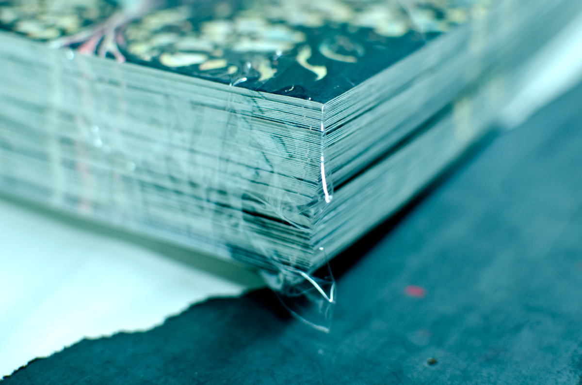
Final piles of posters sealed in protective plastic bags. Double-layered, secured with several layers of tape inside of old French Paper boxes and shipped to St. Louis, MO.
[heading size="h3" stunning="yes" align="center"]Fulfillment[/heading]
Since setting up shop in Toronto towards the end of 2012, my old bedroom at my parents' house has been turned into a storage unit and fulfillment room for my stock. Because space in Toronto is unnecessarily expensive, since I've been in Canada, my Mom has been helping me out by physically fulfilling poster orders for me while I run the online store and do customer service. Segmenting the job and delegating saves me immense amounts of time and leaves me freer to focus on actualizing art than the tedium of order fulfilment. I feel this part of the process should be brought to light because efficiently processing orders has become an admirable feat in and of itself and my Mom (and Aunt for this abnormally-hefty drop) should be commended for helping me keep all of these orders straight.
Once I process the orders for the week (or a large drop), I index the sales and use a website called Ordercup to print shipping labels through USPS. They are connected to a local courier service called ChitChat Express, which specializes in reducing the shipping costs of packages originating from the Greater Toronto Area (particularly to American customers). Their system allows one to simply drop off the packages so long as they are all properly weighed and correctly entered into their system, and the labels match the addresses recorded in the manifest. Because of this, my Mom and I have a weekly ritual where we go over the week's sales together and cross-reference and double-check to make sure everybody gets their orders packed properly and sent quickly.
The Widespread Panic drop was the most complicated one yet. There were over 100 sales totalling twice the posters, coming in 7 combinations of orders, made all the more complicated by the fact that I hadn't said NO to combined shipping (a policy I will correct for future sales), necessitating double-checking and ensuring. Receipts for days.
My Aunt helped my Mom out by helping process the sales data into a couple of Excel sheets which kept orders organized, noting who got what, as well as special requests and orders with which I'd need to follow-up with a partial Paypal refund for combined shipping on separate orders (again, this ended with this drop). Just looking at all these labels gives me anxiety. I fulfilled my own orders when I lived in the Columbus, OH until late 2012, but the most I ever had to deal with was a couple dozen rolls at a time if that. This is comparative madness and I wouldn't have been able to handle it without help.
Highlighting orders and ensuring there are the proper number of rolls for each dividend.
Sorting bundles of orders. As said before, there were many combinations of carts and purchases, which added a full day of begrudging, procrastinatory effort to properly wade through. Some bought one, some bought two, some bought one and two, some bought all three, you get the picture. It got confusing quick, so I'm relieved (but not surprised) that my Mom developed a working system to keep things moving.
Numbers are matched wherever possible, although preference is given to those who purchase full sets.
Regular editions laid out like cards.
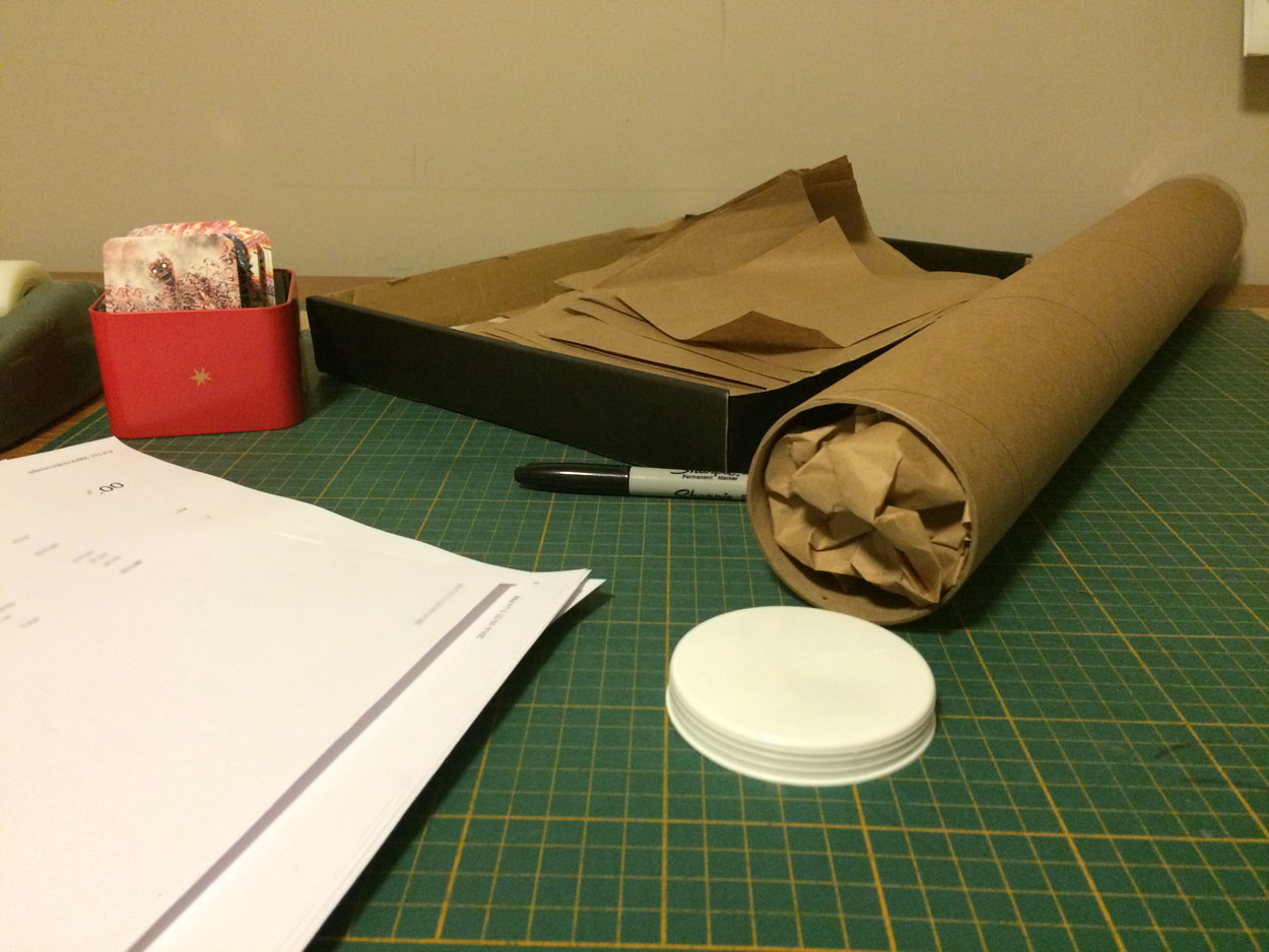
My childhood work desk, now the poster-wrapping station. When getting my first posters sold, Gary of Rock Poster Frame directed me to this shipping guide, which we still refer to and follow.
Paper tape. Because it's gentler.
It looks a little better than masking tape. And until recently I was too cheap for stickers. That'll change.
The medium-tight-rolled poster is then inserted into the tube with its accompanying receipt.
And reinforced with business cards and more paper stuffing.
The padding is gently curled inwards. This whole method of packaging is done as such to make them easy to open and then put back together as border patrol is notorious for doing.
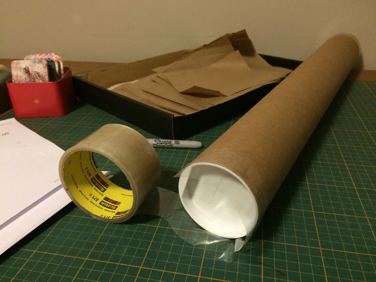
Once the poster is wrapped (not too tightly), and the receipt and business cards are inserted so everything is made traceable and transparent, the ends are capped and sealed with a bit of clear Scotch tape.
My Mom does this over and over again, while I'm double-checking everything and following up with customer queries. Panic poster people are abnormally obsessed with posters, which is great, but they totally flood inboxes and go chatterwild on social media during drops like few others.
Over a hundred times. My head hurts just thinking about it.
I sometimes feel a little bit guilty about delegating this part of the process to my Mom because a part of me really wants to be able to do everything in my business. But doing so while maintaining the already unpredictable schedule I have would drastically slow down my operation, so she says she's happy to do it. She's not connected to the anxiety of dealing with rabid poster fans (which I am primed for) and I'm not connected to wasting a day a week fulfilling orders (which she usually finds therapeutic since we both share a touch of OCD). Also, she said she likes counting my money. And who better to trust than your family with such important stuff?
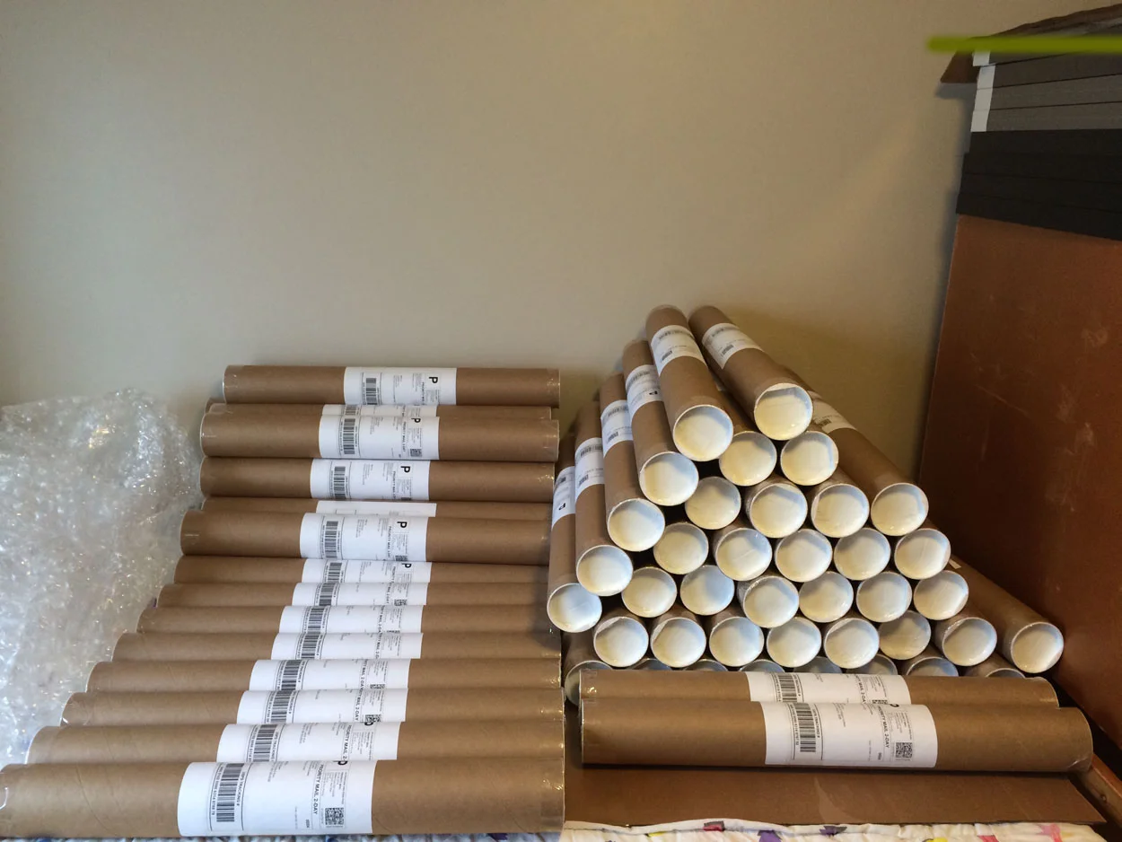
Sorting all of the sealed poster rolls by order contents.
Locked.
Loaded.
Ready for drop-off!
[heading size="h3" stunning="yes" align="center"]Details[/heading]
Thanks for reading!


