Kanye West is an American recording artist who commands a grand presence in hip-hop. He is one of the best-selling and most awarded artists of his generation and has produced one of the most critically lauded discographies in the genre and lent his hand to many others. His larger-than-life personality attracts the attention of the media and the public, as does his flamboyant fashion sense. I really enjoy the music so it was a big surprise and a great honour when Outback Concerts contacted me to do a commemorative gig poster celebrating Kanye West's Yeezus Tour with Kendrick Lamar supporting.
Concept & Rough Ideation
Began by sifting through tour assets, press photos, and recent fan shots for inspiration. With more research, I found that Kanye had really gone all-out to provide the audience with an insane show, so I sort of knew the poster needed to capture that crazy production value, especially since the whole performance was so geared towards the enormity of the arena.
Started by loosely doodling ideas on dry erase board. These first sketches weren't strong but they laid the foundation for what was to come.
Took one of the sketches and played with a couple of variations on the computer, seeing what minimal colour or a monochrome scheme might feel like. I recall browsing for recent performance videos and seeing his performance of Black Skinhead on SNL. That inspired the wolf imagery which made the final composition and clued me into using the background to house more faces.
Went tighter and moved onto more moleskin doodles. Roughed out more ideas having to do with different elements such as the stage, type layout, and Kanye's orchestra of masks. A little frustrating that no individual drawing seemed to cinch things for a while. I think I was choking under the pressure a little. Probably spent about a week brainstorming, researching, and getting some bad drawings out of my system.
Eventually something lit a spark and I combined most of the sketches into one considered rough drawing. I liked the improved sense of design, the invention of the footer with the micro-crowd and backup dancers, the sense of scale to emphasize Kanye's Godliness.
Semi-Composite
After the sketch was completed, I made a 5" inkjet photocopy for transferring purposes.
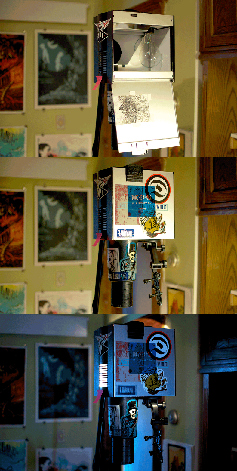
The image was loaded into my vertical projector. Adorned with stickers from AngryBlue, Brian Ewing, LandLand and Deathwish Inc. Also pictured: works by Jason Edminston, John Vogl, Erica Williams, and Delicious Design League. Buy things from all of them. They're all great.
The image was projected onto a piece of coated illustration board which was pre-shrunk and painted with grey gesso.
Started messing loosely with the drawing in graphite. Tried to get a nice flow going, accentuated by sharpened shapes. Not afraid to just paint and redraw over anything at this point.
After the image was pencilled, white was added in ink.
Began filling in blacks and whites at the same time.
Detail of the clouds with portions in un-inked graphite.
Ended up just blacking out the mountain and sky because I knew I'd be filling them with content generated in Photoshop and Illustrator later on.
Went with drawing him in full Yeezus garb, including my favourite mask. His entire wardrobe was a collaboration with fashion house Maison Martin Margiela. Took care to make sure the mask's details came out especially legibly. Directs the eye towards it nicely in that flurry created by the arms and necklace.
The middle portion is filled with images of wolves and other faces said to represent Kanye at different stages of his life. Threw in Dropout Bear too, because I enjoy his face.
I wasn't satisfied at all with the drawing of Kendrick. I overworked it and it ended up looking nothing like him. So I redrew him on a separate board at a slightly higher scale to throw into the piece digitally.
Ended up drawing some more on separate pieces of board. Thought a spare of Kanye's head would come in handy. Also drew up some little assets representing cell phones screens, crowd hands, the backup dancers, and, uh, Jesus.
The whole image was too big too scan one piece, so it was done in 6, then stitched together in Photoshop.
Finalization
The finalized semi-composite in painted greyscale. The image is constructed in this manner because it makes the lights and darks easy to separate using levels in Photoshop.
Starting to input some of the extra assets. Trying to let go of having the traditional piece be 100% perfect. There's so much more that can be done with the flexibility of digital. I know I'm already trying a little too hard for traditionalism most of the time.
Replacing the first Kendrick head with the much-improved version. Much better!
The footer of the image was filled with a smaller-scale crowd, as well as the procession of dancers. After the greyscale comp was fully done, it was taken into Illustrator for additional elements of the typography and mountain.
Using press and fan photos as reference. I didn't get hyper-specific with the details, as I wanted the mountain to read more graphically to sort of provide a little bridge between the stiff symbolism of the typography and the wild flow of the characters.
More graphic reference, bouncing back and forth between Photoshop and Illustrator for texturing effects. Still keeping everything in black and white because everything must work in this mode before moving onto colour. *Cr/edit:"Y," lettering derived from piece created by Diebolt Designs (source).
Finalized greyscale comp with star shine added in the upper sky-screen.
The greyscale drawing was broken up into black masked layers with adjustment layers applied. With this technique, it is possible to fluidly mess with layering and colours.
Close-up of [Baby] Jesus.
Decided to ghost in some vertical laser beams to give the eye "tracks," to ride up and down the centre of the composition. It makes sense to me.
The final four separations. Eventually each was printed on 19"x25" vellum.
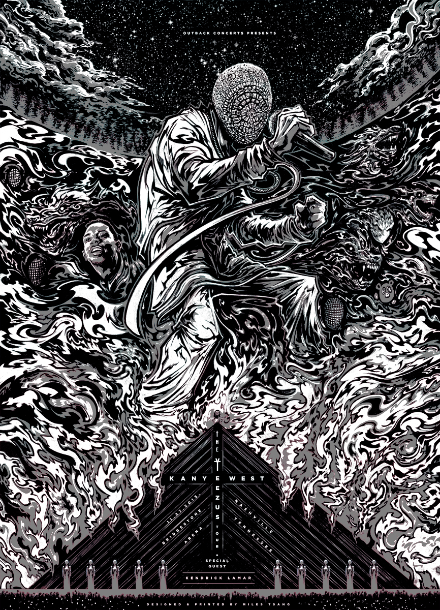
The finalized piece.
After arriving at the final, Outback and I decided to wait to print the poster for a bit. At the time, some of Yeezus' tour dates were either being cancelled or changed so I had to wait a few days before moving onto actualizing the image as a screen print. While restlessly waiting, I chose to add Kanye's real face as a glow-in-the-dark special effect. Maxed the greyscale comp out, masking out random parts of the mid tones and blacks while adding his portrait.
Here's how the print should look in the dark.
The print's layers were also set up in such a way that it lent itself to differing colorway editions. This one's called "Coldest Winter".
Came up with another called "Cruel Summer," as well. Originally, there was meant to be an extra metallic accent layer specifically for the warm and cold variants but that proved more troublesome and time-consuming in the long run so I simplified. Every print glows in the dark.
Screen-Printing
Time to print. Fuck yeah.
Custom-built exposure unit. At the time of the job, I only had half the [special-order UV] bulbs, so the screens each had to be exposed, carefully cleaned on one side, then flipped upside down nd blasted again. I knew I'd be doing colour changes so I needed 100% light coverage even if it took twice as long.
Exposure room cabinet contents. Spare containers, dust cloths, chemical blockout, transparent tape, rubber tubing, blue tape, emulsion, test strips, and scoop-coater.
The transparency is taped in a specific spot on the coated screen about 6" from the sides and 7" from the bottom so the semi-automatic press arm can reach it.
The exposure unit flushes contact between the transparency and screen by using a small vacuum motor which is attached to the unit through a small hole in the bottom right. Rubber tubing is placed around the hole and transparency, creating a small pocket of space for air to sucked out of. Once set up properly, a vacuum is created and the transparency is pushed as closely and unmovably into the screen as possible, allowing the UV right behind it to cast a nice, accurate, constant amount of hardening light.
Washing out the half of the screen before double exposing the other side.
The semi-auto took some getting used to. There are knobs which control the angle of the squeegee as well as the amount of downward pressure applied to the entire arm, which includes the flood bar. The arm rigs the flood bar to lift up and squeegee to push downwards while pulling, while the flood bar pushes down on the up. I'm bad at explaining. It makes sense when you see it.
Some of the Coldest Winter variants after layer #1.
Seeing if acetate registration would work without the vacuum. Didn't quite.
Messing around. Finding that screen-printing with this machine actually doesn't cut down on time spent by a whole lot since the screens it uses are so large (also necessitating a small spike in supply costs) and so prepping, dismantling, and cleanup is more delicate and takes several times longer than it used to . But it is really great to not have my arms feel like rubber after a 14-hour day.
Mixing some ink. Consumer-grade Speedball for the win.
I received a ton of help from friends and family setting up the studio as well as during actual printing. Pictured here is my buddy Christian, who generously allocated his day off to working as shop assistance helping to run these Kanye gig posters. Thanks to him and a few others, printing took about 3 days instead of 5.
Reclaiming one of the screens. Just realized I should really wear gloves for that crap. Whoops.
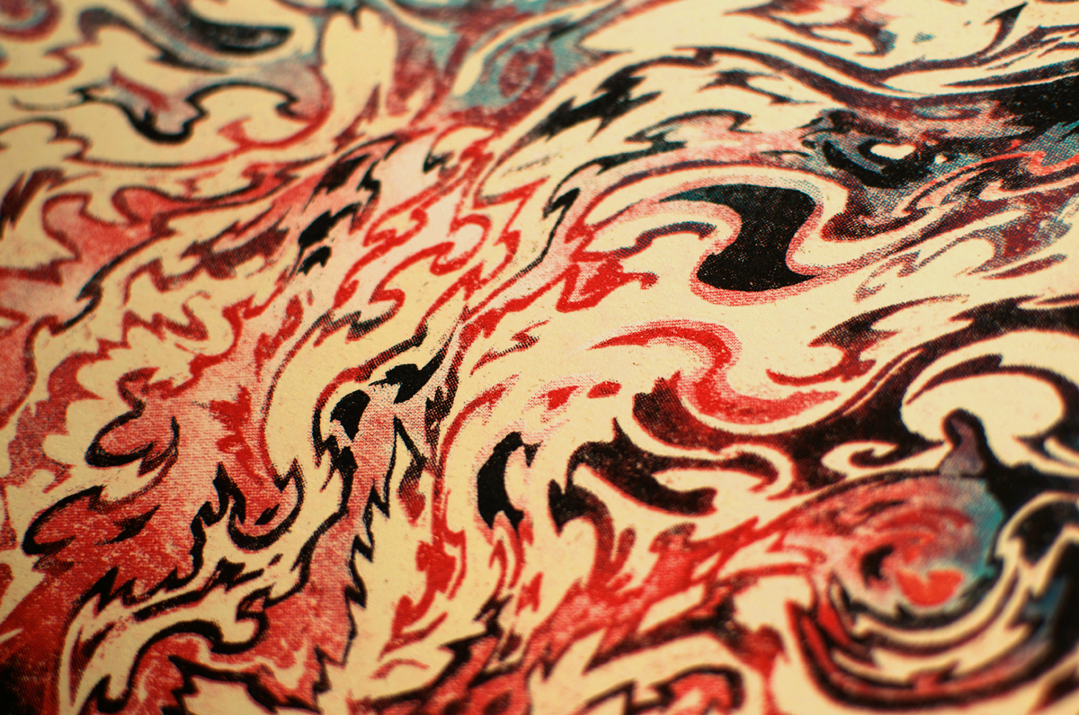
A misprint/test print with colours I enjoyed (you can see some bloody smudges on the left). Greener than the others.
Since the vacuum wasn't working properly, I ended up just printing layers directly onto the table and approximating by just placing already-printed posters on top. It worked well enough for this round.
The glow layer being applied. Hit the poster three times for each glow so that it would be more vibrant than previous efforts.
Final stack of untrimmed prints.
Trimming the sides in small, manageable piles.
Final stacks.
Duplicates of the regular colorway. Quality-controlling and signing and numbering.
About half of the run was paid for by the promoter, so these had to be securely shipped. Ended up going with UPS because USPS has a tendency to screw things up around the holiday season.
Securely taped up and double-bubble-wrapped.
Final poster package, headed for Nashville!
After almost exactly year of commuting to a community facility an hour away (one-way), it's a pleasure to announce that this private studio in Toronto is where I'll be hanging my hat from now on. I'll be printing my own stuff and possibly some co-projects with friendly local talent though this Kanye poster was the first thing run through to break in the brand new setup. Wonder what's next...
Details
Designing this Kanye West poster was an exhilarating, challenging experience and a great way to kickstart activity at this studio. Big thank you to Outback Concerts for putting this together. The print and both alternate colorways are available for purchase through The Shop. Thanks for reading!
*EDIT* This poster is now sold out.


