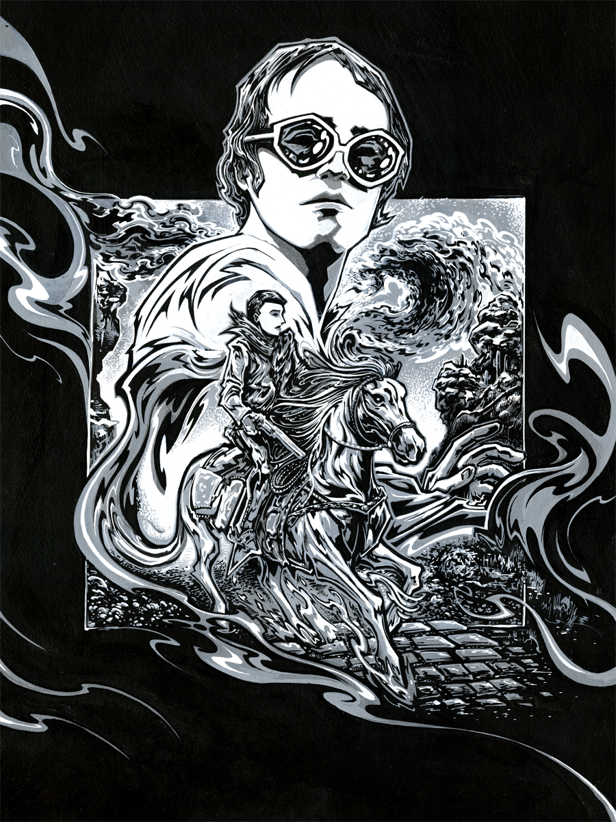
Elton John is an English singer-songwriter, one of the best-selling and most influential musical artists of all time, global champion for LGBT rights and cultural icon. In 2013, I was commissioned by England's The Flood Gallery to create an illustration and accompanying run of screenprints to commemorate the 25th anniversary of the release of Goodbye Yellow Brick Road.
Concept & Rough Ideation
The idea was to get an image inspired by a particular song since the album is so eclectic and visual. I don't know a ton of Elton's catalogue, so it took some repeated listens to decide on which song to illustrate. In the end, I chose "Roy Rogers," because of how chill and laid-back the vibe of the song is, which was a nice contrast from my "heavier," output.
Started by doodling Elton in mixed media to loosen. First time playing around with an airbrush.
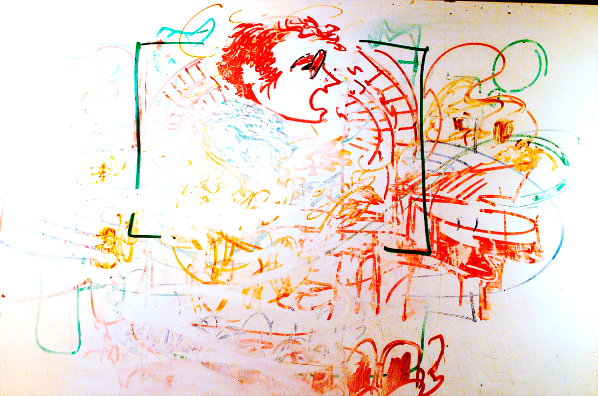
Another loose drawing of Elton in dry erase. Again, just to get stuff out my system that I knew would never really take.
Starting to zero in on an actual image. Interpreting the lyrics of the song kind of literally while messing around with dry erase and copic markers. The idea was to put Elton and Roy in the same frame but keep them inhabiting separate spaces, as if Elton is singing Roy into existence. In the end, I used this as a base for a more detailed collage.
Adding photo references to the mix. I knew I'd be re-interpreting this photo, so I didn't have any qualms about just ripping it and dropping it in place.
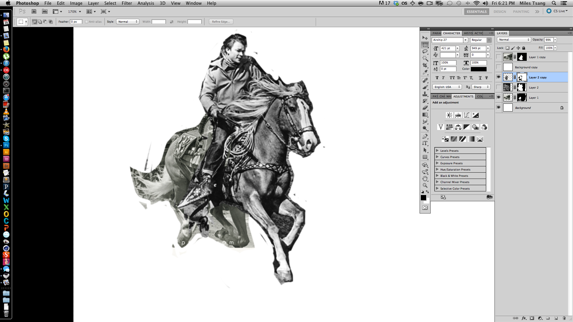
This collage of Roy Rogers is composed of pieces of several other photographs culled from the web. The more pieces you tweak and "Frankenstein," the more individuated the image tends to feel.
[heading size="h3" stunning="yes" align="center"]Semi-Composite Drawing[/heading]
Another photograph of Elton in a similar pose to the sketch above was combined with the Roy collage and projected onto grey gesso-coated illustration board and drawn on.
Surrounded with references and notes.
I don't actually know how to draw a lot of stuff right out of my head. Lots of research and either a tactile wall or board of references always improves my visualization. Otherwise, I often end up spending twice as long drawing something and it doesn't even look like it exists in the space I'm trying to create. It's always better to just have tons of references and make them easy to see.
Projected a webcam photo of my hand. Hands and rough lighting can often be worked out in Photo Booth, I've found.
I overworked the outside and couldn't decide on a direction for the outlying border, so I buried the pencils under a smooth layer of airbrush grey,sealed it, and kept drawing.
Progress shot of the board viewed properly. Still needs way more doing.
Starting to develop some ideas of how to integrate things. I recall making special effort to keep things a little more open than usual, as I've noticed my images are becoming very dense. That's not a bad thing, but with a song like "Roy Rogers," a feeling of spatial aggression was the last thing I wanted to incite. Big, flowy, open shapes...
I wasn't getting very far very fast, so I decided to just bust into inking and highlighting as I was penciling. This isn't advisable, since things tend to look more consistent if you keep areas developing around the same rate at the same time.
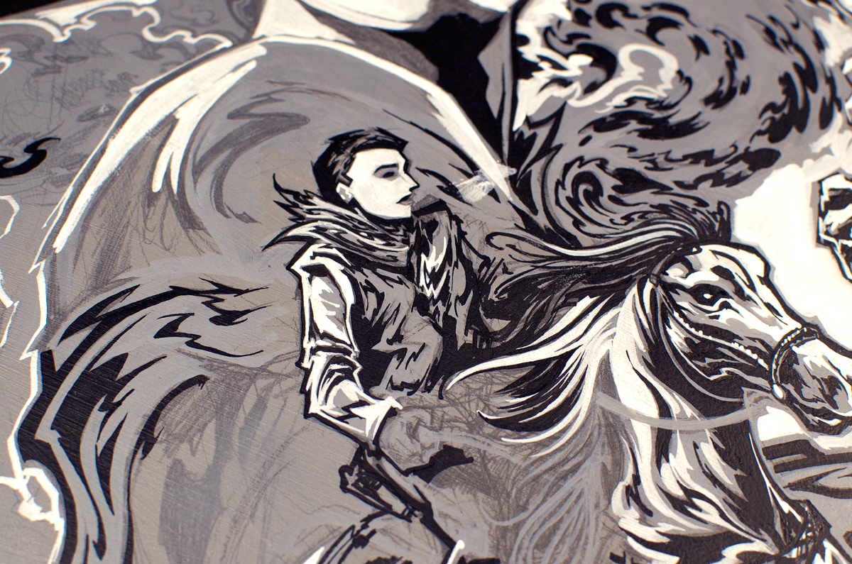
Close-up of Roy in-development. Lots of chisel-tipping.
Elton is finally starting too look like Elton. Stylized things a bit, but took care to keep his likeness intact.
Further development.
Frontal progress shot. Nearly done.
Finalized digital scan.
Finalization
Started by separating the midtones, highlights, and dark shapes/keylines. Accomplished by duplicating layers, only selective positive or negative space using channel selections, and then subtracting them from one another. The idea is to get three separate interlocking layers which act as the mask for colour overlays. The beauty of Photoshop is its ability to take things further, by masking atop those masks and messing with colour transparency.
As such. I like to black out each shape and then apply a Hue/Sat adjustment layer. This way colours can easily be tweaked, and the layer mimics the setup of a printed transparency.
Duplicating lots of layers. Deciding the colouring is wonky because I'm getting tunnel-visioned.
Layers for days.
Loose progression shots.
Final planned (digital) layers.
Final actual colours.
Since it basically became a cmyk print, I was curious to see how the image looked with certain layers missing. Interesting.
Screen-Printing
Went about separation a little bit differently this time with mixed results. Shown here is a detail of the raw raster of a layer.
Normally I'd bitmap the image in Photoshop like so. Can't remember the exact specs but I expect it was something like Halftone Screen>300dpi>55lpi or something. I don't know. Rotation depends on which colour is being printed in order to avoid artificially/aesthetically-distracting moire. Watch this and understand.
But instead of the usual, I tried out stochastic separation. Meaning instead of pure black-and-white preset shapes of varying sizes denoting shade, those shapes' sizes were kept constant, resulting in a more fine-grained look. This is purely aesthetic, and I don't believe one to be better than the other, although I do enjoy the smoothness stochastic bitmapping.
Close-up of stochastic dots overlapping in Photoshop. In a perfect world, this is how it might look in reality.
Separated layers, laid out accordion style.
First layer. Starting lightest.
Screen detail. Didn't take as many pictures as I wanted because I was constantly worrying about the ink drying the screen and there's a lot to run around and do during a print run.
Registration. Still getting used to the setup.
Two more colours added.
Off-registration looks cool when using dropout.
Face progress shot. The red came out very light because I used a 305 mesh. Probably could've gotten away with 250, which has a much more open weave.
Semi-auto press with dripping squeegee blade. It's a pretty rudimentary press with manual screws for angling and a couple of spring-loaded knobs for pressure. There's a flood bar behind it which drops and pushes the ink forward, filling the screen, before it lifts up, the blade presses down, and the whole arm retracts backward while pushing down, laying the ink to the substrate exposed underneath.
This was initially how the print looked after I thought it was finished. But there was something kind of off about it. The colours were mixed ok but the red was too light and the yellow was so transparent, it was being covered up by all the blues. It made the print look cold, distastefully so under artificial light.
Yeah, fuck this.
While passable, it wasn't impressive.
I redid the yellow separation and had it burned into a 250 mesh screen.
Details
The difference is bonkers. Totally filled everything out and imbued the image with life-affirming warmth. It gave all the colours entirely new dimension and drastically altered the feel of the print from "cold vacuum of space," to "extraterrestrial womb."
Roy Rogers with rifle. Mis-registration didn't really help but it didn't really hurt either. If it looks cool, leave it. People find reasons to like or dislike anything so just go for cool-looking.
Celestial horse galloping. Cool.
Detail of Elton's portrait. Ubercool.
Medium shot.
The final posters.
Thanks for taking the time. A portion of this run is now available for purchase through The Shop.


